Appearance
Flutter教程 - 4 组件
下面来介绍一下Flutter中的各个组件。
4.1 容器组件Container
Container 是 Flutter 中的一个基础布局组件,用于包裹和布局其他组件,并且可以添加装饰、边框、阴影等样式效果。它是一个非常灵活的组件,常用于创建各种样式丰富的 UI 元素。
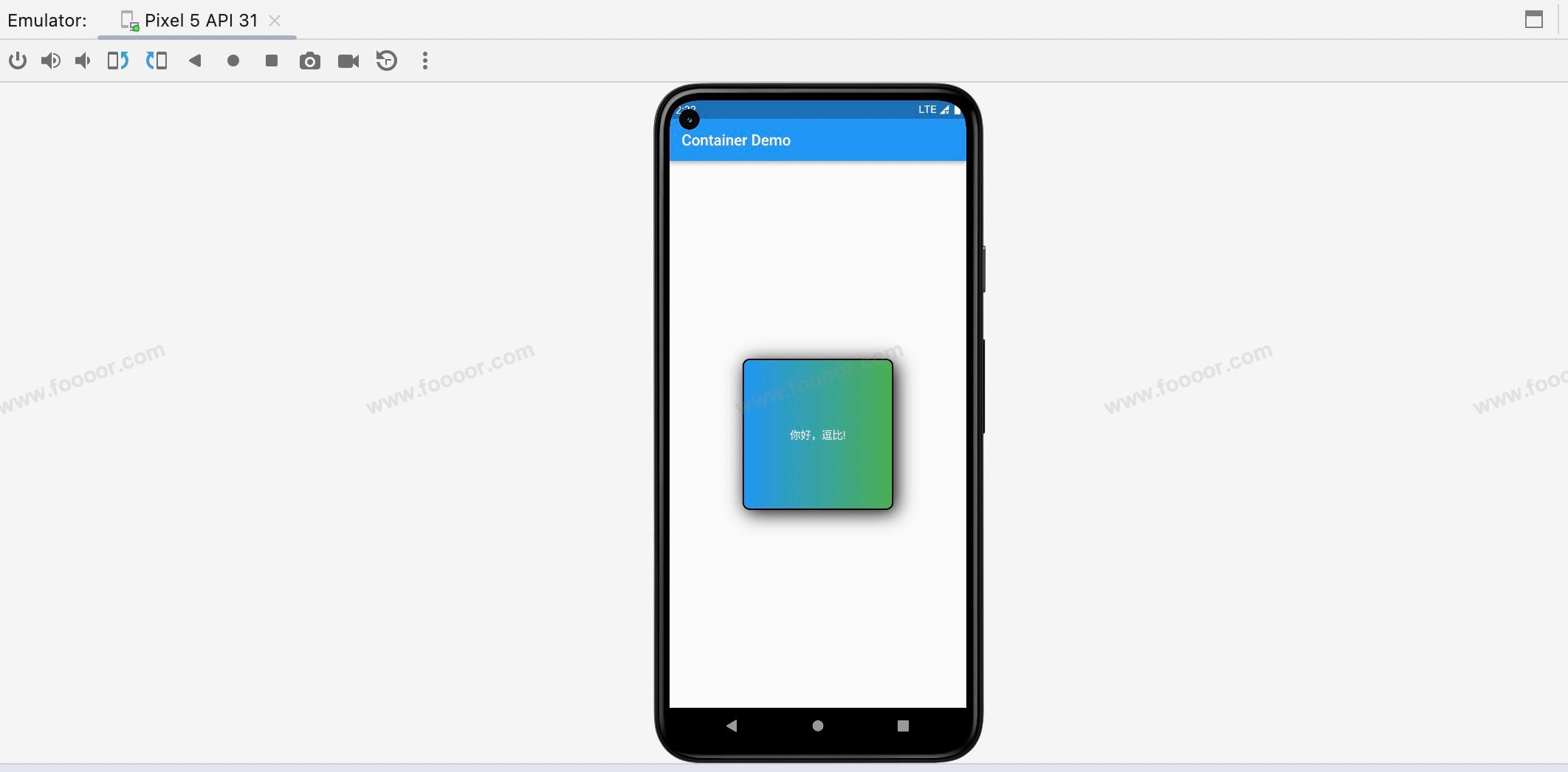
下面我们通过 Container 实现下面的效果,下面居中的部分就是一个 Container 。
先说一下实现的思路:
首先 MaterialApp 和 Scaffold 这部分就不说了,我们在 Scaffold 的 body 中放置一个 Center 组件,在 Center 中添加了 Container 组件,这样Container 组件就可以像上图那样居中了。
然后设置Container 组件的具体细节,设置宽高、boder、圆角、阴影、内外边距、背景或背景渐变,在 Container 中我们添加了一个子元素 Text 组件,用于显示文字,并设置显示的位置、样式。
具体代码:
dart
import 'package:flutter/material.dart';
void main() => runApp(const MyApp());
/// App根Widget
class MyApp extends StatelessWidget {
const MyApp({super.key});
@override
Widget build(BuildContext context) {
return const MaterialApp(
debugShowCheckedModeBanner: false,
home: DemoPage(),
);
}
}
/// 页面
class DemoPage extends StatelessWidget {
const DemoPage({super.key});
@override
Widget build(BuildContext context) {
return Scaffold(
appBar: AppBar(
title: const Text('Container Demo'),
),
body: Center(
// --------------------- 下面是Container的设置 -----------------------------
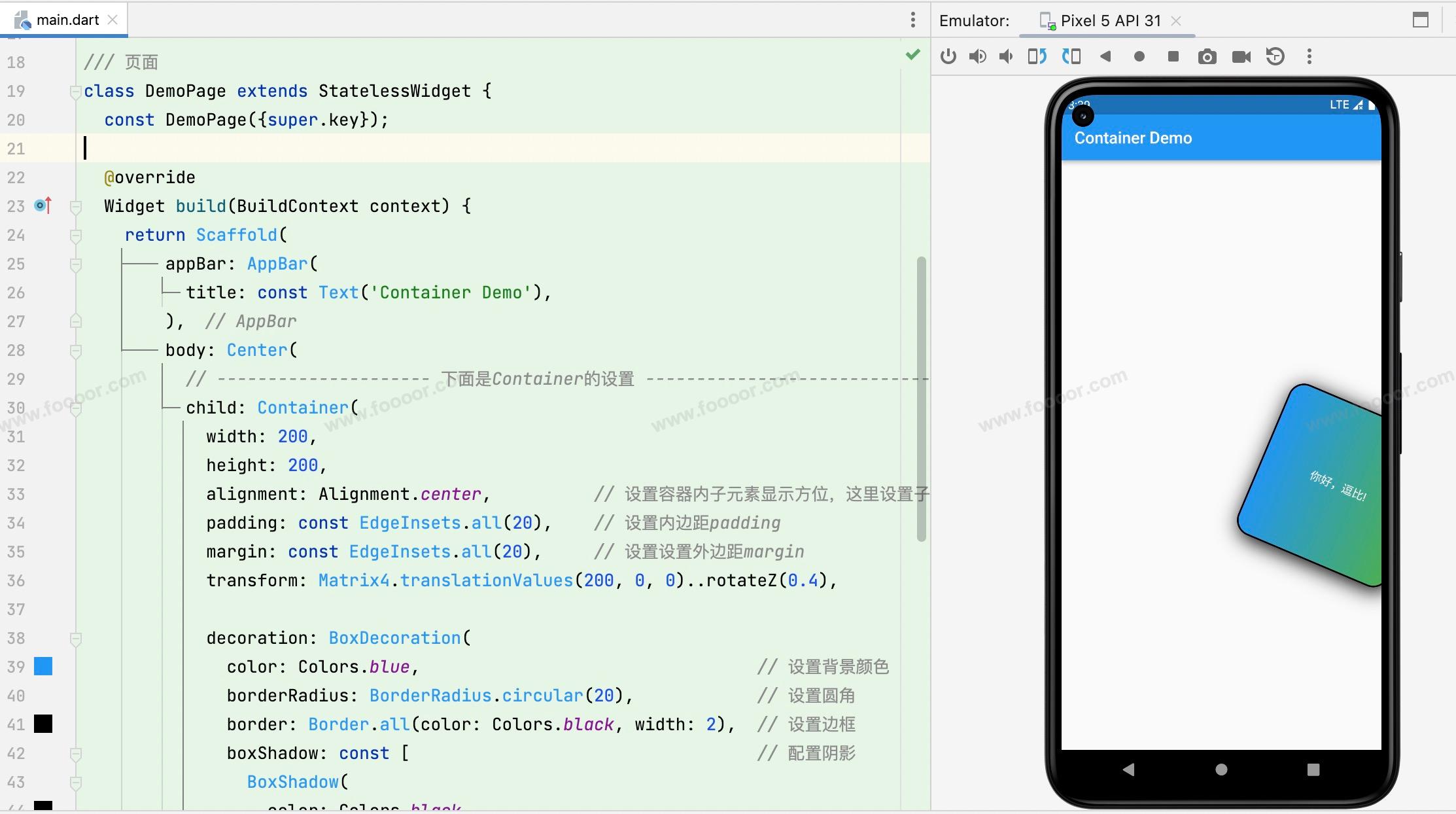
child: Container(
width: 200,
height: 200,
alignment: Alignment.center, // 设置容器内子元素显示方位,这里设置子元素居中
padding: const EdgeInsets.all(20), // 设置内边距padding
margin: const EdgeInsets.all(20), // 设置设置外边距margin
decoration: BoxDecoration(
color: Colors.blue, // 设置背景颜色
borderRadius: BorderRadius.circular(10), // 设置圆角
border: Border.all(color: Colors.black, width: 2), // 设置边框
boxShadow: const [ // 设置阴影
BoxShadow(
color: Colors.black,
blurRadius: 20, // blurRadius设置的是阴影的模糊半径
offset: Offset(4, 4), // 设置阴影的偏移量,往右下偏移
)
],
gradient: const LinearGradient( // 设置背景渐变,会覆盖背景颜色,这里使用的是线性渐变
colors: [
Colors.blue, Colors.green // 设置渐变颜色
]
)
),
child: const Text( // 设置一个子元素
'你好,逗比!',
style: TextStyle(color: Colors.white), // 设置子元素样式
),
),
));
}
}上面的代码其实已经很清晰了。下面介绍一个各个属性。
| 属性 | 说明 |
|---|---|
| width、height | Container的宽和高,单位是逻辑像素,可以在不同的设备上以相同的比例显示。 |
| margin | 设置外边距,距离其他外部组件的距离,也可以通过 EdgeInsets.fromLTRB 方法分别设置上下左右不同的边距。 |
| padding | 设置内边距,内部元素距离 Container 边缘的距离。 |
| alignment | 设置子元素的显示方位, topCenter:顶部居中对齐 topLeft:顶部左对齐 topRight:顶部右对齐 center:水平垂直居中对齐 centerLeft:垂直居中水平居左对齐 centerRight:垂直居中水平居右对齐 bottomCenter底部居中对齐 bottomLeft:底部居左对齐 bottomRight:底部居右对齐 |
| child | 设置子元素 |
| decoration | 装饰,用来设置组件的样式,需要传入 Decoration 对象,但是 Decoration 是抽象类,一般使用它的子类BoxDecoration,可以通过 BoxDecoration 设置边框、圆角、阴影、背景等样式。圆角如果设置为: BorderRadius.circular(宽高的一半) 那么会变成圆形。 |
| transform | 可以设置组件的位移、旋转和缩放。 |
我们在编写代码的时候,很多API可能记不住,可以点进指定的类或方法中查看有哪些方法和参数怎么设置。
接下来简单演示一下 transform,在讲解动画的时候,再进行细致的讲解。
下面我们设置了 transform 属性的值为:Matrix4.translationValues(200, 0, 0)..rotateZ(0.4) ,效果是延X轴平移 200单位,绕Z轴旋转 0.4弧度 ,Z轴是垂直于屏幕的,..rotateZ(0.4) 用了两个点,是级联调用,显示效果如下。
4.2 文本组件Text
我们前面已经多次用到了Text组件,主要是用来显示文字,下面我们重新介绍一下Text组件的常用属性。
在下面的代码中已经列出来了常用的属性:
dart
/// 页面
class DemoPage extends StatelessWidget {
const DemoPage({super.key});
@override
Widget build(BuildContext context) {
return Scaffold(
appBar: AppBar(
title: const Text('Text Demo'),
),
body: const Center(
// --------------------- 下面是Text的设置 -----------------------------
child: Text(
'Hello World,I am coming',
maxLines: 5, // 设置显示的最大行数
textAlign: TextAlign.center, // 设置文字对齐的方式
overflow: TextOverflow.ellipsis, // 设置文字超出时候的样式,ellipsis是显示为...
style: TextStyle(
color: Colors.blue, // 字体颜色
fontSize: 30, // 字体大小
fontWeight: FontWeight.bold, // 字体加粗
letterSpacing: 1, // 设置字母间隙
wordSpacing: 10, // 设置单词间隙
decoration: TextDecoration.underline, // 设置文字修饰线为下划线样式
decorationColor: Colors.red, // 设置文字修饰线的颜色
decorationStyle: TextDecorationStyle.double // 设置修饰线样式为double
), // 设置子元素样式
),
),
);
}
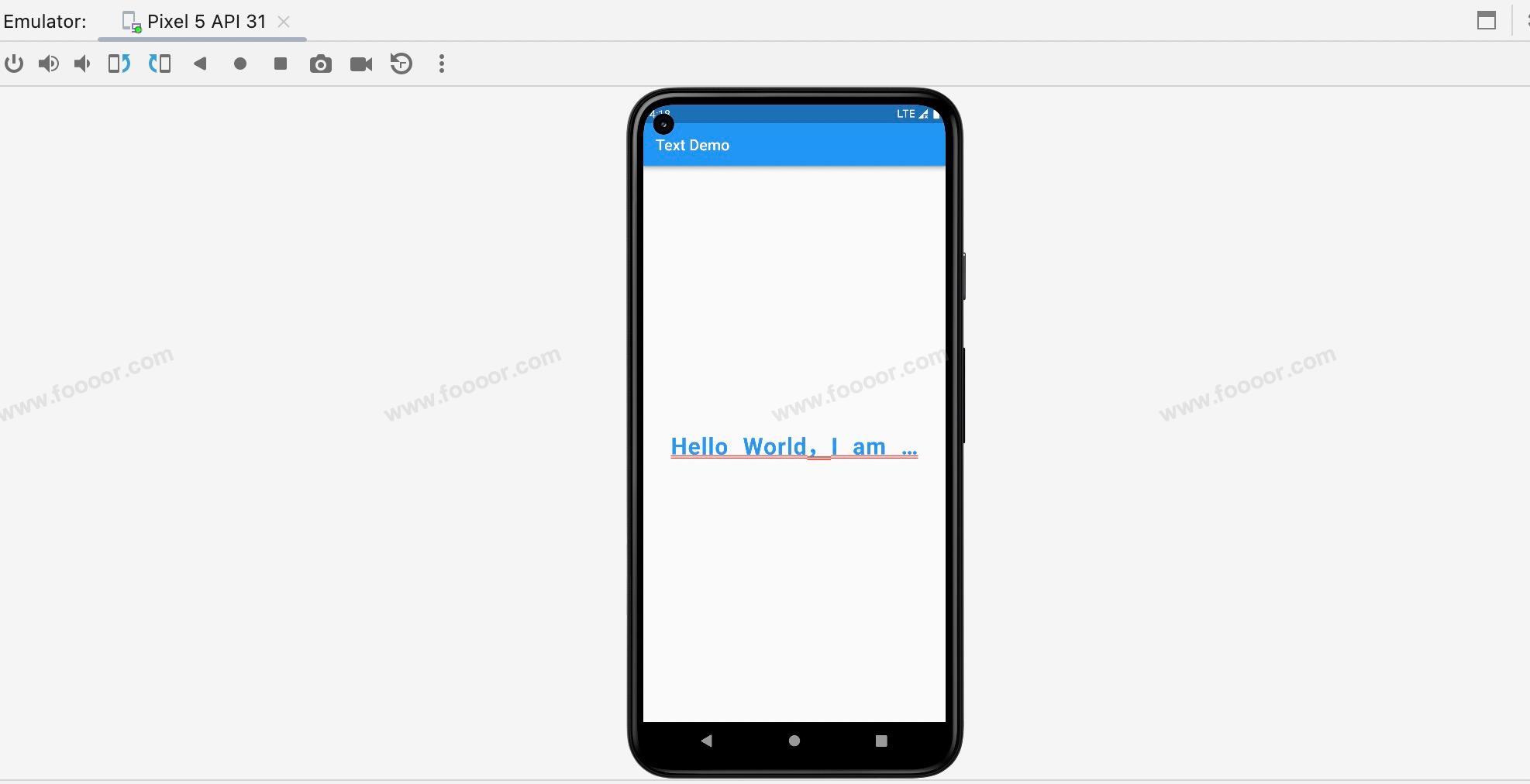
}显示效果:
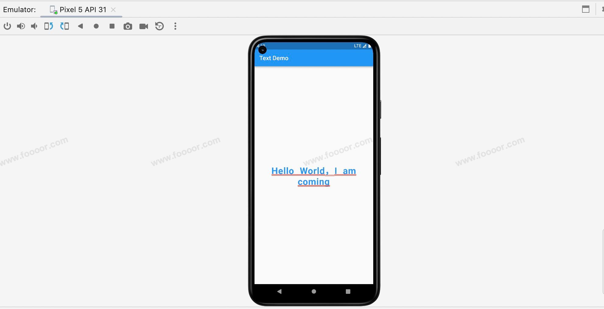
从上面的代码就可以看出具体如何使用了。letterSpacing 和 wordSpacing 是允许设置为负值的,设置为负值,字母显示会更加紧凑。
修改上面的代码将 Text 最大只允许显示一行,显示效果:
因为设置了 overflow: TextOverflow.ellipsis ,所以超出部分显示为 ... 。
下面使用 Container 和 Text 制作一下如下样式的按钮。
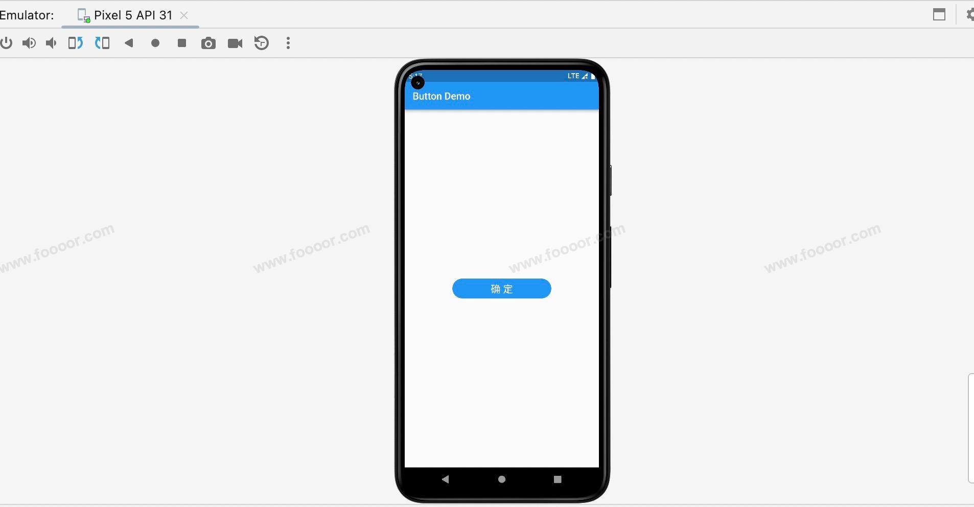
实现的思路:
使用 Container 设置圆角按钮,使用 Text 设置文字,实现是很简单的的。
代码如下:
dart
import 'package:flutter/material.dart';

void main() => runApp(const MyApp());

/// App根Widget
class MyApp extends StatelessWidget {
  const MyApp({super.key});

  @override
  Widget build(BuildContext context) {
    return const MaterialApp(
      debugShowCheckedModeBanner: false,
      home: DemoPage(),
    );
  }
}

/// 页面
class DemoPage extends StatelessWidget {
  const DemoPage({super.key});

  @override
  Widget build(BuildContext context) {
    return Scaffold(
        appBar: AppBar(
          title: const Text('Button Demo'),
        ),
        body: Center(
          // --------------------- 下面是按钮的实现 -----------------------------
          child: Container(
            width: 200,
            height: 40,
            alignment: Alignment.center,          // 设置容器内子元素显示方位,这里设置子元素居中
            decoration: BoxDecoration(
                color: Colors.blue,                                 // 设置背景颜色
                borderRadius: BorderRadius.circular(20),            // 设置圆角
            ),
            child: const Text(                        // 设置文本子元素
              '确 定',
              style: TextStyle(
                  color: Colors.white,
                  fontSize: 20,                     // 字体大小
              ),
            ),
          ),
        ));
  }
}
4.3 容器组件SizedBox
SizedBox 是 Flutter 中的一个布局组件,它可以用来创建一个固定尺寸的空间。SizedBox 可以在水平和垂直方向上设置固定的宽度和高度,用于限制子组件的大小或创建间距。
例如 Text 组件本身是不支持直接设置宽度和高度的,如果想要控制 Text 组件的宽度和高度,可以将其放在SizedBox 或 Container 里,然后设置SizedBox 或 Container 的宽高。
举个栗子:
下面通过 SizedBox 设置 Text 的宽高
dart
import 'package:flutter/material.dart';
void main() => runApp(const MyApp());
/// App根Widget
class MyApp extends StatelessWidget {
const MyApp({super.key});
@override
Widget build(BuildContext context) {
return const MaterialApp(
debugShowCheckedModeBanner: false,
home: DemoPage(),
);
}
}
/// 页面
class DemoPage extends StatelessWidget {
const DemoPage({super.key});
@override
Widget build(BuildContext context) {
return Scaffold(
appBar: AppBar(
title: const Text('Container Demo'),
),
//------------------ SizedBox 设置 ---------------------
body: const SizedBox(
width: 100,
height: 100,
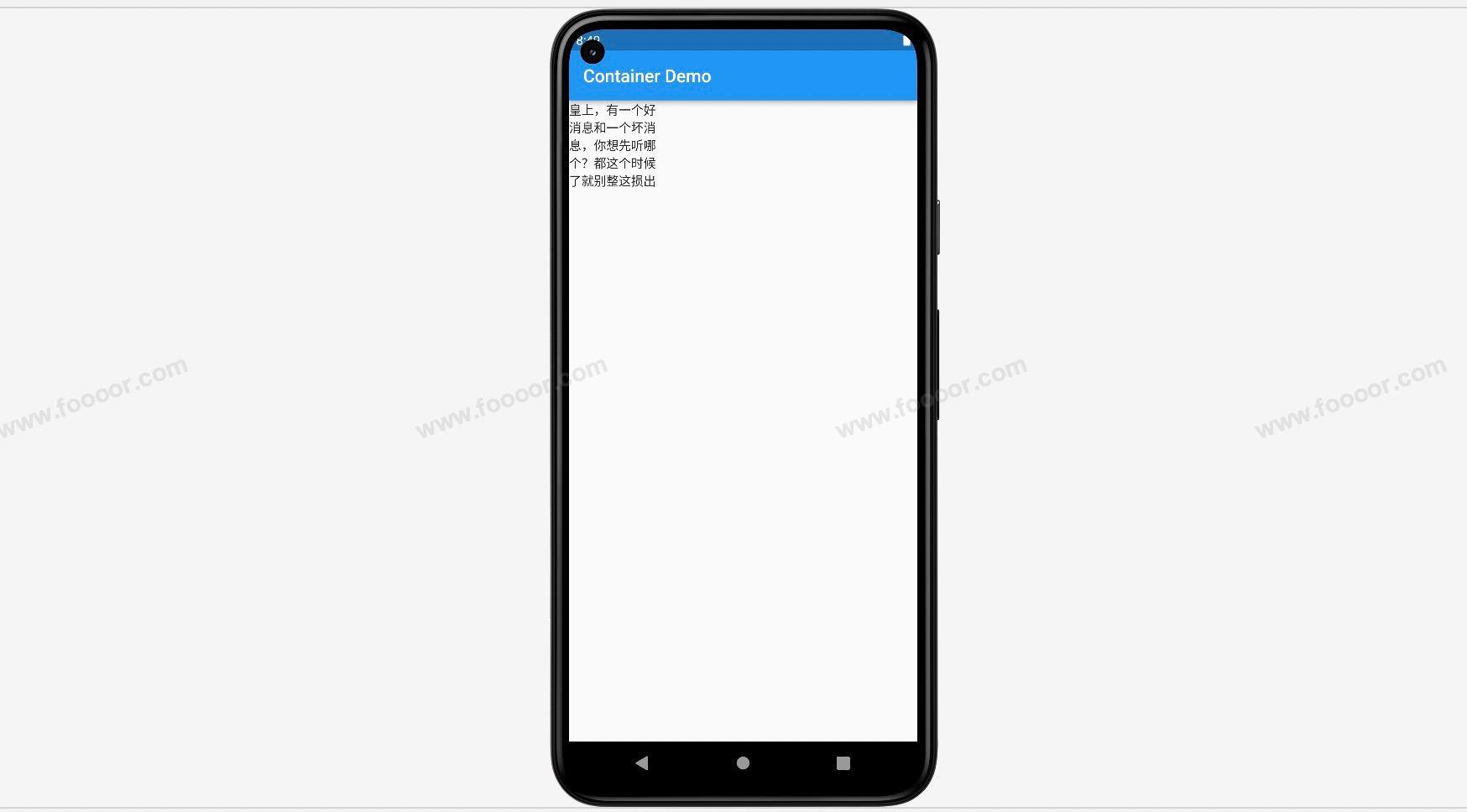
child: Text(
'皇上,有一个好消息和一个坏消息,你想先听哪个?都这个时候了就别整这损出了,赶紧说。好消息是屎管够,坏消息是屎里有毒!',
),
));
}
}在上面的代码中,我们在 SizedBox 中放了一个 Text ,然后设置了 SizedBox 的尺寸,用来约束 Text 的大小。
SizedBox 可以单独设置宽度或高度,可以根据需要来使用。
显示效果:
SizedBox 和 Container 在布局方面的作用是很相似的,什么时候用 SizedBox ,什么时候使用 Container 呢?
如果只是设置尺寸,不涉及额外的装饰和样式,优先使用 SizedBox 因为 Container 会增加一些性能开销。如果要使用样式,那么只能使用 Container 。
4.4 布局组件Center
Center 是一个用于居中其子组件的布局组件。它可以将其子组件在水平和垂直方向上都居中排列,使子组件在父组件内部居中显示。
举个栗子:
dart
import 'package:flutter/material.dart';
void main() => runApp(const MyApp());
/// App根Widget
class MyApp extends StatelessWidget {
const MyApp({super.key});
@override
Widget build(BuildContext context) {
return const MaterialApp(
debugShowCheckedModeBanner: false,
home: DemoPage(),
);
}
}
/// 页面
class DemoPage extends StatelessWidget {
const DemoPage({super.key});
@override
Widget build(BuildContext context) {
return Scaffold(
appBar: AppBar(
title: const Text('Demo'),
),
// --------------------- Center组件 ---------------------------
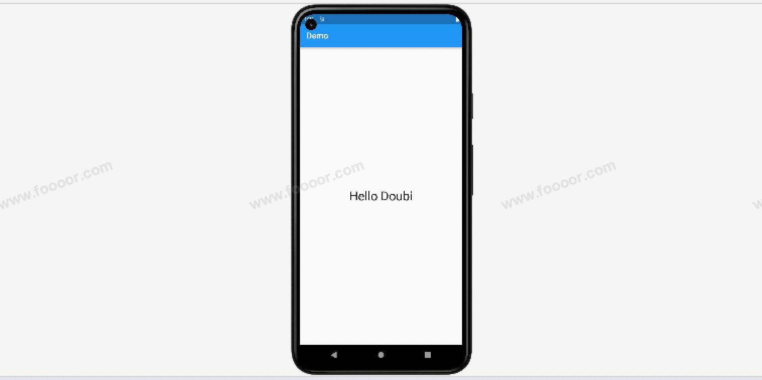
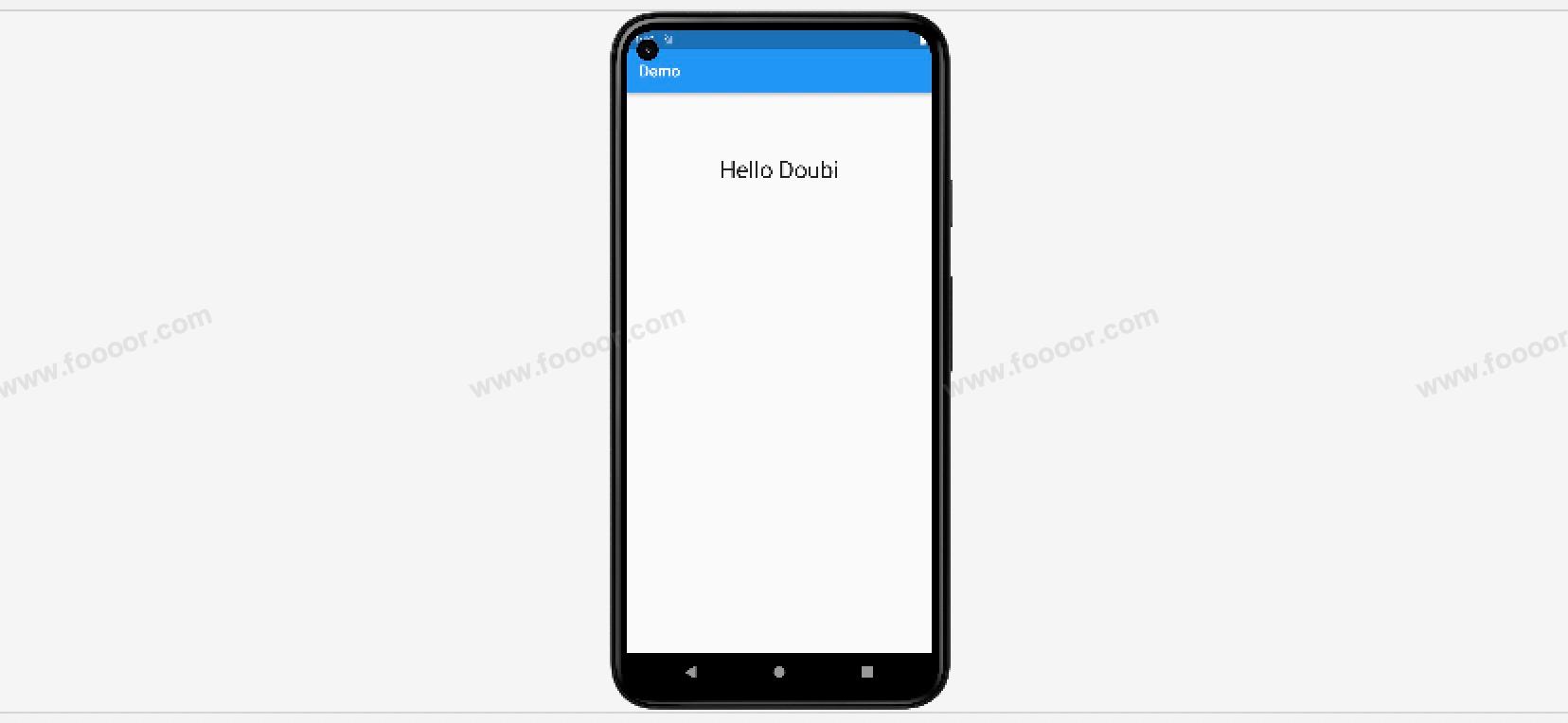
body: const Center(
child: Text("Hello Doubi", style: TextStyle(fontSize: 30))
));
}
}在Center 组件中添加一个 Text 组件,Text 组件就居中显示了。
显示效果如下:
为什么Text组件能在页面中间居中呢?
因为默认情况下,Center组件的宽高是填满父组件的,所以Text组件在Center组件中居中就是在页面中居中。
可以通过Container或SizedBox约束Center的大小。
举个栗子:
dart
import 'package:flutter/material.dart';
void main() => runApp(const MyApp());
/// App根Widget
class MyApp extends StatelessWidget {
const MyApp({super.key});
@override
Widget build(BuildContext context) {
return const MaterialApp(
debugShowCheckedModeBanner: false,
home: DemoPage(),
);
}
}
/// 页面
class DemoPage extends StatelessWidget {
const DemoPage({super.key});
@override
Widget build(BuildContext context) {
return Scaffold(
appBar: AppBar(
title: const Text('Demo'),
),
// ----------------------通过SizedBox约束Center的大小--------------------------
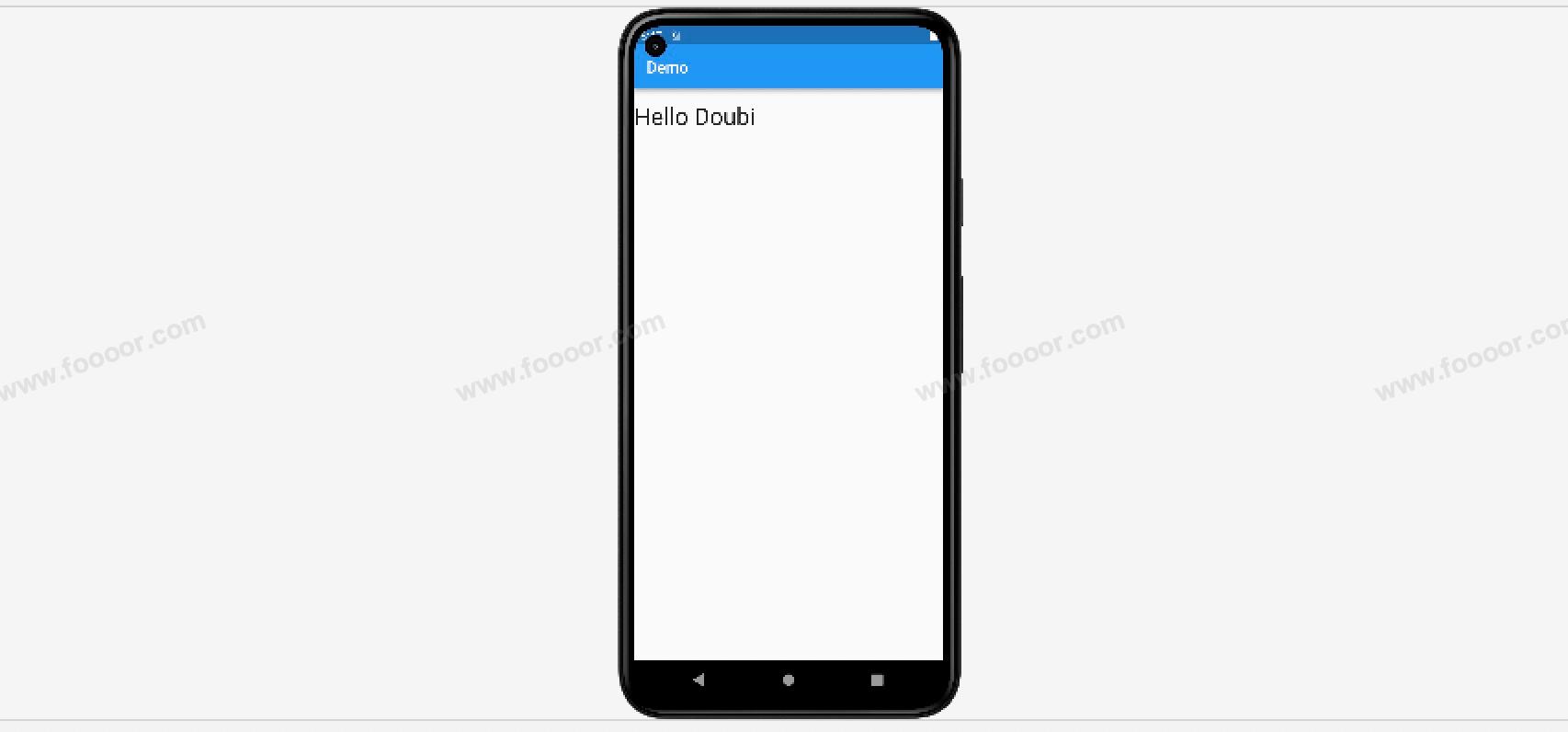
body: const SizedBox(
height: 200, // 设置高度为200
child: Center(
child: Text("Hello Doubi", style: TextStyle(fontSize: 30))
)
)
);
}
}显示如下:
我们还可以通过Center组件的属性 widthFactor 和 heightFactor 来设置Center组件的大小。
| 属性 | 说明 |
|---|---|
| widthFactor | 如果不设置Center的宽度将尽可能大的填充,如果设置widthFactor后,Center的宽度即为子部件的宽度乘以widthFactor的设置值 |
| heightFactor | 如果不设置Center的高度将尽可能大的填充,如果设置heightFactor后,Center的高度即为子部件的宽度乘以heightFactor的设置值 |
举个栗子:
dart
import 'package:flutter/material.dart';

void main() => runApp(const MyApp());

/// App根Widget
class MyApp extends StatelessWidget {
  const MyApp({super.key});

  @override
  Widget build(BuildContext context) {
    return const MaterialApp(
      debugShowCheckedModeBanner: false,
      home: DemoPage(),
    );
  }
}

/// 页面
class DemoPage extends StatelessWidget {
  const DemoPage({super.key});

  @override
  Widget build(BuildContext context) {
    return Scaffold(
        appBar: AppBar(
          title: const Text('Demo'),
        ),
        // ----------------------Center使用演示--------------------------
        body: const Center(
          heightFactor: 2,
          widthFactor: 1,
          child: Text("Hello Doubi", style: TextStyle(fontSize: 30))
        ));
  }
}
在上面的代码中,设置了 Center 组件的 heightFactor 为 2 ,则 Center 组件的高度为 Text 组件的 2倍 ,widthFactor 值为 1,则 Center 组件的宽度和Text 组件的宽度是相同的,所以水平方向 Text 组件肯定就居左显示了。
所以显示效果如下:
4.5 布局组件Padding
在Flutter中,Padding 是一个用于添加内边距(空白间隔)的布局组件,它可以包裹一个子组件,设置子组件与父组件的间隙。
用 Container 组件完全可以实现 Padding 组件的功能,但是 Padding 组件的功能更单一,就是用来做边距的,所以如果只是设置边距的话优先使用 Padding 组件,它的性能要比 Container 组件更好一些。
下面举个栗子,讲解一个Padding组件的使用。
先看一下下面的代码,其实就是类似之前的HelloWorld程序:
dart
import 'package:flutter/material.dart';
void main() => runApp(const MyApp());
/// App根Widget
class MyApp extends StatelessWidget {
const MyApp({super.key});
@override
Widget build(BuildContext context) {
return const MaterialApp(
debugShowCheckedModeBanner: false,
home: DemoPage(),
);
}
}
/// 页面
class DemoPage extends StatelessWidget {
const DemoPage({super.key});
@override
Widget build(BuildContext context) {
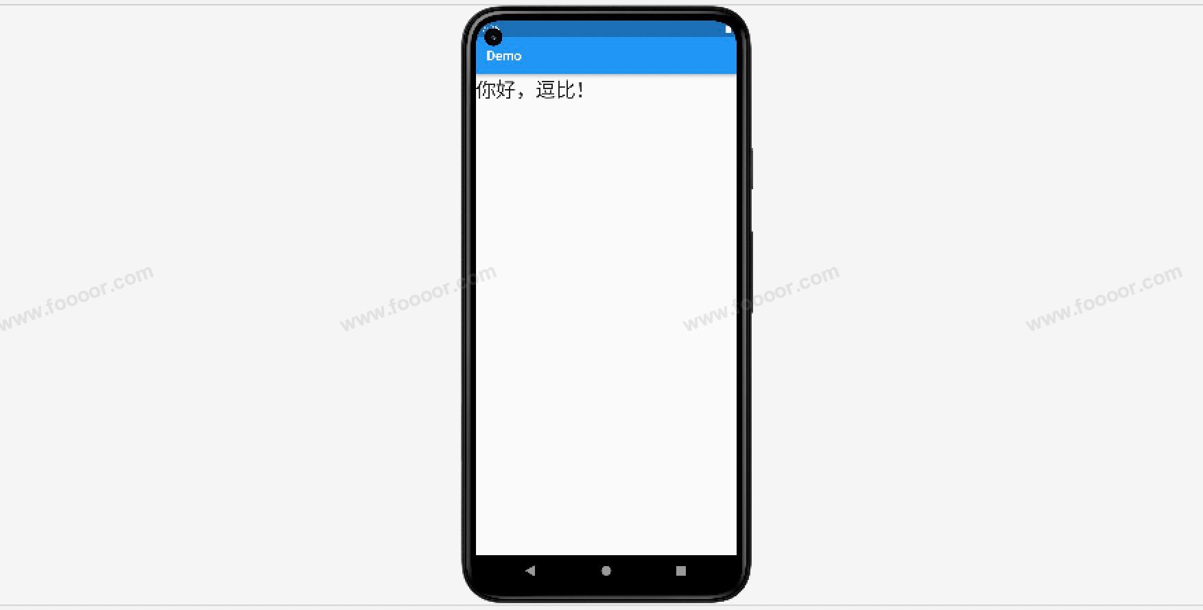
return Scaffold(
appBar: AppBar(
title: const Text('Demo'),
),
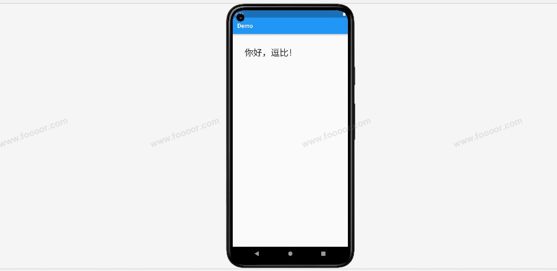
body: const Text("你好,逗比!", style: TextStyle(fontSize: 30),)
);
}
}就是在页面的body部分放了一个文本,灰常的简单,显示效果如下:
如果想调整文本距离边框的距离,那么可以使用Padding组件包括文本,使用Padding组件来设置间距。
修改代码如下:
dart
/// 页面
class DemoPage extends StatelessWidget {
  const DemoPage({super.key});

  @override
  Widget build(BuildContext context) {
    return Scaffold(
        appBar: AppBar(
          title: const Text('Demo'),
        ),
        //------------------ 通过Padding设置Text的边距 ---------------------
        body: const Padding(
          padding: EdgeInsets.all(40),
          child: Text("你好,逗比!", style: TextStyle(fontSize: 30),),
        )
    );
  }
}
使用 Padding 组件包括 Text 组件,然后设置 Padding 组件的 padding 属性即可,EdgeInsets.all(40) 表示设置4个方向的内边距都是40。
显示效果如下: