Appearance
Flutter教程 - 5 页面Scaffold
在之前创建页面的时候,使用的是 Scaffold 创建页面, Scaffold 可以设置标题、body、悬浮按钮,还可以设置tabbar等,下面就围绕 Scaffold ,讲解一下页面相关的设置。
5.1 底部导航栏
先看效果,当点击下面的tabbar的时候,切换显示不同的页面:
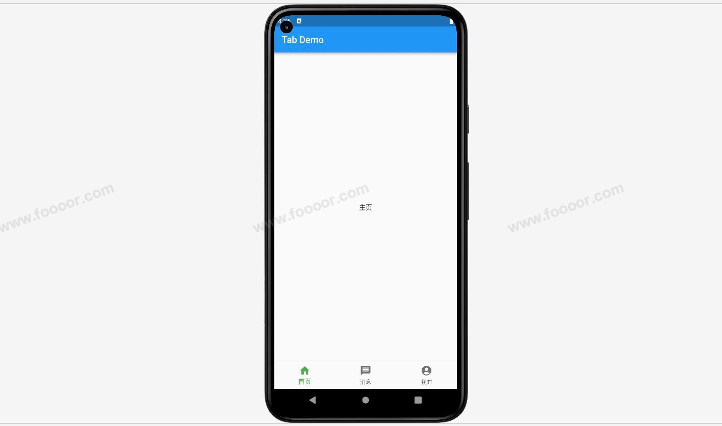
下面开始实现上面的效果。
首先我们需要创建三个tabbar的页面,用于切换的时候显示,这里使用 StatefulWidget 来创建三个页面。
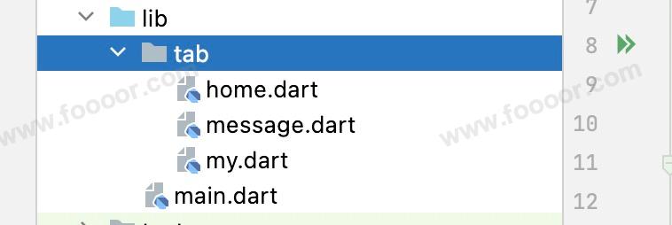
home.dart
dart
import 'package:flutter/material.dart';

/// 主页tab页面
class HomePage extends StatefulWidget {
  const HomePage({Key? key}) : super(key: key);

  @override
  State<HomePage> createState() => _HomePageState();
}

class _HomePageState extends State<HomePage> {
  @override
  Widget build(BuildContext context) {
    return const Center(child: Text("主页"));
  }
}
在 body 部分显示文字,用于区分哪个页面,下面定义的两个页面也是一样的。
message.dart
dart
import 'package:flutter/material.dart';

/// 消息tab页面
class MessagePage extends StatefulWidget {
  const MessagePage({Key? key}) : super(key: key);

  @override
  State<MessagePage> createState() => _MessagePageState();
}

class _MessagePageState extends State<MessagePage> {
  @override
  Widget build(BuildContext context) {
    return const Center(child: Text("消息"));
  }
}
my.dart
dart
import 'package:flutter/material.dart';

/// 我的tab页面
class MyPage extends StatefulWidget {
  const MyPage({Key? key}) : super(key: key);

  @override
  State<MyPage> createState() => _MyPageState();
}

class _MyPageState extends State<MyPage> {
  @override
  Widget build(BuildContext context) {
    return const Center(child: Text("我的"));
  }
}
下面在 main.dart 引入三个页面,然后在点击tabbar的时候切换。
实现代码:
dart
import 'package:flutter/material.dart';

// 1. 首先引入三个页面
import 'tab/home.dart';
import 'tab/message.dart';
import 'tab/my.dart';

void main() => runApp(const MyApp());

/// App根Widget
class MyApp extends StatelessWidget {
  const MyApp({super.key});

  @override
  Widget build(BuildContext context) {
    return const MaterialApp(
      debugShowCheckedModeBanner: false,
      home: MainPage(),
    );
  }
}

class MainPage extends StatefulWidget {
  const MainPage({Key? key}) : super(key: key);

  @override
  State<MainPage> createState() => _MainPageState();
}

class _MainPageState extends State<MainPage> {

  int _currentIndex = 0;

  // 2.创建三个页面
  final List<Widget> _tabPages = const [
    HomePage(),
    MessagePage(),
    MyPage()
  ];

  @override
  Widget build(BuildContext context) {
    return Scaffold(
      appBar: AppBar(
        title: const Text('Tab Demo'),
      ),
      // 3.在这里通过_currentIndex获取指定的page用于显示
      body: _tabPages[_currentIndex],
      // ------------------- 创建tabbar ---------------------
      bottomNavigationBar: BottomNavigationBar(
        currentIndex: _currentIndex,            // 设置当前选中的tab
        fixedColor: Colors.green,               // 设置tab选中的颜色
        iconSize: 25,                           // 设置图标的大小
        type: BottomNavigationBarType.fixed,    // 如果tab大于3个,则需要设置该属性才能显示
        items: const [                          // 设置tabbar按钮
          BottomNavigationBarItem(
              icon: Icon(Icons.home),
              label: "首页"
          ),
          BottomNavigationBarItem(
              icon: Icon(Icons.message),
              label: "消息"
          ),
          BottomNavigationBarItem(
              icon: Icon(Icons.account_circle),
              label: "我的"
          ),
        ],
        onTap: (index) {      // 点击tabbar按钮的时候触发
          // 4.当点击tabbar的时候修改_currentIndex,从而让body部分修改指向的页面,实现切换页面
          setState(() {
            _currentIndex = index;
          });
        },
      ),
    );
  }
}- 首先引入三个页面;
- 创建三个页面;
- 在
body部分,通过_tabPages[_currentIndex]指定显示的页面,然后当点击tabbar的时候,修改_currentIndex的值,实现页面的切换; - 点击tabbar的时候,会触发
onTap方法,传入的参数是当前点击的tabbar的index,将index赋值给_currentIndex,实现页面切换。
5.2 悬浮按钮
在前面Flutter初体验中,实现计数器功能的时候,已经简单使用了悬浮按钮,下面使用悬浮按钮,结合tabbar实现下面的效果。
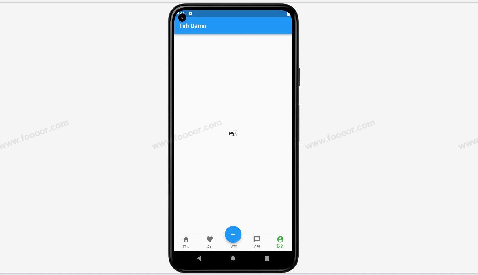
在tabbar中添加了5个按钮,中间的按钮的图标比较大。这个该如何实现呢?
其实这里是使用了悬浮按钮 FloatingActionButton 遮挡了中间的tabbar的按钮而已。
所以这里涉及到一个问题,就是如何设置悬浮按钮 FloatingActionButton 的位置。
下面展示代码实现:
首先定义了5个tabbar按钮对应的页面,在前面tabbar的基础上,再定义两个页面。
focus.dart
dart
import 'package:flutter/material.dart';

/// 主页tab页面
class FocusPage extends StatefulWidget {
  const FocusPage({Key? key}) : super(key: key);

  @override
  State<FocusPage> createState() => _FocusPageState();
}

class _FocusPageState extends State<FocusPage> {
  @override
  Widget build(BuildContext context) {
    return const Center(child: Text("关注"));
  }
}
publish.dart
dart
import 'package:flutter/material.dart';

/// 主页tab页面
class PublishPage extends StatefulWidget {
  const PublishPage({Key? key}) : super(key: key);

  @override
  State<PublishPage> createState() => _PublishPageState();
}

class _PublishPageState extends State<PublishPage> {
  @override
  Widget build(BuildContext context) {
    return const Center(child: Text("发布"));
  }
}
下面主要是tabbar的实现:
dart
import 'package:flutter/material.dart';

// 首先引入页面
import 'tab/home.dart';
import 'tab/message.dart';
import 'tab/my.dart';
import 'tab/focus.dart';
import 'tab/publish.dart';

void main() => runApp(const MyApp());

/// App根Widget
class MyApp extends StatelessWidget {
  const MyApp({super.key});

  @override
  Widget build(BuildContext context) {
    return const MaterialApp(
      debugShowCheckedModeBanner: false,
      home: MainPage(),
    );
  }
}

class MainPage extends StatefulWidget {
  const MainPage({Key? key}) : super(key: key);

  @override
  State<MainPage> createState() => _MainPageState();
}

class _MainPageState extends State<MainPage> {

  int _currentIndex = 0;

  // 创建页面
  final List<Widget> _tabPages = const [
    HomePage(),
    FocusPage(),
    PublishPage(),
    MessagePage(),
    MyPage(),
  ];

  @override
  Widget build(BuildContext context) {
    return Scaffold(
      appBar: AppBar(
        title: const Text('Tab Demo'),
      ),
      // 在这里通过_currentIndex获取指定的page用于显示
      body: _tabPages[_currentIndex],
      // ------------------- 创建tabbar ---------------------
      bottomNavigationBar: BottomNavigationBar(
        currentIndex: _currentIndex,            // 设置当前选中的tab
        fixedColor: Colors.green,               // 设置tab选中的颜色
        iconSize: 25,                           // 设置图标的大小
        type: BottomNavigationBarType.fixed,    // 如果tab大于3个,则需要设置该属性才能显示
        items: const [                          // 设置tabbar的5个按钮
          BottomNavigationBarItem(
              icon: Icon(Icons.home),
              label: "首页"
          ),
          BottomNavigationBarItem(
              icon: Icon(Icons.favorite),
              label: "关注"
          ),
          BottomNavigationBarItem(
              icon: Icon(Icons.add),
              label: "发布"
          ),
          BottomNavigationBarItem(
              icon: Icon(Icons.message),
              label: "消息"
          ),
          BottomNavigationBarItem(
              icon: Icon(Icons.account_circle),
              label: "我的"
          ),
        ],
        onTap: (index) {      // 点击tabbar按钮的时候触发
          // 当点击tabbar的时候修改_currentIndex,从而让body部分修改指向的页面,实现切换页面
          setState(() {
            _currentIndex = index;
          });
        }
      ),
      floatingActionButton: Container(      // 这里使用Container包裹,是为了调整FloatingActionButton的大小和微调一下按钮位置
        height: 60,
        width: 60,
        padding: const EdgeInsets.all(2),
        margin: const EdgeInsets.only(top:6),
        decoration: BoxDecoration(
            color: Colors.white,
            borderRadius: BorderRadius.circular(30)
        ),
        child: FloatingActionButton(
          backgroundColor: _currentIndex == 2 ? Colors.green : Colors.blue, // 这里主要是设置中间按钮的颜色,当选中了tabbar中间的按钮的时候,则将悬浮按钮的颜色改为绿色
          onPressed: () {
            // 当点击悬浮按钮的时候,选中发布页面
            setState(() {
              _currentIndex = 2;
            });
          },
          child: const Icon(Icons.add),
        ),
      ),
      floatingActionButtonLocation: FloatingActionButtonLocation.centerDocked,  // 设置悬浮按钮的位置
    );
  }
}
这里有几个关键的点:
- 首先设置tabbar的5个按钮和对应的页面;
- 使用
floatingActionButton属性设置悬浮按钮,因为floatingActionButton没有属性设置大小,所以使用Container包裹floatingActionButton,用于设置悬浮按钮的大小,同时使用margin属性微调一下悬浮按钮的位置; - 设置悬浮按钮的位置,主要通过
floatingActionButtonLocation属性来设置,可以设置居上、居中还是居右; - 还有一个点就是点击了悬浮按钮的时候,要修改
_currentIndex,这样才能实现页面的切换,另外在设置悬浮按钮颜色的时候,也是通过_currentIndex属性来判断的,如果当前点击的是中间的按钮,则将按钮设置为红色。
悬浮按钮 FloatingActionButton 还有一些属性,需要的时候可以查阅一下:
| 属性 | 类型 | 作用 |
|---|---|---|
| child | Widget | 在按钮上显示的子组件,通常是一个 Icon。 |
| tooltip | String | 长按按钮时显示的提示文本。 |
| backgroundColor | Color | 按钮的背景颜色。 |
| foregroundColor | Color | 按钮的前景颜色,通常用于子组件的颜色。 |
| elevation | double | 按钮的阴影深度。 |
| highlightElevation | double | 按钮被按下时的阴影深度。 |
| disabledElevation | double | 按钮被禁用时的阴影深度。 |
| onPressed | VoidCallback | 按钮被点击时触发的回调函数。 |
| mini | bool | 是否显示小型的浮动操作按钮。 |
| shape | ShapeBorder | 按钮的形状,可以是圆形或自定义形状。 |
| clipBehavior | Clip | 裁剪行为,控制按钮的子组件是否被裁剪到按钮的边界内。 |
| focusColor | Color | 按钮获取焦点时的颜色。 |
| hoverColor | Color | 鼠标悬停在按钮上时的颜色。 |
| focusElevation | double | 按钮获取焦点时的阴影深度。 |
| hoverElevation | double | 鼠标悬停在按钮上时的阴影深度。 |
| splashColor | Color | 点击按钮时溅出的颜色。 |
| focusNode | FocusNode | 用于控制按钮的焦点状态。 |
| autofocus | bool | 是否自动获取焦点。 |
5.3 收缩侧边栏
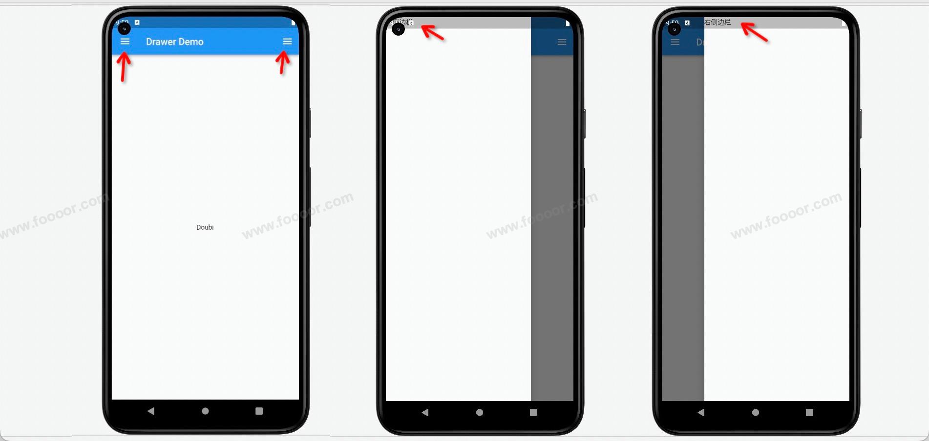
在实际开发的过程中,我们经常会使用到可以展开和隐藏的侧边栏,在 Scaffffold 组件里,可以通过 drawer 参数可以定义左侧边栏,通过 endDrawer 可以定义右侧边栏。侧边栏默认是隐藏的,我们可以通过手指滑动显示侧边栏,也可以通过点击按钮显示侧边栏。
1 实现侧边栏
下面展示一下侧边栏的实现。
实现代码:
dart
import 'package:flutter/material.dart';

void main() => runApp(const MyApp());

/// App根Widget
class MyApp extends StatelessWidget {
  const MyApp({super.key});

  @override
  Widget build(BuildContext context) {
    return const MaterialApp(
      debugShowCheckedModeBanner: false,
      home: MainPage(),
    );
  }
}

class MainPage extends StatefulWidget {
  const MainPage({Key? key}) : super(key: key);

  @override
  State<MainPage> createState() => _MainPageState();
}

class _MainPageState extends State<MainPage> {

  @override
  Widget build(BuildContext context) {
    return Scaffold(
      appBar: AppBar(
        title: const Text('Drawer Demo'),
      ),
      body: const Center(
          child: Text("Doubi")
      ),
      // ------------添加左侧边栏---------------
      drawer: const Drawer(
        child: Text('左侧边栏'),
      ),
      // ------------添加右侧边栏---------------
      endDrawer: const Drawer(
        child: Text('右侧边栏')
      )
    );
  }
}
只需要在 Scaffold 中添加 drawer 属性,就可以添加左侧边栏,添加 endDrawer 就可以添加右侧边栏。
添加了 drawer 和 endDrawer 属性后,导航栏会显示打开侧边栏的按钮,点击按钮就可以显示侧边栏,通过在屏幕边缘滑动屏幕也可以显示侧边栏。
实现效果:
如果想在侧边栏布局,只需要在 Drawer 组件的 child 属性中进行布局即可。
2 UserAccountsDrawerHeader
Flutter 也提供了内置的侧边栏布局的组件,例如 UserAccountsDrawerHeader ,下面展示一下 UserAccountsDrawerHeader 的使用。
先看布局效果:
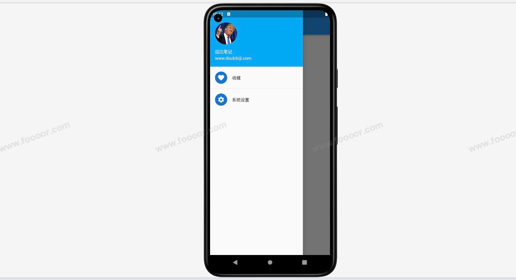
UserAccountsDrawerHeader 只是侧边栏上面的部分,下面的 收藏 和 系统设置选项是另外的布局。
实现代码:
dart
import 'package:flutter/material.dart';

void main() => runApp(const MyApp());

/// App根Widget
class MyApp extends StatelessWidget {
  const MyApp({super.key});

  @override
  Widget build(BuildContext context) {
    return const MaterialApp(
      debugShowCheckedModeBanner: false,
      home: MainPage(),
    );
  }
}

class MainPage extends StatefulWidget {
  const MainPage({Key? key}) : super(key: key);

  @override
  State<MainPage> createState() => _MainPageState();
}

class _MainPageState extends State<MainPage> {
  @override
  Widget build(BuildContext context) {
    return Scaffold(
        appBar: AppBar(
          title: const Text('Drawer Demo'),
        ),
        body: const Center(child: Text("Doubi")),
        // ------------添加左侧边栏---------------
        drawer: Drawer(
            child: Column(
          children: const [
            // ------------UserAccountsDrawerHeader 的使用---------------
            UserAccountsDrawerHeader(
              accountName: Text("逗比笔记"),
              accountEmail: Text("www.doubibiji.com"),
              currentAccountPicture: CircleAvatar(    // 设置一个圆形的头像
                backgroundImage:
                    NetworkImage("http://doubibiji.com/open-assets/img/telangpu.jpg"),
              ),
              decoration: BoxDecoration(    // 设置背景,也可以设置背景图片
                  color: Colors.lightBlue
              ),
            ),

            // ------------继续添加两个选项---------------
            ListTile(
              title: Text("收藏"),
              leading: CircleAvatar(child: Icon(Icons.favorite)),
            ),
            Divider(),
            ListTile(
              title: Text("系统设置"),
              leading: CircleAvatar(child: Icon(Icons.settings)),
            )
          ],
        )));
  }
}
通过上面的代码,可以看到 UserAccountsDrawerHeader 提供了设置账号、邮箱、头像、背景等属性,可以根据需要进行设置。
下表列出了 UserAccountsDrawerHeader 组件的常用属性以及它们的作用:
| 属性 | 类型 | 作用 |
|---|---|---|
| currentAccountPicture | Widget | 当前用户的头像或图片。 |
| otherAccountsPictures | List<Widget> | 其他用户的头像或图片。 |
| accountName | Widget | 当前用户的名称或标题。 |
| accountEmail | Widget | 当前用户的电子邮件地址。 |
| onDetailsPressed | VoidCallback? | 当用户详细信息被点击时触发的回调函数。 |
| arrowColor | Color | 右侧箭头的颜色。 |
| margin | EdgeInsetsGeometry? | 组件的外边距。 |
| decoration | Decoration? | 组件的装饰样式,例如背景、阴影等。 |
请注意,这里没有使用 将属性名括起来,这样可能会使属性与普通文本混淆。在实际编程和文档编写中,使用 来标识属性名是一种更为清晰和规范的做法。
3 DrawerHeader
如果 UserAccountsDrawerHeader 不满足自己的需求,可以自己进行自己的布局。
在进行自己布局的时候,我们还可以借助一个 DrawerHeader 组件,DrawerHeader 是 Flutter 中的一个组件,用于在侧边抽屉(Drawer)中创建一个头部区域。DrawerHeader 组件通常作为 Drawer 组件的子组件之一,用于增加抽屉的内容和样式。
举个栗子:
dart
import 'package:flutter/material.dart';

void main() => runApp(const MyApp());

/// App根Widget
class MyApp extends StatelessWidget {
  const MyApp({super.key});

  @override
  Widget build(BuildContext context) {
    return const MaterialApp(
      debugShowCheckedModeBanner: false,
      home: MainPage(),
    );
  }
}

class MainPage extends StatefulWidget {
  const MainPage({Key? key}) : super(key: key);

  @override
  State<MainPage> createState() => _MainPageState();
}

class _MainPageState extends State<MainPage> {
  @override
  Widget build(BuildContext context) {
    return Scaffold(
        appBar: AppBar(
          title: const Text('Drawer Demo'),
        ),
        body: const Center(child: Text("Doubi")),
        // ------------添加左侧边栏---------------
        drawer: Drawer(
            child: Column(
          children: [
            // ------------DrawerHeader 的使用---------------
            DrawerHeader(
              decoration: const BoxDecoration(
                  color: Colors.blue,			// 设置背景颜色
              ),
              child: SizedBox(
                width: double.infinity,
                child: Column(
                  children: [
                    Text('我是一个头部')
                  ],
                ),
              )
            ),

            // ------------继续添加两个选项---------------
            const ListTile(
              title: Text("收藏"),
              leading: CircleAvatar(child: Icon(Icons.favorite)),
            ),
            const Divider(),
            const ListTile(
              title: Text("系统设置"),
              leading: CircleAvatar(child: Icon(Icons.settings)),
            )
          ],
        )
        )
    );
  }
}
显示效果:
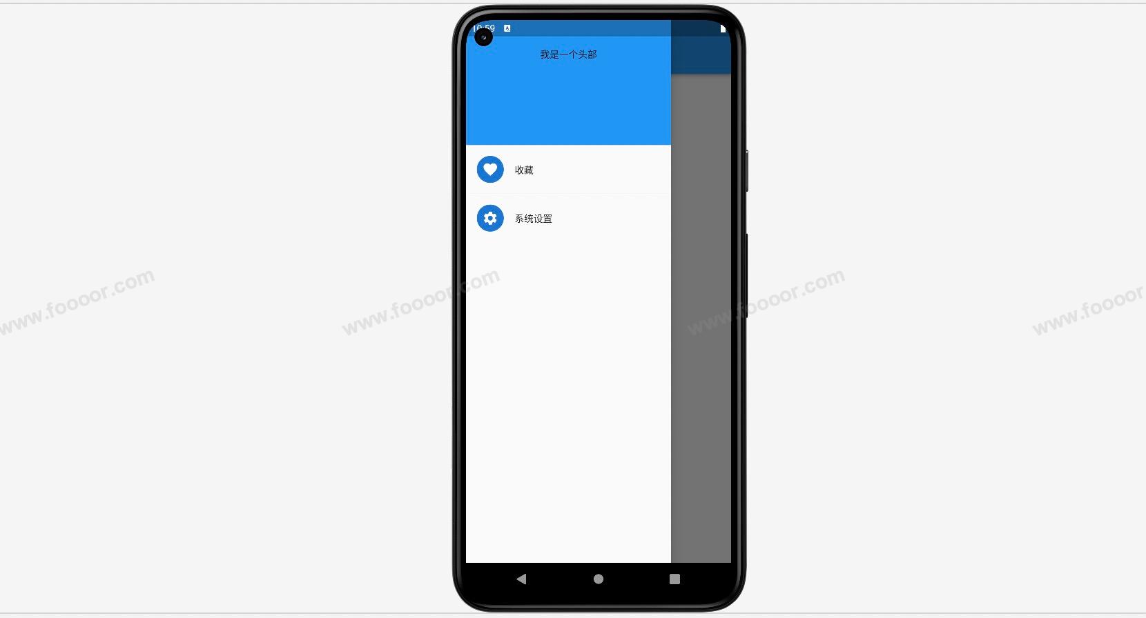
可以在 DrawerHeader 中进行自己的布局,如果 DrawerHeader 满足不了需求,那就自己进行布局吧。
5.4 标题栏AppBar
前面已经使用了标题栏,下面介绍一下其他的设置。
先看效果:
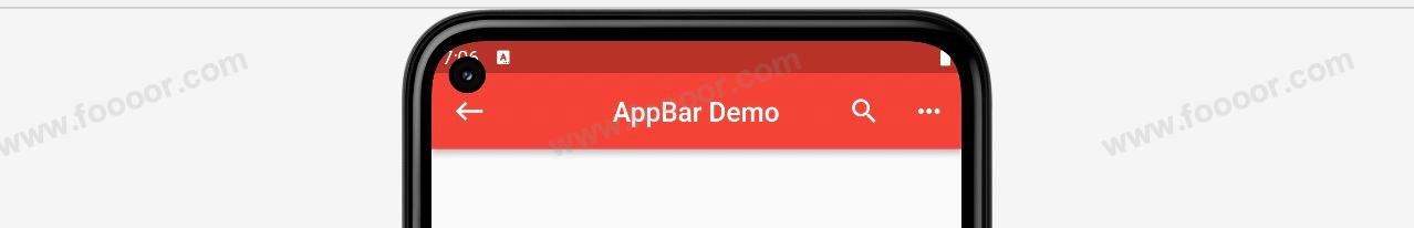
可以修改左右侧的按钮,标题栏颜色,标题居中等。
代码如下:
dart
import 'package:flutter/material.dart';

void main() => runApp(const MyApp());

/// App根Widget
class MyApp extends StatelessWidget {
  const MyApp({super.key});

  @override
  Widget build(BuildContext context) {
    return const MaterialApp(
      debugShowCheckedModeBanner: false,
      home: MainPage(),
    );
  }
}

class MainPage extends StatefulWidget {
  const MainPage({Key? key}) : super(key: key);

  @override
  State<MainPage> createState() => _MainPageState();
}

class _MainPageState extends State<MainPage> {
  @override
  Widget build(BuildContext context) {
    return Scaffold(
        appBar: AppBar(
          title: const Text('Drawer Demo'),     // 标题
          centerTitle: true,                    // 标题居中
          backgroundColor:Colors.red,           // 背景颜色
          leading:IconButton(                   // 左侧按钮
              icon: const Icon(Icons.west),
              onPressed: (){
                print('点击左侧按钮');
              }),
          actions: [                            // 右侧按钮,可以有多个
          IconButton(
              icon: const Icon(Icons.search),
              onPressed: () {
                print('点击了搜索按钮');
              }),
          IconButton(
              icon: const Icon(Icons.more_horiz),
                  onPressed: (){
                  print('点击了更多按钮');
                })
            ],
        ),
        body: const Center(child: Text("Doubi")),
    );
  }
}
下表列出了 AppBar 组件的常用属性以及它们的作用:
| 属性 | 类型 | 作用 |
|---|---|---|
| leading | Widget? | 在标题前面显示的小部件,通常是一个返回按钮或菜单图标。 |
| automaticallyImplyLeading | bool | 控制是否自动显示默认的返回按钮(true 为自动显示)。 |
| title | Widget? | 标题部分显示的小部件,通常是一个 Text 或 Image。 |
| actions | List<Widget>? | 在标题后面显示的小部件列表,通常是一些操作按钮。 |
| flexibleSpace | Widget? | 可伸缩的空间,通常用于添加一些背景图像或效果。 |
| bottom | PreferredSizeWidget? | 在标题下面显示的小部件,通常是一个选项卡栏或按钮组。 |
| elevation | double | AppBar 的阴影深度。 |
| backgroundColor | Color? | AppBar 的背景颜色。 |
| brightness | Brightness | 控制 AppBar 文字和图标的颜色主题。 |
| iconTheme | IconThemeData | 控制 AppBar 内部图标的颜色和大小。 |
| textTheme | TextTheme? | 控制 AppBar 内部文本的样式。 |
| centerTitle | bool | 标题是否居中显示。 |
| titleSpacing | double? | 标题左右两侧的空间。 |
| toolbarOpacity | double | 工具栏部分的透明度。 |
| bottomOpacity | double | 底部部分的透明度。 |
在 AppBar下是可以通过 bottom 属性添加 tabbar 的。
举个栗子:
在上面的实现中,可以点击标签进行切换,也可以滑动进行切换。
下面看一下实现代码,这个实现的逻辑要比之前组件的实现的稍微复杂一些。
dart
import 'package:flutter/material.dart';
void main() => runApp(const MyApp());
/// App根Widget
class MyApp extends StatelessWidget {
const MyApp({super.key});
@override
Widget build(BuildContext context) {
return const MaterialApp(
debugShowCheckedModeBanner: false,
home: MainPage(),
);
}
}
class MainPage extends StatefulWidget {
const MainPage({Key? key}) : super(key: key);
@override
State<MainPage> createState() => _MainPageState();
}
// 1.首先需要混入SingleTickerProviderStateMixin
class _MainPageState extends State<MainPage>
with SingleTickerProviderStateMixin {
// 2.定义TabController
late TabController _tabController;
// 生命周期函数,当组件初始化的时候会被调用
@override
void initState() {
super.initState();
// 3.初始化TabController,其中第一个参数表示的tabbar的个数
_tabController = TabController(length: 5, vsync: this);
_tabController.addListener(() {
// 监听当前选中的哪个标签页
if (_tabController.animation!.value == _tabController.index) {
print("选中标签页:${_tabController.index}"); //获取点击或滑动页面的索引值
}
});
}
@override
Widget build(BuildContext context) {
return Scaffold(
appBar: AppBar(
title: const Text('TabBar Demo'),
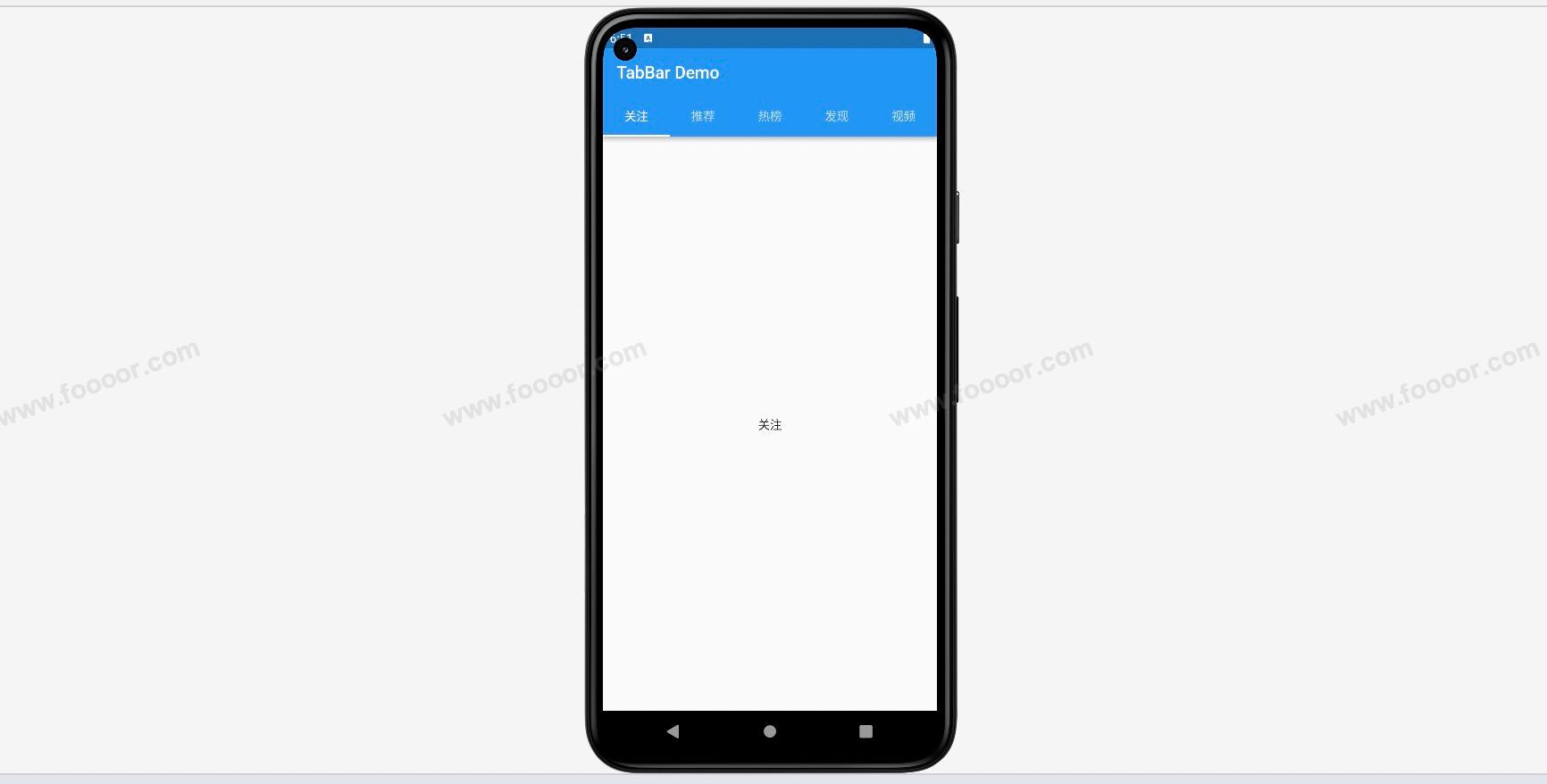
// 4.通过AppBar的bottom设置TabBar
bottom: TabBar(
controller: _tabController, // 设置tabController
tabs: const [ // 设置tabbar的各个标签
Tab(child: Text("关注")),
Tab(child: Text("推荐")),
Tab(child: Text("热榜")),
Tab(child: Text("发现")),
Tab(child: Text("视频"))
],
),
),
// 5.设置TabBarView
body: TabBarView(
controller: _tabController, // 设置tabController
children: const [ // 当切换tabbar的标签时,会切换TabBarView中的各个组件
Center(child: Text("关注")),
Center(child: Text("推荐")),
Center(child: Text("热榜")),
Center(child: Text("发现")),
Center(child: Text("视频"))
],
));
}
}- 首先需要在
State类上混入SingleTickerProviderStateMixin; - 需要定义属性
tabController,并在生命周期函数中初始化tabController; - 在
AppBar的bottom属性中定义TabBar,同时传入tabController和 各个标签页; - 在
body中使用TabBarView组件定义切换的组件,当切换TabBar的时候,会根据index切换TabBarView子组件中的组件。
TabBar有很多样式可以调整,下表列出了 TabBar 组件的常用属性以及它们的作用:
| 属性 | 类型 | 作用 |
|---|---|---|
| controller | TabController? | 控制选项卡的状态和交互。 |
| tabs | List<Widget> | 选项卡的列表,通常是一组 Tab 小部件。 |
| isScrollable | bool | 是否允许选项卡可以滚动。 |
| indicatorColor | Color? | 选中选项卡下方指示器的颜色。 |
| indicatorWeight | double | 选中选项卡下方指示器的高度。 |
| indicatorPadding | EdgeInsetsGeometry | 选中选项卡下方指示器的内边距。 |
| indicator | Decoration? | 选中选项卡下方指示器的装饰样式。 |
| indicatorSize | TabBarIndicatorSize | 选中选项卡下方指示器的尺寸。 |
| labelColor | Color? | 选中选项卡文本的颜色。 |
| unselectedLabelColor | Color? | 未选中选项卡文本的颜色。 |
| labelStyle | TextStyle? | 选中选项卡文本的样式。 |
| unselectedLabelStyle | TextStyle? | 未选中选项卡文本的样式。 |
下面简单演示一下:
dart
TabBar(
  controller: _tabController,   // 设置tabController
  indicatorColor: Colors.red,   // 设置指示器的颜色
  indicatorWeight: 4,           // 设置指示器的高度
  labelColor: Colors.white,     // 标签的文字颜色
  indicatorPadding: const EdgeInsets.fromLTRB(0, 5, 0, 5),    // 设置指示器的边距
  indicatorSize: TabBarIndicatorSize.label,                 	// 设置指示器的宽度和标签一一样宽
  tabs: const [                 // 设置tabbar的各个标签
    Tab(child: Text("关注")),
    Tab(child: Text("推荐")),
    Tab(child: Text("热榜")),
    Tab(child: Text("发现")),
    Tab(child: Text("视频"))
  ],
)
显示效果:
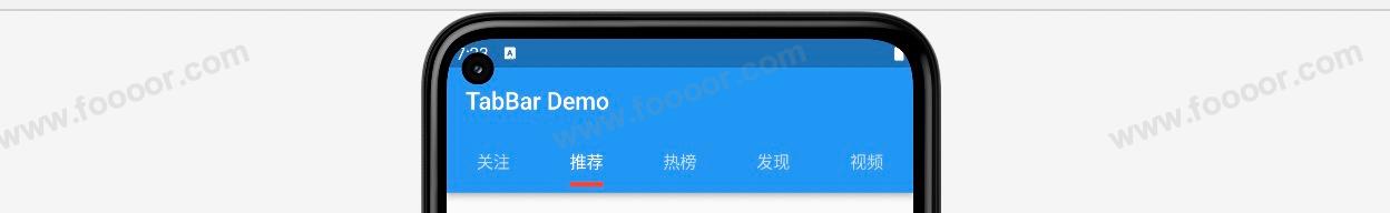
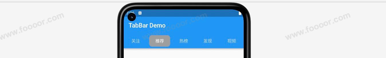
也可以直接通过 indicator 设置指示器的样式,举个栗子:
dart
TabBar(
  controller: _tabController,   // 设置tabController
  labelColor: Colors.white,     // 标签的文字颜色
  indicatorPadding: const EdgeInsets.all(5),    // 设置指示器的边距
  indicator: BoxDecoration(       							// 设置指示器的样式
    color: Colors.grey,
    borderRadius: BorderRadius.circular(10)
  ),
  tabs: const [                 // 设置tabbar的各个标签
    Tab(child: Text("关注")),
    Tab(child: Text("推荐")),
    Tab(child: Text("热榜")),
    Tab(child: Text("发现")),
    Tab(child: Text("视频"))
  ],
),
显示效果:
5.5 BottomNavigationBar结合TabBar
如果我们的页面底部是 BottomNavigationBar ,然后在一个页面中使用 TabBar,该如何实现呢?
效果如下:
选中首页的时候,顶部有 TabBar,选择消息的时候,没有 TabBar。
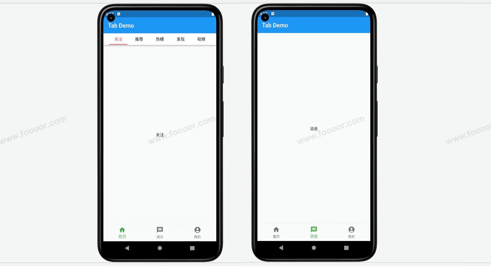
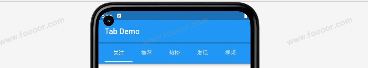
这里实现的思路是很简单的,在之前实现底部导航栏的基础上,在首页添加标题栏 AppBar,在 AppBar 的基础上添加TabBar即可。
这里有一个点就是:在 Scaffold 中是可以嵌套 Scaffold 的。所以本身 Main 页面已经是一个 Scaffold 了,还需要在首页的页面使用 Scaffold 。
代码如下:
main.dart还是之前实现地图导航栏时候的文件
dart
import 'package:flutter/material.dart';

// 1. 首先引入三个页面
import 'tab/home.dart';
import 'tab/message.dart';
import 'tab/my.dart';

void main() => runApp(const MyApp());

/// App根Widget
class MyApp extends StatelessWidget {
  const MyApp({super.key});

  @override
  Widget build(BuildContext context) {
    return const MaterialApp(
      debugShowCheckedModeBanner: false,
      home: MainPage(),
    );
  }
}

class MainPage extends StatefulWidget {
  const MainPage({Key? key}) : super(key: key);

  @override
  State<MainPage> createState() => _MainPageState();
}

class _MainPageState extends State<MainPage> {

  int _currentIndex = 0;

  // 2.创建三个页面
  final List<Widget> _tabPages = const [
    HomePage(),
    MessagePage(),
    MyPage()
  ];

  @override
  Widget build(BuildContext context) {
    return Scaffold(
      appBar: AppBar(
        title: const Text('Tab Demo'),
      ),
      // 3.在这里通过_currentIndex获取指定的page用于显示
      body: _tabPages[_currentIndex],
      // ------------------- 创建tabbar ---------------------
      bottomNavigationBar: BottomNavigationBar(
        currentIndex: _currentIndex,            // 设置当前选中的tab
        fixedColor: Colors.green,               // 设置tab选中的颜色
        iconSize: 25,                           // 设置图标的大小
        type: BottomNavigationBarType.fixed,    // 如果tab大于3个,则需要设置该属性才能显示
        items: const [                          // 设置tabbar按钮
          BottomNavigationBarItem(
              icon: Icon(Icons.home),
              label: "首页"
          ),
          BottomNavigationBarItem(
              icon: Icon(Icons.message),
              label: "消息"
          ),
          BottomNavigationBarItem(
              icon: Icon(Icons.account_circle),
              label: "我的"
          ),
        ],
        onTap: (index) {      // 点击tabbar按钮的时候触发
          // 4.当点击tabbar的时候修改_currentIndex,从而让body部分修改指向的页面,实现切换页面
          setState(() {
            _currentIndex = index;
          });
        },
      ),
    );
  }
}
然后修改 HomePage ,在 HomePage 中添加 AppBar,在 AppBar 的 bottom 中添加 TabBar。
home.dart,代码基本上是上一节的代码。
dart
import 'package:flutter/material.dart';

/// 主页tab页面
class HomePage extends StatefulWidget {
  const HomePage({Key? key}) : super(key: key);

  @override
  State<HomePage> createState() => _HomePageState();
}

class _HomePageState extends State<HomePage> with SingleTickerProviderStateMixin {

  // 2.定义TabController
  late TabController _tabController;

  // 生命周期函数,当组件初始化的时候会被调用
  @override
  void initState() {
    super.initState();

    // 3.初始化TabController,其中第一个参数表示的tabbar的个数
    _tabController = TabController(length: 5, vsync: this);
    _tabController.addListener(() {
      // 监听当前选中的哪个标签页
      if (_tabController.animation!.value == _tabController.index) {
        print("选中标签页:${_tabController.index}"); //获取点击或滑动页面的索引值
      }
    });
  }


  @override
  Widget build(BuildContext context) {
    return Scaffold(
        appBar: AppBar(
          title: const Text("Home"),
          bottom: TabBar(
            controller: _tabController,   // 设置tabController
            tabs: const [                 // 设置tabbar的各个标签
              Tab(child: Text("关注")),
              Tab(child: Text("推荐")),
              Tab(child: Text("热榜")),
              Tab(child: Text("发现")),
              Tab(child: Text("视频"))
            ],
          ),
        ),
        // 5.设置TabBarView
        body: TabBarView(
          controller: _tabController,     // 设置tabController
          children: const [               // 当切换tabbar的标签时,会切换TabBarView中的各个组件
            Center(child: Text("关注")),
            Center(child: Text("推荐")),
            Center(child: Text("热榜")),
            Center(child: Text("发现")),
            Center(child: Text("视频"))
          ],
        ));
  }
}
显示效果:
好像有不干净的东西进眼睛里了,两个标题栏是什么鬼?
其实 title 是一个组件,我们可以将 TabBar 设置到 title 的位置。
dart
appBar: AppBar(
  title: TabBar(
    controller: _tabController,   // 设置tabController
    tabs: const [                 // 设置tabbar的各个标签
      Tab(child: Text("关注")),
      Tab(child: Text("推荐")),
      Tab(child: Text("热榜")),
      Tab(child: Text("发现")),
      Tab(child: Text("视频"))
    ],
  ),
),
显示效果:
效果差不多,演示有点丑,调整一下样式。
dart
import 'package:flutter/material.dart';
/// 主页tab页面
class HomePage extends StatefulWidget {
const HomePage({Key? key}) : super(key: key);
@override
State<HomePage> createState() => _HomePageState();
}
class _HomePageState extends State<HomePage> with SingleTickerProviderStateMixin {
// 2.定义TabController
late TabController _tabController;
// 生命周期函数,当组件初始化的时候会被调用
@override
void initState() {
super.initState();
// 3.初始化TabController,其中第一个参数表示的tabbar的个数
_tabController = TabController(length: 5, vsync: this);
_tabController.addListener(() {
// 监听当前选中的哪个标签页
if (_tabController.animation!.value == _tabController.index) {
print("选中标签页:${_tabController.index}"); //获取点击或滑动页面的索引值
}
});
}
@override
Widget build(BuildContext context) {
return Scaffold(
appBar: AppBar(
toolbarHeight: 40, // 修改标题栏高度
backgroundColor: Colors.white, // 设置背景颜色为白色
title: TabBar(
indicatorColor: Colors.red, // 指示器的颜色
labelColor: Colors.red, // 标签的文字颜色
indicatorPadding: const EdgeInsets.all(5), // 设置指示器的边距
indicatorSize: TabBarIndicatorSize.label, // 设置指示器的宽度
unselectedLabelColor: Colors.black, // 未选中标签的颜色
controller: _tabController, // 设置tabController
tabs: const [ // 设置tabbar的各个标签
Tab(child: Text("关注")),
Tab(child: Text("推荐")),
Tab(child: Text("热榜")),
Tab(child: Text("发现")),
Tab(child: Text("视频"))
],
),
),
// 5.设置TabBarView
body: TabBarView(
controller: _tabController, // 设置tabController
children: const [ // 当切换tabbar的标签时,会切换TabBarView中的各个组件
Center(child: Text("关注")),
Center(child: Text("推荐")),
Center(child: Text("热榜")),
Center(child: Text("发现")),
Center(child: Text("视频"))
],
));
}
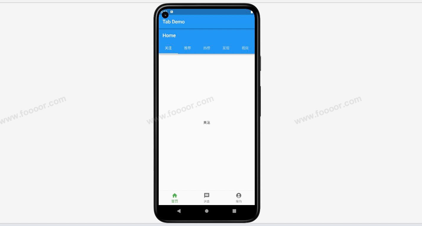
}调整了一下标题栏 和 tabbar 的样式,显示效果如下:

已经差不多了,如果需要再调整一下样式,例如将最上面的标题栏的阴影去掉,可以在 main.dart 中的 AppBar 中添加属性 elevation: 0。这里就不演示了。
5.6 缓存页面
接下来还是在之前实现底部导航栏的基础上,重新修改首页的代码。
如下:
home.dart
dart
import 'package:flutter/material.dart';

/// 主页tab页面
class HomePage extends StatefulWidget {
  const HomePage({Key? key}) : super(key: key);

  @override
  State<HomePage> createState() => _HomePageState();
}

class _HomePageState extends State<HomePage> {

  int _count = 0;

  @override
  Widget build(BuildContext context) {
    return Center(
      //--------------添加一个计数器,点击按钮的时候----------------
      child: Column(
          children: [
            const SizedBox(height: 50),
            Text("$_count", style: const TextStyle(fontSize: 30)),
            const SizedBox(height: 50),
            ElevatedButton(onPressed: () {
              setState(() {
                _count++;
              });
            }, child: const Text("按钮")),
          ]
      ),
    );
  }
}
显示效果如下:
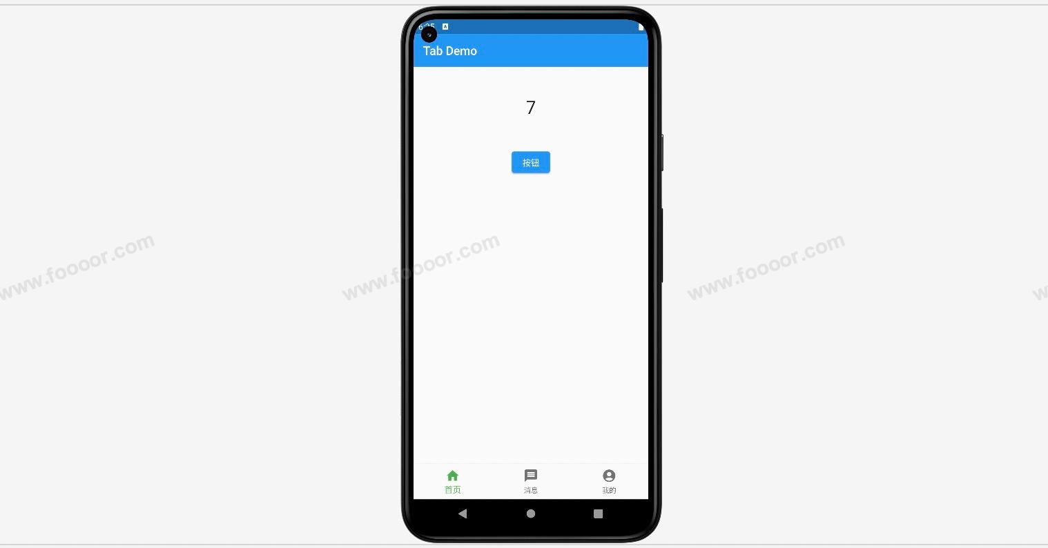
没毛病。
每次点击按钮的时候,数字会加一,但是当切换到消息页面的时候,重新切换回首页的时候,之前增加的数字消失了。
没办法保存状态。
5.7 全局修改标题栏样式
在前面我们针对标题栏进行了一些设置,但是如果针对每个页面的标题栏都进行设置,例如居中设置,那也太麻烦了。、
所以我们可以在 MaterialApp 中通过 theme 来设置。
dart
return MaterialApp(
  debugShowCheckedModeBanner: false,
  theme: ThemeData(
    	// ---- 全局设置标题栏样式
      appBarTheme: const AppBarTheme(
          color: Colors.blue, 				// 设置标题栏的背景颜色
          elevation: 4, 							// 设置标题栏的阴影
          centerTitle: true,
          titleTextStyle: TextStyle(
            color: Colors.white, 			// 设置标题文字颜色
            fontSize: 20, 						// 设置标题文字大小
            fontWeight: FontWeight.bold, // 设置标题文字的粗细
          ))),
  home: const MainPage(),
);