Appearance
Flutter教程 - 4 组件
4.6 图片组件Image
Image 组件是 Flutter 中用于显示图像的部件,它可以显示网络图像、本地资源图像或者内存中的图像。
1 加载网络图片
dart
import 'package:flutter/material.dart';
void main() => runApp(const MyApp());
/// App根Widget
class MyApp extends StatelessWidget {
const MyApp({super.key});
@override
Widget build(BuildContext context) {
return const MaterialApp(
debugShowCheckedModeBanner: false,
home: DemoPage(),
);
}
}
/// 页面
class DemoPage extends StatelessWidget {
const DemoPage({super.key});
@override
Widget build(BuildContext context) {
return Scaffold(
appBar: AppBar(
title: const Text('Demo'),
),
body: Center(
child: Container(
width: 300,
height: 300,
decoration: const BoxDecoration(
color: Colors.lightBlue, // 设置背景颜色
),
// --------------------- 下面是加载图片 -----------------------------
child: Image.network(
"http://doubibiji.com/open-assets/img/telangpu2.jpg",
),
),
));
}
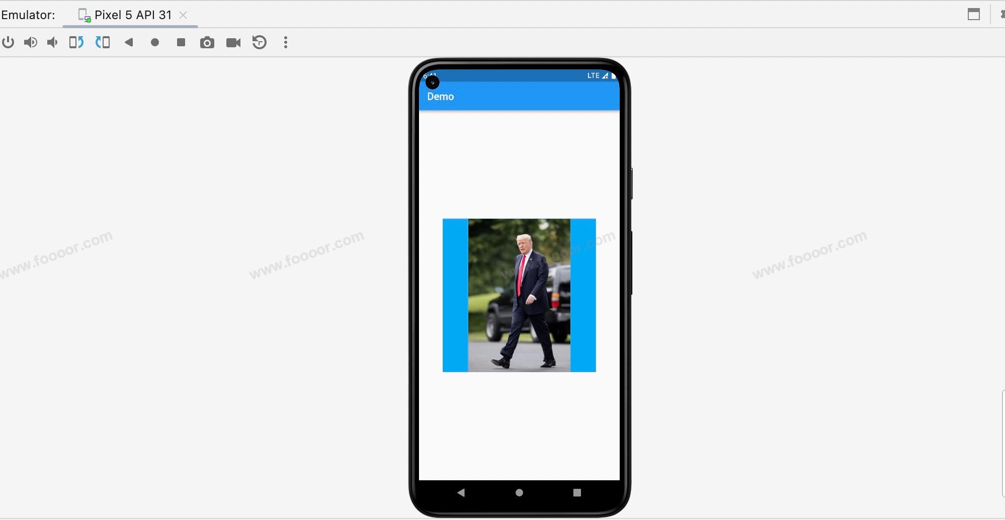
}在上面的代码中,我们在一个 Container 中添加了一个 Image 组件(通过命名构造函数 Image.network 创建),传递了图片的地址。
显示效果如下:
2 图片常用设置
一般情况下我们会设置图片适配的模式,例如保持图片比例不变,让长和宽都扩展到边缘,可以通过 fit 参数设置。
代码如下:
dart
Image.network(
  "http://doubibiji.com/open-assets/img/telangpu2.jpg",     // 设置背景颜色
  fit: BoxFit.cover,                                        // 设置图片显示的适配模式
)
显示效果如下:

fit 是一个枚举值,最常用的就是 BoxFit.cover,还有一些值如下:
| 枚举值 | 效果 |
|---|---|
| BoxFit.cover | 将长和宽铺满整个容器,多出去的部分被裁掉 |
| BoxFit.fill | 全图显示,图片会填满整个容器,不会裁剪,图片可能会被拉伸。 |
| BoxFit.contain | 默认设置,保持宽高比例,全图显示,可能会有空隙 |
| BoxFit.fitWidth | 保持宽高比例,宽度方向会填满整个容器,高度方向可能会被裁剪或出现空隙 |
| BoxFit.fitHeight | 保持宽高比例,高度方向会填满整个容器,宽度方向可能会被裁剪或出现空隙 |
还有一个属性 repeat 在设置背景图片的时候可能被用到,在将很小的图片设置为背景图片的时候,因为图片很小,我们可能希望将图片重复铺满整个容器,那么就可以使用 repeat 属性。
举个栗子:
有一张很小的背景图片

将它平铺设置为背景图片,先看效果:
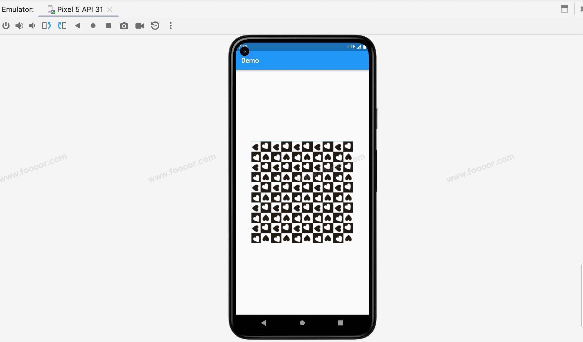
代码如下:
dart
Image.network(
  "http://doubibiji.com/open-assets/img/repeat.jpg",     // 设置背景颜色
  repeat: ImageRepeat.repeat,                            // 设置图片平铺
)
在上面我们使用的是 ImageRepeat.repeat ,会在X和Y轴方向平铺,也可以通过 ImageRepeat.repeatX 或 ImageRepeat.repeatY 设置单方向平铺。
3 加载本地图片
加载本地图片首先需要知道图片放哪里。
在 Flutter 中,通常将不同分辨率的图像放置在特定的文件夹中,以便区分不同的屏幕密度。
例如,可以在项目根目录下创建 assets 文件夹中,然后创建子文件夹用于存放不同分辨率的图像。
想要适配 2.0x 和 3.0x 的屏幕密度,可以创建以下文件夹:
assets/images/:用于存放基本分辨率图像assets/images/2.0x/:用于存放2.0x屏幕密度的图像assets/images/3.0x/:用于存放3.0x屏幕密度的图像
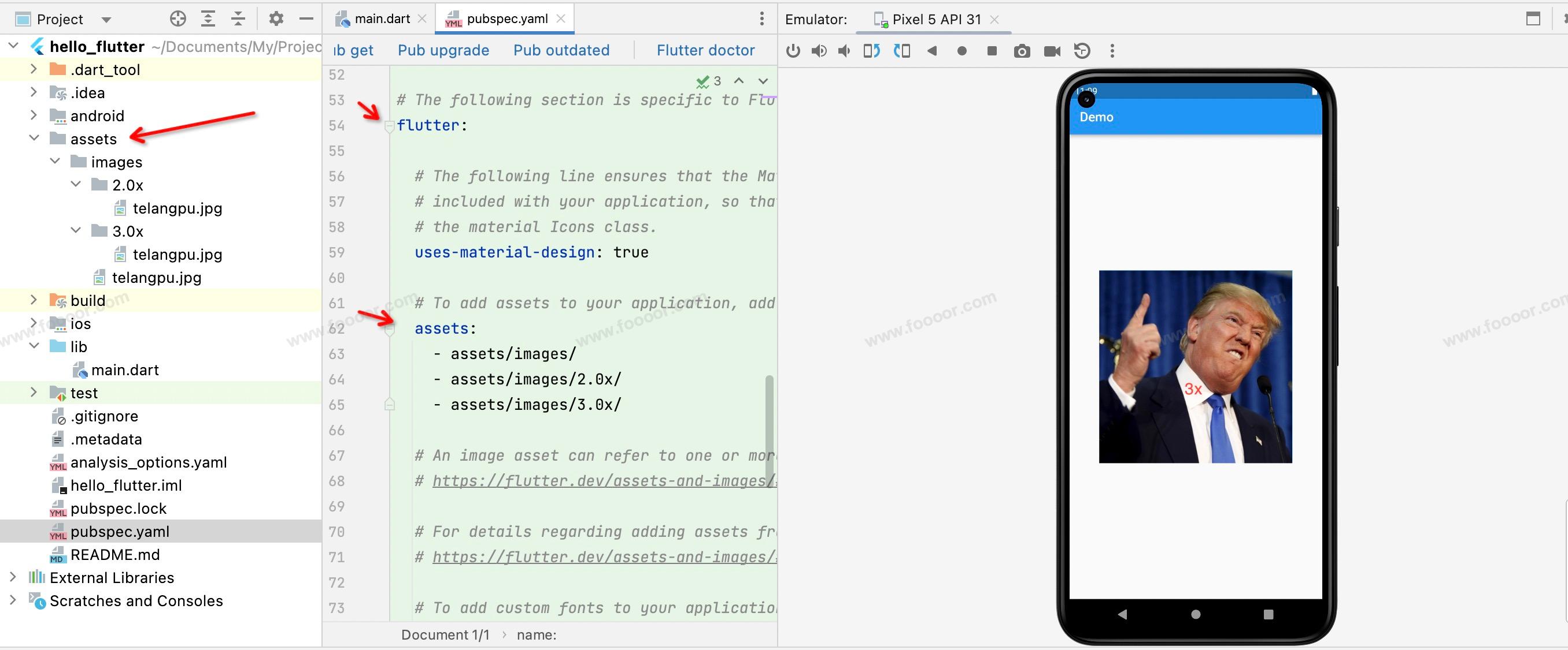
然后将不同密度的图片放到对应的文件夹中,如下图:
然后需要在 pubspec.yaml 文件中配置资源文件夹的路径。
yaml
flutter:
  assets:
    - assets/images/
    - assets/images/2.0x/
    - assets/images/3.0x/
然后就可以在代码中加载本地图片了:
dart
import 'package:flutter/material.dart';
void main() => runApp(const MyApp());
/// App根Widget
class MyApp extends StatelessWidget {
const MyApp({super.key});
@override
Widget build(BuildContext context) {
return const MaterialApp(
debugShowCheckedModeBanner: false,
home: DemoPage(),
);
}
}
/// 页面
class DemoPage extends StatelessWidget {
const DemoPage({super.key});
@override
Widget build(BuildContext context) {
return Scaffold(
appBar: AppBar(
title: const Text('Demo'),
),
body: Center(
child: Container(
width: 300,
height: 300,
decoration: const BoxDecoration(
color: Colors.lightBlue, // 设置背景颜色
),
// --------------------- 下面是加载本地图片 -----------------------------
child: Image.asset(
"assets/images/telangpu.jpg",
fit: BoxFit.cover, // 设置图片适配模式
),
),
));
}
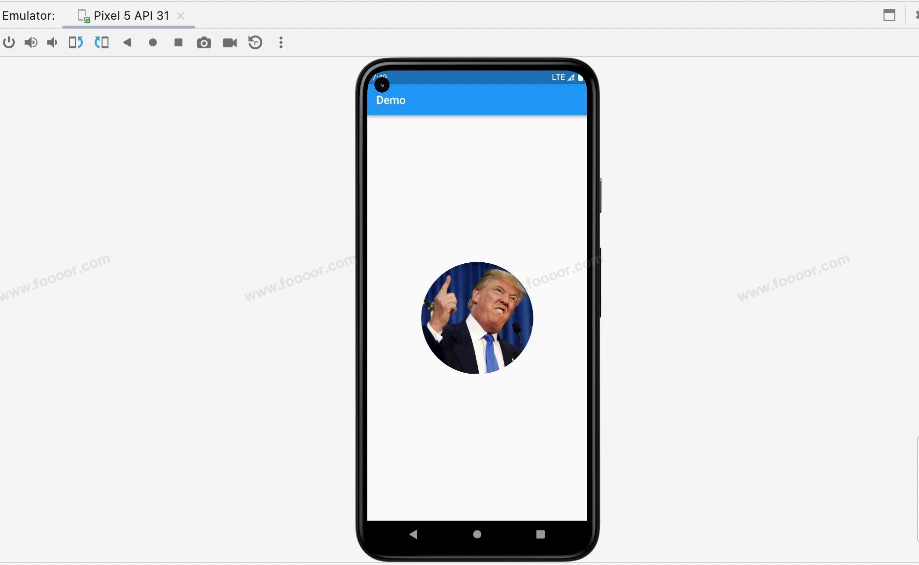
}我在图片上做了标记,从特朗普的领子上可以看到加载的是3x的图片。
4 Container设置圆形图片
在上面的代码中,我们将图片放在 Container 中,这个时候通过设置 Container 的圆角是不生效的。我们要通过设置 Container 的decoration 来设置才可以实现圆形图片,还可以给图片添加边框。
代码如下:
dart
import 'package:flutter/material.dart';

void main() => runApp(const MyApp());

/// App根Widget
class MyApp extends StatelessWidget {
  const MyApp({super.key});

  @override
  Widget build(BuildContext context) {
    return const MaterialApp(
      debugShowCheckedModeBanner: false,
      home: DemoPage(),
    );
  }
}

/// 页面
class DemoPage extends StatelessWidget {
  const DemoPage({super.key});

  @override
  Widget build(BuildContext context) {
    return Scaffold(
        appBar: AppBar(
          title: const Text('Demo'),
        ),
        body: Center(
          child: Container(
            width: 200,
            height: 200,
            // --------------------- 通过BoxDecoration设置圆角 ---------------------
            decoration: BoxDecoration(
                color: Colors.lightBlue,              // 设置背景颜色
                borderRadius: BorderRadius.circular(100),
                image: const DecorationImage(
                    image: NetworkImage(
                        "http://doubibiji.com/open-assets/img/telangpu.jpg"
                    ),
                    fit: BoxFit.cover
                )
            ),
          ),
        ));
  }
}
还可以通过给 Container 设置边框来给圆形图片添加边框,给 BoxDecoration 添加boder属性即可。
因为Container的宽高为200,所以设置圆角尺寸为一半100。
显示效果如下:
缩小圆角尺寸,可以得到圆角的图片。

上面使用 NetworkImage 是从网络加载图片,也可以使用 AssetImage 从本地加载图片。
dart
AssetImage('assets/images/telangpu.jpg')5 ClipOval实现圆形图片
ClipOval 是一个用于剪裁子部件的小部件,将其剪裁为椭圆形的形状。用它来实现圆形图片更简单一些。
举个栗子:
dart
import 'package:flutter/material.dart';

void main() => runApp(const MyApp());

/// App根Widget
class MyApp extends StatelessWidget {
  const MyApp({super.key});

  @override
  Widget build(BuildContext context) {
    return const MaterialApp(
      debugShowCheckedModeBanner: false,
      home: DemoPage(),
    );
  }
}

/// 页面
class DemoPage extends StatelessWidget {
  const DemoPage({super.key});

  @override
  Widget build(BuildContext context) {
    return Scaffold(
        appBar: AppBar(
          title: const Text('Demo'),
        ),
        body: Center(
          // --------------------- 通过ClipOval实现圆形图片 ---------------------
          child: ClipOval(
            child: Image.network(
                "http://doubibiji.com/open-assets/img/telangpu.jpg",
                width: 200,
                height: 200,
                fit: BoxFit.cover
            ),
          ),
        ));
  }
}
在上面的代码中直接在 ClipOval 组件中添加了一个 Image 组件,然后设置图片的宽高即可。通过 ClipOval 不太好设置边框。
6 CircleAvatar实现圆形图片
CircleAvatar 是一个常用的小部件,用于显示圆形的用户头像、图标或其他小图像。它是基于 ClipOval 封装的,可以方便地创建圆形的显示元素,如用户头像、用户图标等。
举个栗子:
dart
import 'package:flutter/material.dart';
void main() => runApp(const MyApp());
/// App根Widget
class MyApp extends StatelessWidget {
const MyApp({super.key});
@override
Widget build(BuildContext context) {
return const MaterialApp(
debugShowCheckedModeBanner: false,
home: DemoPage(),
);
}
}
/// 页面
class DemoPage extends StatelessWidget {
const DemoPage({super.key});
@override
Widget build(BuildContext context) {
return Scaffold(
appBar: AppBar(
title: const Text('Demo'),
),
body: const Center(
// --------------------- 通过CircleAvatar实现圆形图片 ---------------------
child: CircleAvatar(
radius: 100, // 设置圆形图片的半径
backgroundImage: NetworkImage(
"http://doubibiji.com/open-assets/img/telangpu.jpg" // 网络图片的地址
),
),
));
}
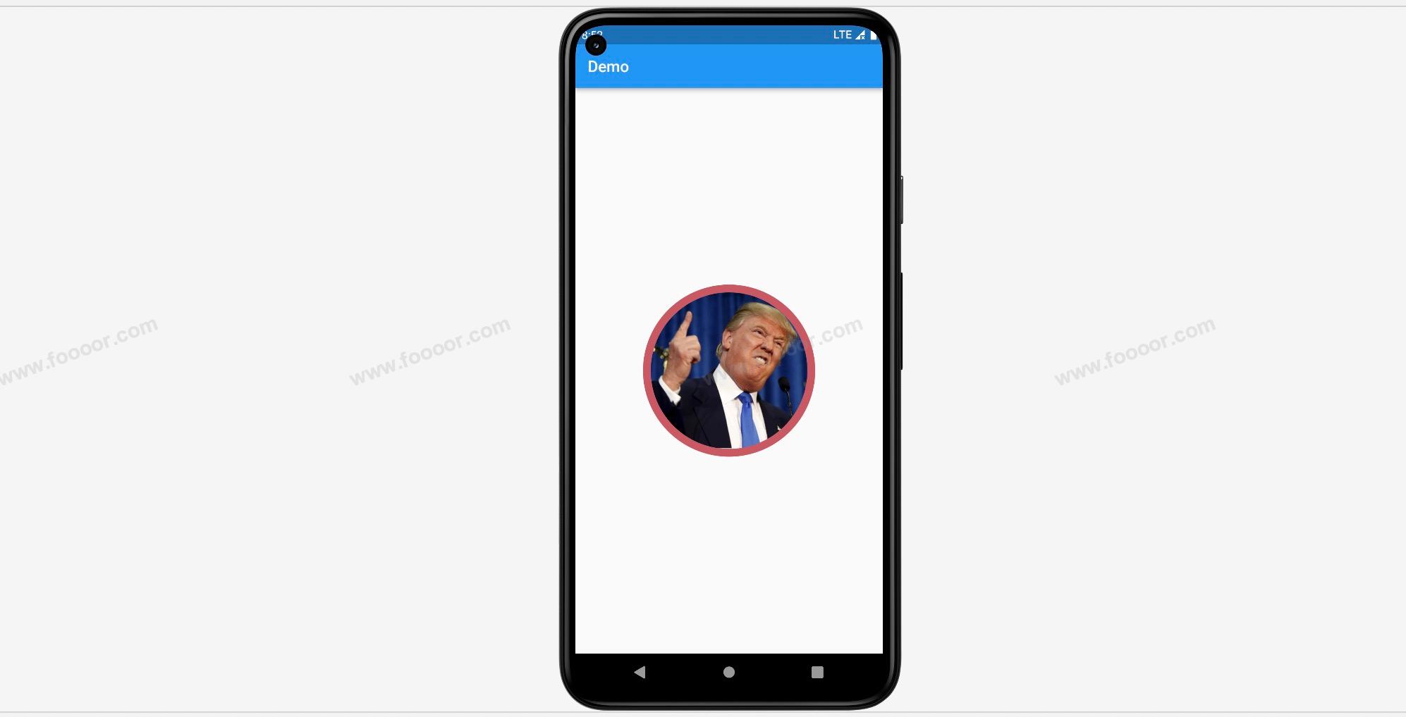
}通过 CircleAvatar 来设置图片边框不太好设置,我们可以使用一个更大的带有背景颜色的 CircleAvatar 来包裹一下圆形图片,这样漏出来的部分作为边框。
举个栗子:
dart
import 'package:flutter/material.dart';

void main() => runApp(const MyApp());

/// App根Widget
class MyApp extends StatelessWidget {
  const MyApp({super.key});

  @override
  Widget build(BuildContext context) {
    return const MaterialApp(
      debugShowCheckedModeBanner: false,
      home: DemoPage(),
    );
  }
}

/// 页面
class DemoPage extends StatelessWidget {
  const DemoPage({super.key});

  @override
  Widget build(BuildContext context) {
    return Scaffold(
        appBar: AppBar(
          title: const Text('Demo'),
        ),
        body: const Center(
          // --------------------- 通过CircleAvatar实现带边框的圆形图片 ---------------------
          child: CircleAvatar(                      // 外面的圆形,用来设置边框
            radius: 110,                            // 用来设置边框的圆形半径
            backgroundColor: Color(0xffc95863),     // 外面的圆形的背景,作为边框颜色
            child: CircleAvatar(
              radius: 100,                          // 设置圆形图片的半径
              backgroundImage: NetworkImage(
                  "http://doubibiji.com/open-assets/img/telangpu.jpg"     // 网络图片的地址
              ),
            ),
          )
        ));
  }
}
显示效果:
4.7 图标组件Icon
在开发应用的时候,肯定是会使用图标的,下面介绍一下Flutter中图标的使用。
Flutter中提供了很多官方的图标,我们可以直接使用。
1 官方图标
下面介绍一下官方图标的使用,直接通过Icon组件即可使用,非常的方便。
举个栗子:
dart
import 'package:flutter/material.dart';
void main() => runApp(const MyApp());
/// App根Widget
class MyApp extends StatelessWidget {
const MyApp({super.key});
@override
Widget build(BuildContext context) {
return const MaterialApp(
debugShowCheckedModeBanner: false,
home: DemoPage(),
);
}
}
/// 页面
class DemoPage extends StatelessWidget {
const DemoPage({super.key});
@override
Widget build(BuildContext context) {
return Scaffold(
appBar: AppBar(
title: const Text('Demo'),
),
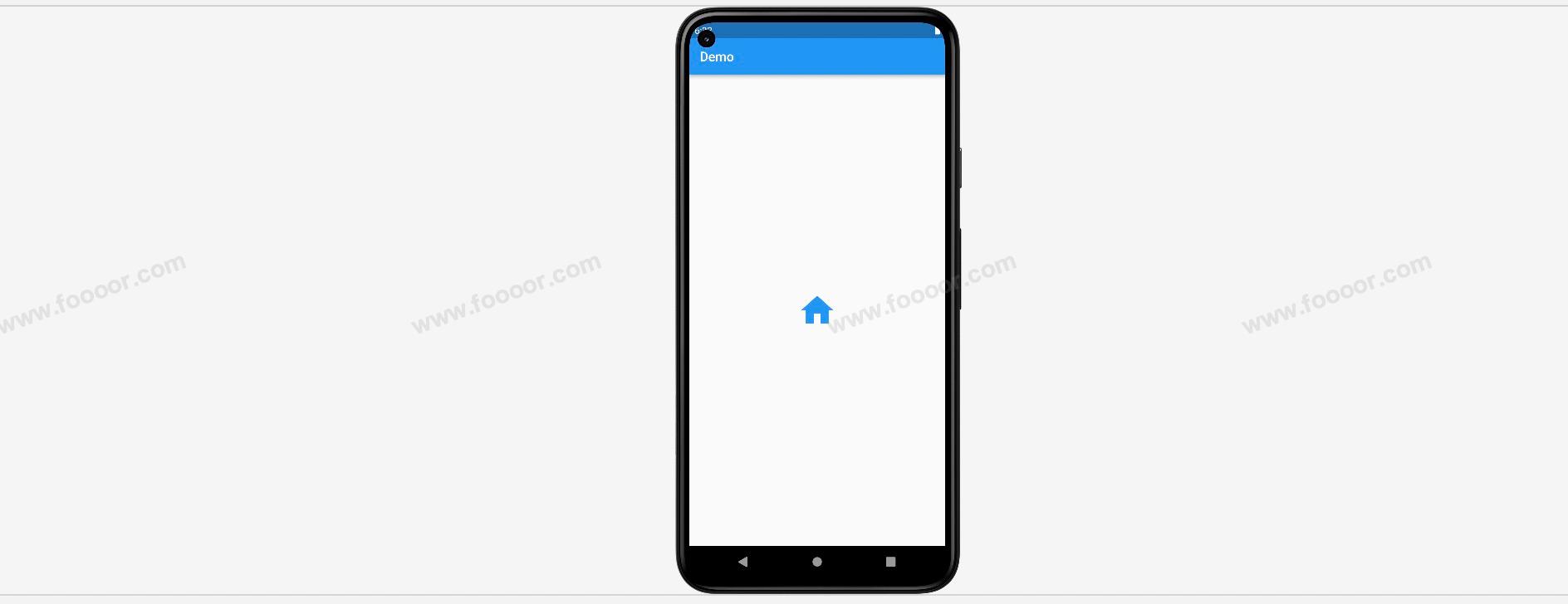
body: const Center(
// --------------------- 官方图标的使用 ---------------------
child: Icon(
Icons.home, // home 表示是一个首页的图标
size: 60, // 图标尺寸
color: Colors.blue, // 图标颜色
),
));
}
}Icons.home 就是指定的图标,这里是主页,size 可以调整图标的尺寸,color 可以设置图标的颜色。
显示效果:
想要什么图标通过 Icons 去查看即可,或者通过 https://material.io/tools/icons/ 来查看,我看了一下,非常的丰富。(很遗憾,需要科学上网才能看到)
再举一个例子:
dart
// 商店
Icon(
  Icons.shop,
  size: 60,
  color: Color(0xff72b236),
),
显示效果:

2 自定义图标
虽然官方提供了大量的图标,但是有时候还是不能满足我们的需求。
例如我们想要一个 微信 的图标,一个 微博 的图标,显然是没有的。但是阿里巴巴的 iconfont 网站( https://www.iconfont.cn/ ) 提供了很多的图标,我们如何使用这些图标呢?
那么就需要借助阿里巴巴图标库自定义字体图标。主要分为以下几个步骤:
- 在阿里巴巴图标库下载字体图标文件
- 将字体图标文件拷贝到项目中
- 在项目的
pubspec.yaml文件中配置字体库 - 自定义字体类,在字体类中配置字体图标文件中的图标
- 使用图标
下载图标
首先需要访问和登录阿里巴巴的 iconfont 网站,没有账号的注册一个账号。
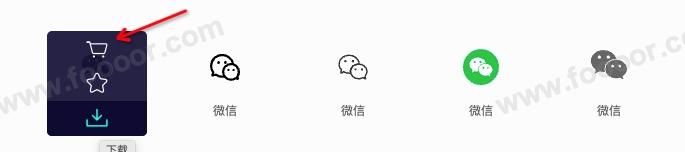
然后将自己选定的图标加入到购物车,这里我就选定微信、微博的图标。
选择完图标,点击购物车,然后点击 下载代码 按钮
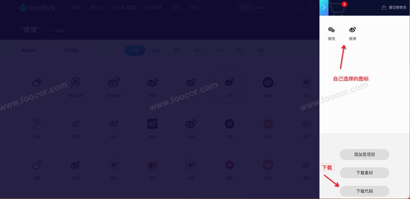
下载完成,是一个 zip 的压缩包。
将字体图标文件拷贝到项目中
解压下载的压缩包,将其中的 ttf 和 json 文件拷贝到自己的项目中。
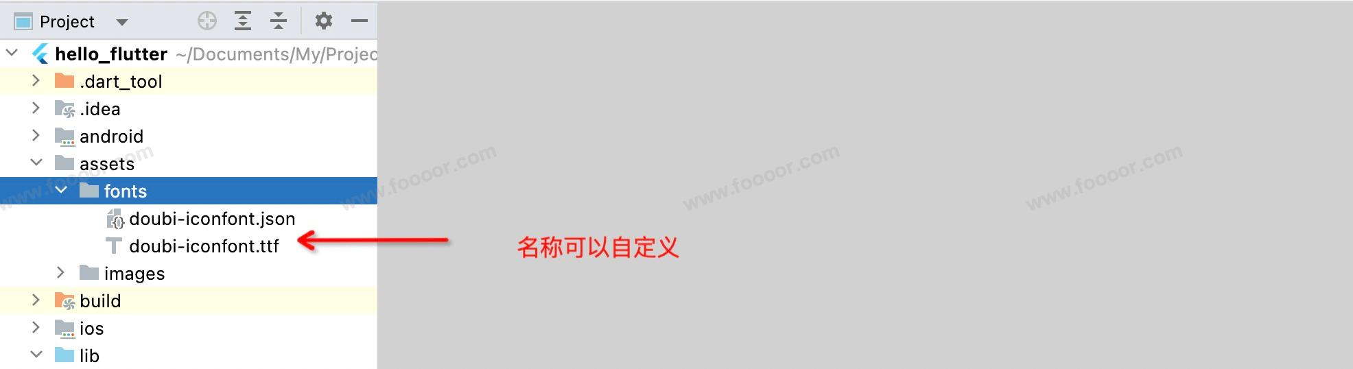
首先新建一个目录,用来放置字体图标文件,这里我在 assets 文件夹下新建一个 font目录,然后将文件放到下面。
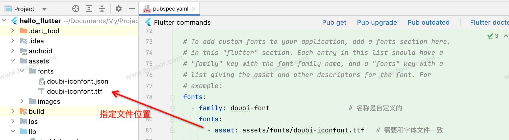
配置pubspec.yaml
在 pubspec.yaml 文件中配置图标字体文件,需要指定 字体的名称 和 字体文件的路径 。名称是自定义的,字体文件的路径按照文件的位置设置即可。
例如找到字体文件的配置,配置如下:
yaml
fonts:
  - family: doubi-font                    # 名称是自定义的
    fonts:
      - asset: assets/fonts/doubi-iconfont.ttf   # 需要和字体文件一致
字体文件是可以配置多个的,如果有多个,可以在下面继续配置。
自定义字体类
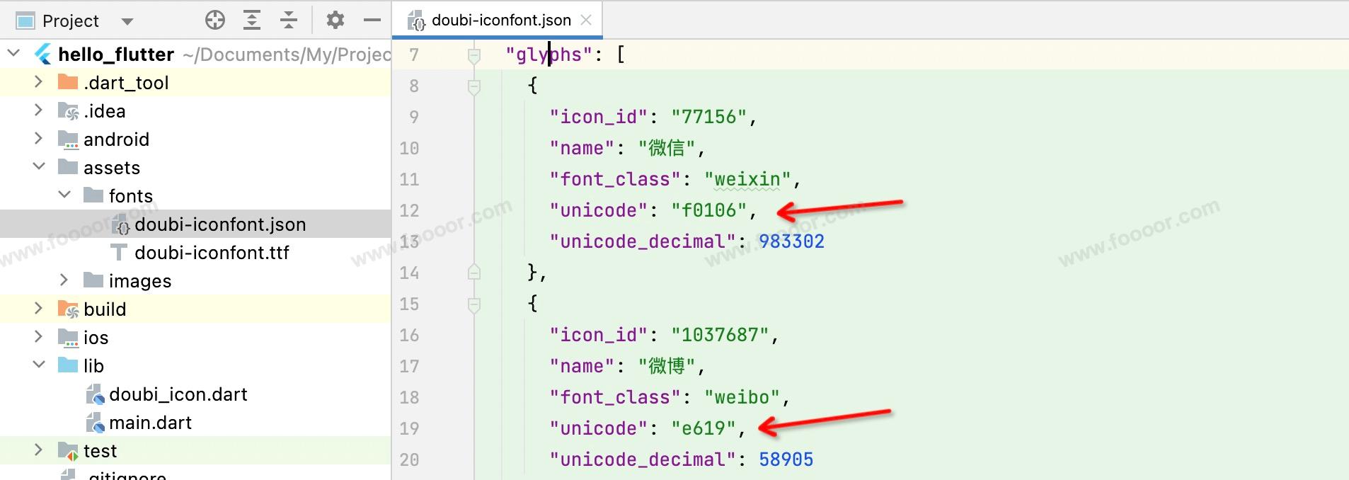
然后自定义一个字体类,在字体类中创建图标的常量。
之前我们使用官方图标使用的是 Icons 字体类,里面就是定义了一个个图标常量。
这里自定义一个 DoubiIcon 字体类。
在 lib 下创建一个 doubi_font.dart 文件,编辑如下:
dart
import 'package:flutter/cupertino.dart';

class DoubiIcon {
  // 定义微信图标
  static const IconData weixin = IconData(
    0xf0106,
    fontFamily: "doubi-font",
    matchTextDirection: true
  );

  // 定义微博图标
  static const IconData weibo = IconData(
      0xe619,
      fontFamily: "doubi-font",
      matchTextDirection: true
  );
}
解释一下上面的代码:
- 首先创建了一个类;
- 在类中使用
IconData创建图标常量;其中用到三个参数,第一个参数需要在之前拷贝的json文件中查找图标的unicode编码,然后在前面添加0x表示的是十六进制。第二个参数是之前在pubspec.yaml文件中配置的family,第三个参数表示和文字的方向一致,配置成true就可以了。
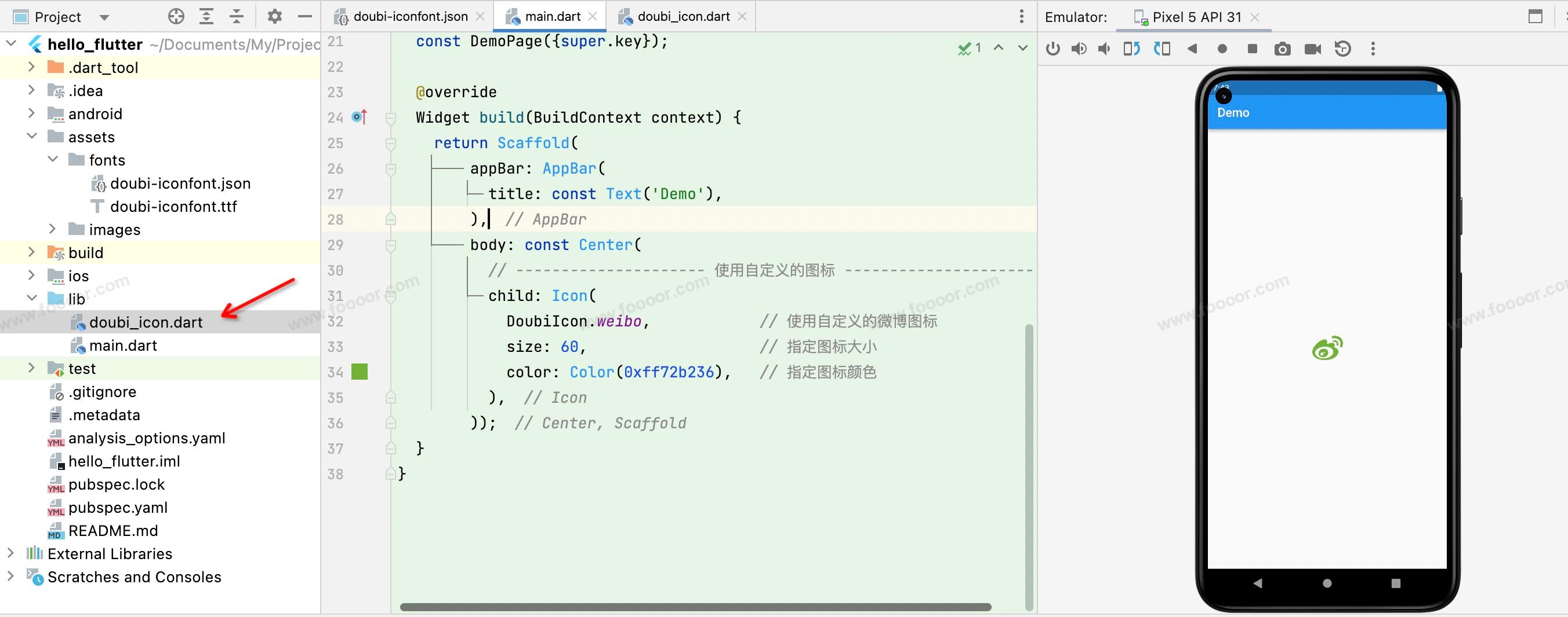
使用自定义图标
现在在项目中使用自定义字体类。
- 首先引入自定义字体类
- 然后就可以向之前使用官方图标一样使用自定义图标啦
dart
import 'package:flutter/material.dart';
import './doubi_icon.dart';

void main() => runApp(const MyApp());

/// App根Widget
class MyApp extends StatelessWidget {
  const MyApp({super.key});

  @override
  Widget build(BuildContext context) {
    return const MaterialApp(
      debugShowCheckedModeBanner: false,
      home: DemoPage(),
    );
  }
}

/// 页面
class DemoPage extends StatelessWidget {
  const DemoPage({super.key});

  @override
  Widget build(BuildContext context) {
    return Scaffold(
        appBar: AppBar(
          title: const Text('Demo'),
        ),
        body: const Center(
          // --------------------- 使用自定义的图标 ---------------------
          child: Icon(
            DoubiIcon.weibo,            // 使用自定义的微博图标
            size: 60,                   // 指定图标大小
            color: Color(0xff72b236),   // 指定图标颜色
          ),
        ));
  }
}
显示效果:
图标为什么可以设置颜色呢?
其实这里是图标字体,本质上和字体是没有区别的,所以这里的图标相当于一个文字,所以就可以设置它的大小和颜色了。就算将图标设置很大的尺寸也不会失真。
4.8 水平布局组件Row
Row是一种水平排列子组件的布局组件。它将其子组件按照水平方向依次排列,可以用来创建水平的UI布局,比如按钮、文本、图标等。
举个栗子:
dart
import 'package:flutter/material.dart';
void main() => runApp(const MyApp());
/// App根Widget
class MyApp extends StatelessWidget {
const MyApp({super.key});
@override
Widget build(BuildContext context) {
return const MaterialApp(
debugShowCheckedModeBanner: false,
home: DemoPage(),
);
}
}
/// 页面
class DemoPage extends StatelessWidget {
const DemoPage({super.key});
@override
Widget build(BuildContext context) {
return Scaffold(
appBar: AppBar(
title: const Text('Demo'),
),
body: Row(
// ---------------------在Row中添加三个按钮,按钮是自定义的组件------------------------
children: const [
IconButton(icon: Icons.shop, color: Colors.lightBlue),
IconButton(icon: Icons.house, color: Colors.lightGreen),
IconButton(icon: Icons.fire_truck, color: Colors.red),
],
)
);
}
}
// 自定义一个按钮组件
class IconButton extends StatelessWidget {
final Color color;
final double size;
final IconData icon;
// 自定义按钮组件,可以传递按钮的颜色和按钮上的图标,以及图标的尺寸
const IconButton({super.key, required this.icon, this.color = Colors.blue, this.size = 32.0});
@override
Widget build(BuildContext context) {
return Container(
height: 100.0,
width: 100.0,
color: color,
child: Center(
child: Icon(icon, size: size, color: Colors.white)
),
);
}
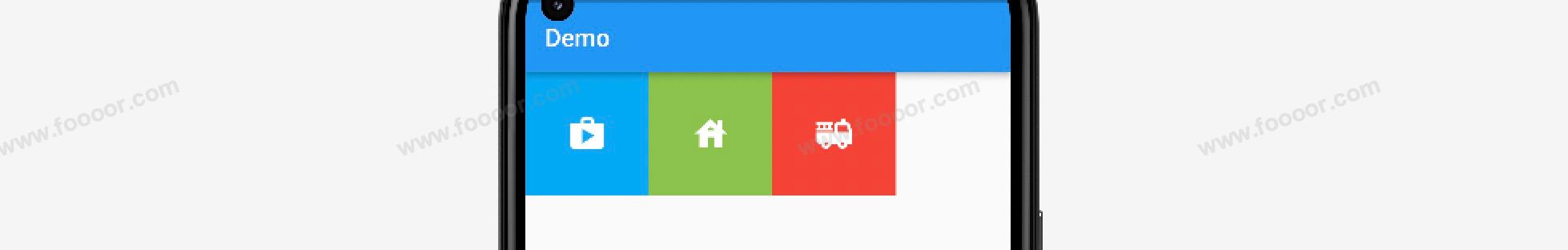
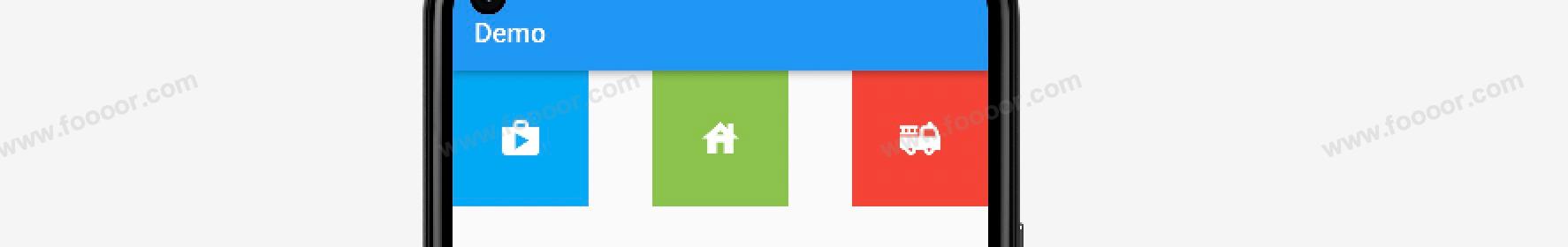
}在上面的代码中,在 Row 中添加了三个自定的按钮,所以会在一行显示三个按钮。
显示效果如下:

Row 组件还可以通过 mainAxisAlignment 和 crossAxisAlignment 属性来设置子元素的排序方式。
| 属性 | 说明 |
|---|---|
| mainAxisAlignment | 主轴的排序方式,Row的主轴为水平方向 |
| crossAxisAlignment | 交叉轴的排序方式,与主轴的交叉轴,也就是垂直方向 |
mainAxisAlignment
演示一下 mainAxisAlignment ,主轴方向上的子元素对齐方式,举个栗子:
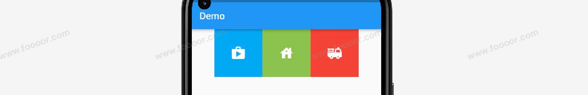
设置 mainAxisAlignment 为 MainAxisAlignment.start,从主轴的开始位置对齐,也就是左对齐。
dart
/// 页面
class DemoPage extends StatelessWidget {
const DemoPage({super.key});
@override
Widget build(BuildContext context) {
return Scaffold(
appBar: AppBar(
title: const Text('Demo'),
),
body: Row(
// ---------------------在Row中添加三个按钮,按钮是自定义的组件------------------------
mainAxisAlignment: MainAxisAlignment.start,
children: const [
IconButton(icon: Icons.shop, color: Colors.lightBlue),
IconButton(icon: Icons.house, color: Colors.lightGreen),
IconButton(icon: Icons.fire_truck, color: Colors.red),
],
)
);
}
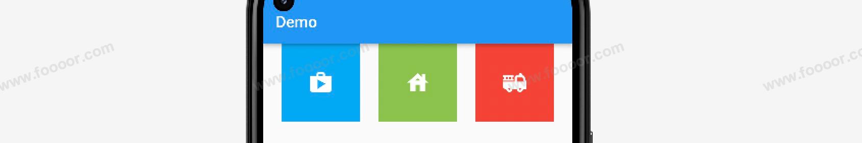
}显示效果如下:
设置 mainAxisAlignment 为 MainAxisAlignment.center,水平居中对齐。
显示效果如下:
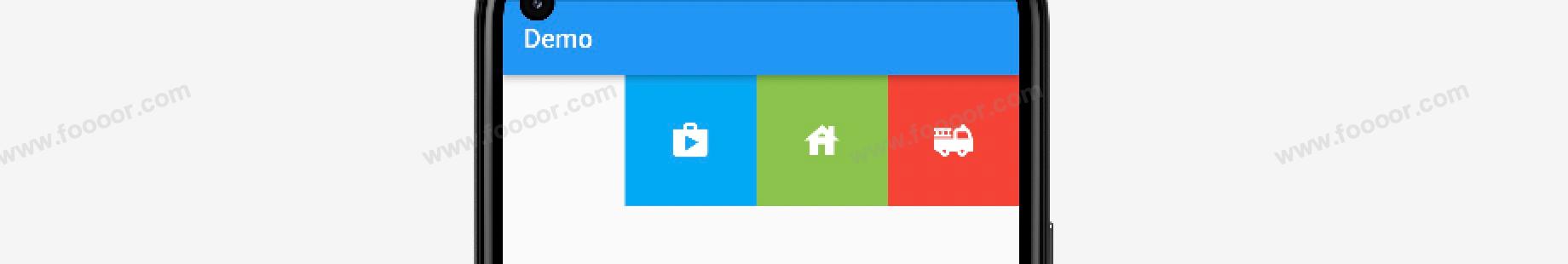
设置 mainAxisAlignment 为 MainAxisAlignment.end,水平居右对齐。
显示效果如下:
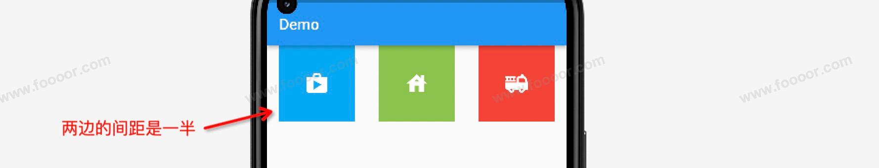
设置 mainAxisAlignment 为 MainAxisAlignment.spaceAround,子组件之间均匀分布,同时子组件之前和之后的空间是一半的。
显示效果如下:
设置 mainAxisAlignment 为 MainAxisAlignment.spaceBetween,在子组件之间均匀分布,不包括首尾。
显示效果如下:
如果只有两个子元素,设置 MainAxisAlignment.spaceBetween 可以让两个子元素一左一右显示。
设置 mainAxisAlignment 为 MainAxisAlignment.spaceEvenly,在子组件之间和首尾的空间均匀分布。
显示效果如下:
crossAxisAlignment
Row 组件的宽度默认是扩展到和父组件相同的,高度是由其中子组件的最大高度决定的。
这个时候如果Row组件如果没有被外层容器包裹,设置 crossAxisAlignment 是不生效的,现在我们使用 Container 包括 Row ,然后使用 crossAxisAlignment 设置交叉轴方向上的对齐方式。
dart
import 'package:flutter/material.dart';

void main() => runApp(const MyApp());

/// App根Widget
class MyApp extends StatelessWidget {
  const MyApp({super.key});

  @override
  Widget build(BuildContext context) {
    return const MaterialApp(
      debugShowCheckedModeBanner: false,
      home: DemoPage(),
    );
  }
}

/// 页面
class DemoPage extends StatelessWidget {
  const DemoPage({super.key});

  @override
  Widget build(BuildContext context) {
    return Scaffold(
        appBar: AppBar(
          title: const Text('Demo'),
        ),
        body: Container(
            height: 400,
            color: Colors.yellow,
            child: Row(
              // ---------------------在Row中添加三个按钮,按钮是自定义的组件------------------------
              mainAxisAlignment: MainAxisAlignment.center,
              crossAxisAlignment: CrossAxisAlignment.center,
              children: const [
                IconButton(icon: Icons.shop, color: Colors.lightBlue),
                IconButton(icon: Icons.house, color: Colors.lightGreen),
                IconButton(icon: Icons.fire_truck, color: Colors.red),
              ],
            ),
        )
    );
  }
}

// 自定义一个按钮组件
class IconButton extends StatelessWidget {
  final Color color;
  final double size;
  final IconData icon;

  const IconButton({super.key, required this.icon, this.color = Colors.blue, this.size = 32.0});

  @override
  Widget build(BuildContext context) {
    return Container(
      height: 100.0,
      width: 100.0,
      color: color,
      child: Center(
          child: Icon(icon, size: size, color: Colors.white)
      ),
    );
  }
}
在上面的代码中,使用 Container 包裹了 Row 组件,并设置了 Container 的高度。这样就可以设置 Row 在交叉轴上的对齐方式了。
显示效果如下:
上面演示了在交叉轴上居中对齐。如果需要的话,还可以通过设置 crossAxisAlignment: CrossAxisAlignment.start, 居上对齐,设置 crossAxisAlignment: CrossAxisAlignment.end, 居下对齐。
4.9 垂直布局组件Column
Column是一种垂直排列子组件的布局组件。它将其子组件按照垂直方向依次排列。
Column 组件和 Row 组件是非常相似的,使用方法基本一样。只是排列方向不一样,Row 组件的主轴方向是水平的,Column 的主轴方向是垂直的。
举个栗子:
下面我们在一个 Container 容器中使用 Column ,这样主轴方面的对齐方式和交叉轴上的对齐方式都能生效。
dart
import 'package:flutter/material.dart';
void main() => runApp(const MyApp());
/// App根Widget
class MyApp extends StatelessWidget {
const MyApp({super.key});
@override
Widget build(BuildContext context) {
return const MaterialApp(
debugShowCheckedModeBanner: false,
home: DemoPage(),
);
}
}
/// 页面
class DemoPage extends StatelessWidget {
const DemoPage({super.key});
@override
Widget build(BuildContext context) {
return Scaffold(
appBar: AppBar(
title: const Text('Demo'),
),
body: Container(
height: 400,
width: double.infinity,
color: Colors.yellow,
child: Column(
// ---------------------在Column中添加三个按钮,按钮是自定义的组件------------------------
mainAxisAlignment: MainAxisAlignment.spaceBetween,
crossAxisAlignment: CrossAxisAlignment.center,
children: const [
IconButton(icon: Icons.shop, color: Colors.lightBlue),
IconButton(icon: Icons.house, color: Colors.lightGreen),
IconButton(icon: Icons.fire_truck, color: Colors.red),
],
),
)
);
}
}
// 自定义一个按钮组件
class IconButton extends StatelessWidget {
final Color color;
final double size;
final IconData icon;
const IconButton({super.key, required this.icon, this.color = Colors.blue, this.size = 32.0});
@override
Widget build(BuildContext context) {
return Container(
height: 100.0,
width: 100.0,
color: color,
child: Center(
child: Icon(icon, size: size, color: Colors.white)
),
);
}
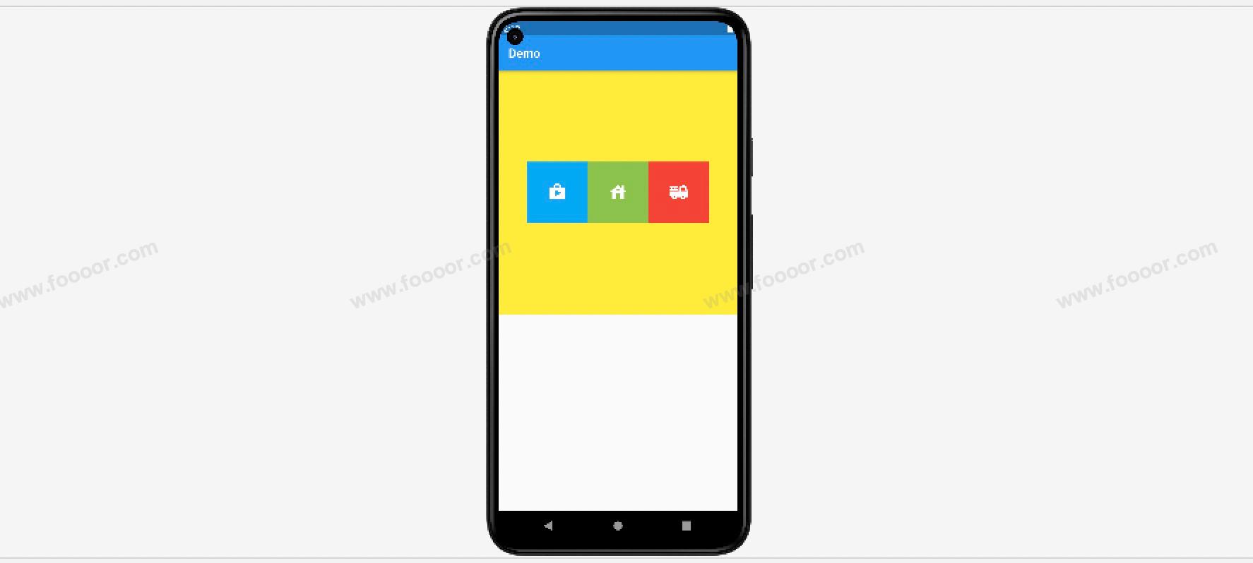
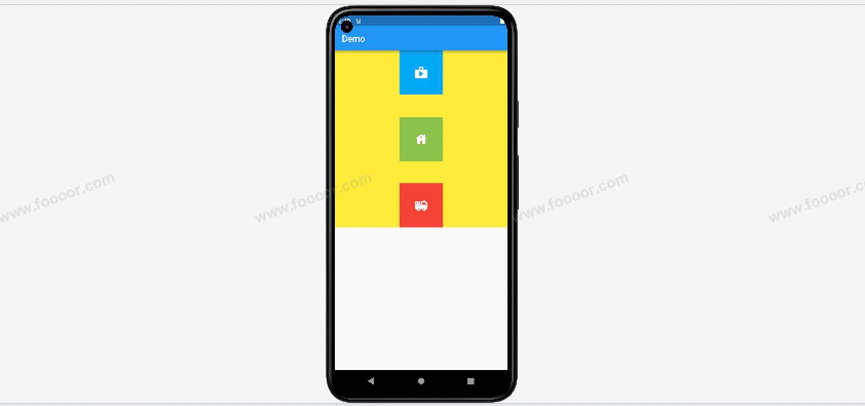
}在上面的代码中,我们Container的高度是400,宽度是 double.infinity 。 double.infinity 是为了让Container能填满整个屏幕,如果想让Container填满父元素,可以设置Container的宽度和高度的值尽可能的大,可以使用 double.infinity 或 double.maxFinite。
然后在 Column 中添加了三个自定义的按钮,同时设置主轴的对齐方式为 MainAxisAlignment.spaceBetween(在子组件之间均匀分布,不包括首尾)。设置交叉轴的对齐方式为 CrossAxisAlignment.center(居中对齐)。
显示效果如下:
和 Row 组件一样,Column 在主轴的对齐方式有:
| 对齐方式 | 说明 |
|---|---|
| MainAxisAlignment.start | 垂直居上对齐 |
| MainAxisAlignment.center | 垂直居中对齐 |
| MainAxisAlignment.end | 垂直居下对齐 |
| MainAxisAlignment.spaceAround | 垂直方向,空隙在子组件之间均匀分布,同时子组件之前和之后的空间是一半的。 |
| MainAxisAlignment.spaceBetween | 垂直方向,空隙在子组件之间均匀分布,不包括首尾。 |
| MainAxisAlignment.spaceEvenly | 垂直方向,在子组件之间和首尾的空间均匀分布。 |
交叉轴的对齐方式:
| 对齐方式 | 说明 |
|---|---|
| CrossAxisAlignment.start | 水平方向的开始位置,也就是水平居左 |
| CrossAxisAlignment.center | 水平方向的中间位置,也就是水平居中 |
| CrossAxisAlignment.end | 水平方向的结束位置,也就是水平居右 |
如果不设置 mainAxisAlignment,默认默认为 MainAxisAlignment.start,不设置 crossAxisAlignment,默认为 CrossAxisAlignment.start。
4.10 弹性布局组件Flex和Expanded
Flex 组件可以沿着水平或垂直方向排列子组件,可以通过 direction 属性指定它是水平方向还是垂直方向。如果指定它是水平方向的,那么它和 Row 是一样的,如果指定它是垂直方向的,那么它和 Column 是一样的,因为 Row 和 Column 都继承自 Flex ,参数基本相同,所以能使用 Flex 的地方基本上都可以使用 Row 或 Column 来实现 。 Flex、Row、Column 可以结合 Expanded 组件来实现弹性布局 。
举个栗子:
一行有两个组件,根据屏幕的宽度自适应,一个占宽度的三分之二,一个占屏幕的三分之一,如下图:
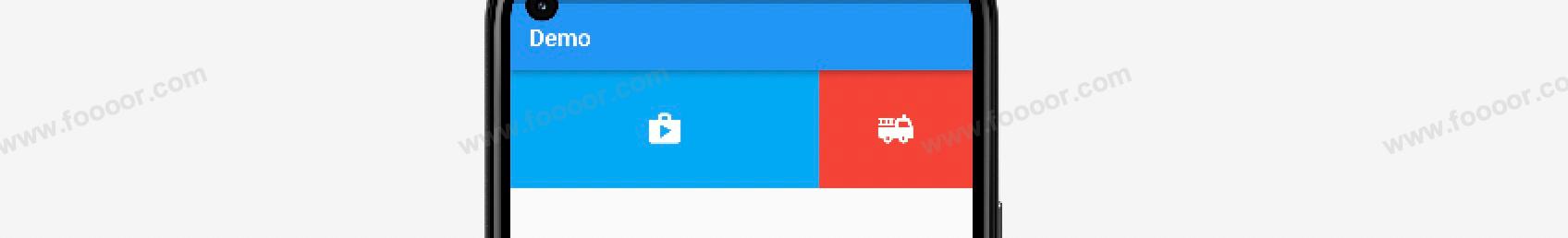
使用 Flex 和 Expanded 就可以轻松实现。
代码如下:
dart
import 'package:flutter/material.dart';

void main() => runApp(const MyApp());

/// App根Widget
class MyApp extends StatelessWidget {
  const MyApp({super.key});

  @override
  Widget build(BuildContext context) {
    return const MaterialApp(
      debugShowCheckedModeBanner: false,
      home: DemoPage(),
    );
  }
}

/// 页面
class DemoPage extends StatelessWidget {
  const DemoPage({super.key});

  @override
  Widget build(BuildContext context) {
    return Scaffold(
      appBar: AppBar(
        title: const Text('Demo'),
      ),
      // --------------------Flex 组件----------------------
      body: Flex(
        direction: Axis.horizontal,
        children: const [
          // -------------------- 通过Expanded组件指定占用的比例 ----------------------
          Expanded(
              flex: 2,      // 占用2份的空间,设置flex后,child的元素的宽度是失效的。
              child: IconButton(icon: Icons.shop, color: Colors.lightBlue)),
          Expanded(
              flex: 1,      // 占用1份的空间
              child: IconButton(icon: Icons.fire_truck, color: Colors.red))
        ],
      ),
    );
  }
}

// 自定义一个按钮组件
class IconButton extends StatelessWidget {
  final Color color;
  final double size;
  final IconData icon;

  const IconButton(
      {super.key,
      required this.icon,
      this.color = Colors.blue,
      this.size = 32.0});

  @override
  Widget build(BuildContext context) {
    return Container(
      height: 100.0,
      width: 100.0,
      color: color,
      child: Center(child: Icon(icon, size: size, color: Colors.white)),
    );
  }
}
首先设置 Flex 元素的方向为水平方向,然后使用 Flex 组件包裹 Expanded 组件,通过 Expanded 设置占用的比例。
需要注意 Expanded 组件中的子组件的宽度是无效的,是由 Expanded 来控制的。
上面的 Flex 可以换成 Row ,效果是一样的。
我们还可以实现一种效果,就是固定一部分组件的尺寸不变,剩余的组件随着屏幕的尺寸进行自适应。
举个栗子:
右侧的按钮尺寸是固定的,左侧按钮随着屏幕的尺寸进行自适应。
只需要将自适应的组将使用Expanded组件包裹即可。
dart
import 'package:flutter/material.dart';

void main() => runApp(const MyApp());

/// App根Widget
class MyApp extends StatelessWidget {
  const MyApp({super.key});

  @override
  Widget build(BuildContext context) {
    return const MaterialApp(
      debugShowCheckedModeBanner: false,
      home: DemoPage(),
    );
  }
}

/// 页面
class DemoPage extends StatelessWidget {
  const DemoPage({super.key});

  @override
  Widget build(BuildContext context) {
    return Scaffold(
      appBar: AppBar(
        title: const Text('Demo'),
      ),
      // --------------------Flex 组件----------------------
      body: Flex(
        direction: Axis.horizontal,
        children: const [
          // -------------------将自适应的组件使用Expanded组件包裹----------------------
          Expanded(
              child: IconButton(icon: Icons.shop, color: Colors.lightBlue)
          ),
          IconButton(icon: Icons.fire_truck, color: Colors.red)
        ],
      ),
    );
  }
}

// 自定义一个按钮组件
class IconButton extends StatelessWidget {
  final Color color;
  final double size;
  final IconData icon;

  const IconButton(
      {super.key,
      required this.icon,
      this.color = Colors.blue,
      this.size = 32.0});

  @override
  Widget build(BuildContext context) {
    return Container(
      height: 100.0,
      width: 100.0,
      color: color,
      child: Center(child: Icon(icon, size: size, color: Colors.white)),
    );
  }
}
将需要自适应的组件使用 Expanded组件包裹,固定尺寸的组件不用 Expanded 组件包裹即可。
再来看一个实现。
整体部分,左侧部分占三分之二,右侧占三分之一;右侧部分,上面占三分之二,下面占三分之一,如下图:

思路是很简单的,整体使用Row,右侧使用Column,然后通过Expanded设置比例。
代码实现:
dart
import 'package:flutter/material.dart';

void main() => runApp(const MyApp());

/// App根Widget
class MyApp extends StatelessWidget {
  const MyApp({super.key});

  @override
  Widget build(BuildContext context) {
    return const MaterialApp(
      debugShowCheckedModeBanner: false,
      home: DemoPage(),
    );
  }
}

/// 页面
class DemoPage extends StatelessWidget {
  const DemoPage({super.key});

  @override
  Widget build(BuildContext context) {
    return Scaffold(
        appBar: AppBar(
          title: const Text('Demo'),
        ),
        // ------------------------------------------------
        body: SizedBox(       // 通过SizedBox约束高度
          height: 200,
          // -----------------------整体使用Row-------------------------
          child: Row(
            children: [
              Expanded(
                  flex: 2,
                  child: Image.network(
                      "http://doubibiji.com/open-assets/img/telangpu.jpg",
                      fit: BoxFit.cover)),
              Expanded(
                flex: 1,
                // -----------------------右侧使用Column-------------------------
                child: Column(
                  children: [
                    Expanded(
                        flex: 2,
                        child: SizedBox(
                          width: double.infinity,
                          child: Image.network(
                              "http://doubibiji.com/open-assets/img/baideng.jpg",
                              fit: BoxFit.cover),
                        )),
                    Expanded(
                        flex: 1,
                        child: SizedBox(
                            width: double.infinity,
                            child: Image.network(
                                "http://doubibiji.com/open-assets/img/pujing.jpg",
                                fit: BoxFit.cover))),
                  ],
                ),
              ),
            ],
          ),
        ));
  }
}