Appearance
Flutter教程 - 4 组件
4.11 分隔线组件Divider
在列表和页面布局的时候,经常用到分隔线,下面演示一下分隔线的使用。
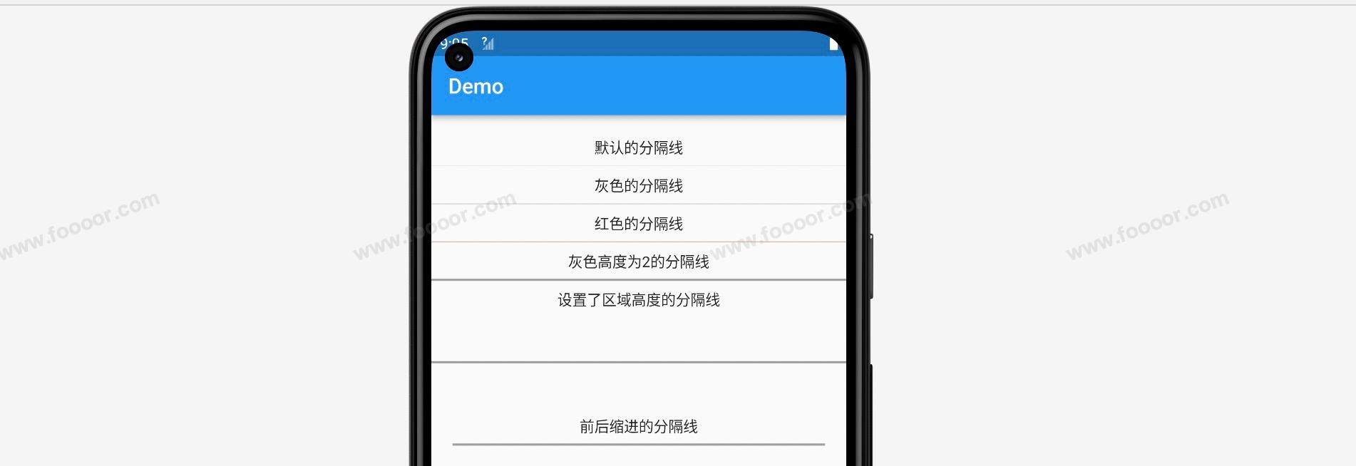
直接看效果:
代码如下:
dart
import 'package:flutter/material.dart';

void main() => runApp(const MyApp());

/// App根Widget
class MyApp extends StatelessWidget {
  const MyApp({super.key});

  @override
  Widget build(BuildContext context) {
    return const MaterialApp(
      debugShowCheckedModeBanner: false,
      home: DemoPage(),
    );
  }
}

/// 页面
class DemoPage extends StatelessWidget {
  const DemoPage({super.key});

  @override
  Widget build(BuildContext context) {
    return Scaffold(
        appBar: AppBar(
          title: const Text('Demo'),
        ),
        // ----------------------Divider的使用--------------------------
        body: Column(
          children: const [
            SizedBox(height: 20),
            Text("默认的分隔线"),
            Divider(),

            Text("灰色的分隔线"),
            Divider(color: Colors.grey),

            Text("红色的分隔线"),
            Divider(color: Colors.red,),

            Text("灰色高度为2的分隔线"),
            Divider(color: Colors.grey, thickness: 2),

            Text("设置了区域高度的分隔线"),
            Divider(color: Colors.grey, height: 100, thickness: 2),

            Text("前后缩进的分隔线"),
            Divider(color: Colors.grey, indent: 20, endIndent: 20, thickness: 2),
          ],
        ));
  }
}
代码很简单,根据需要设置指定的属性即可。
解释一下各个属性的含义:
| 属性 | 说明 |
|---|---|
| color | 分隔线的颜色,默认灰色 |
| thickness | 分隔线的高度,默认1 |
| height | 分割线区域的高度,不是分隔线的高度,是设置分隔线上下区域的高度 |
| indent | 起点缩进距离 |
| endIndent | 终点缩进距离 |
4.12 列表组件ListView
列表在我们项目开发中必不可少,我们经常会看到消息列表、新闻列表等。
在Flutter中,列表可以通过ListView 实现,ListView 可以在垂直或水平方向滚动,也可以根据需要设置为有限高度的列表或无限高度的滚动视图。
下面先从一个简单的实现开始。
1 垂直列表
先看效果:
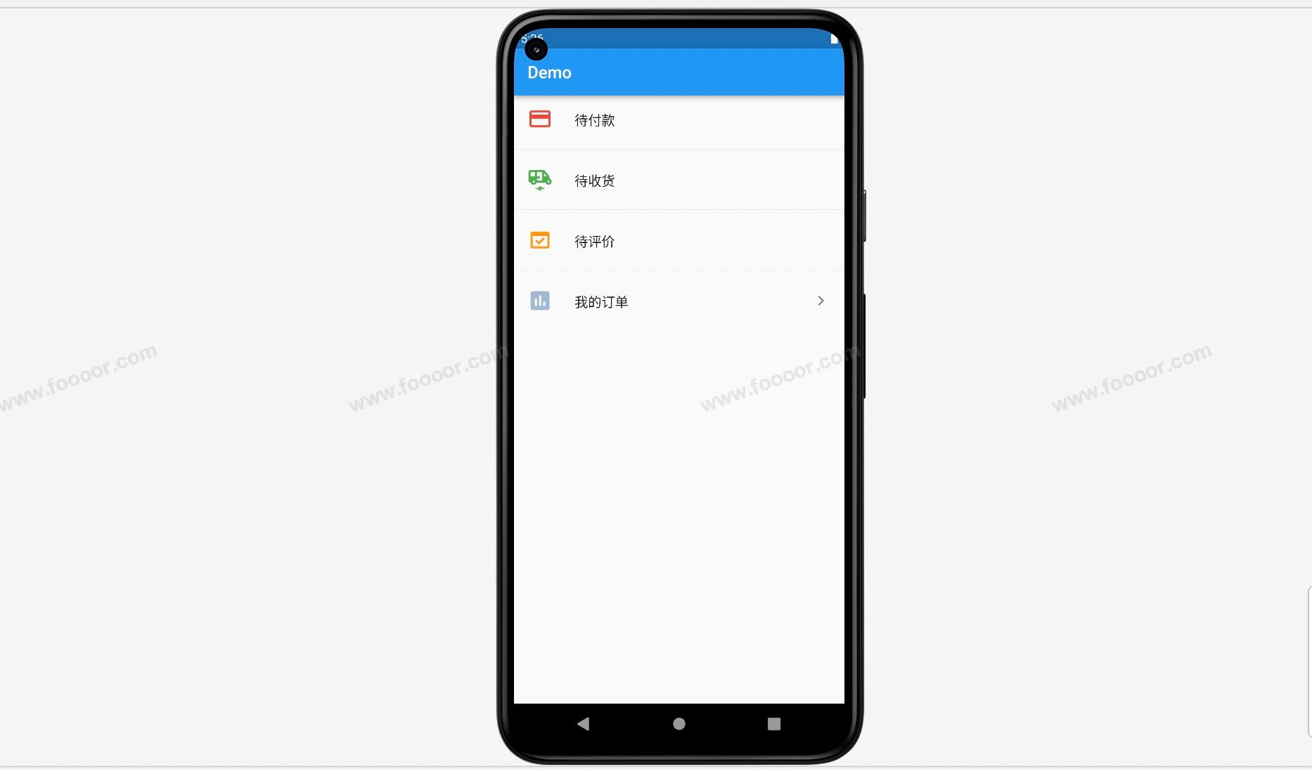
在实现上面的列表之前,先介绍另一个组件 ListTile。
ListTile 是 Flutter 中用于创建列表项的常用组件,它可以在列表中显示一个包含图标、文本和其它内容的项。ListTile 可以轻松地创建常见的列表视图,如设置页面、通知列表等。
在这里我们使用 ListTile 构建列表中的每一个item。
下面通过代码实现上面的列表:
dart
import 'package:flutter/material.dart';
import './doubi_icon.dart';

void main() => runApp(const MyApp());

/// App根Widget
class MyApp extends StatelessWidget {
  const MyApp({super.key});

  @override
  Widget build(BuildContext context) {
    return const MaterialApp(
      debugShowCheckedModeBanner: false,
      home: DemoPage(),
    );
  }
}

/// 页面
class DemoPage extends StatelessWidget {
  const DemoPage({super.key});

  @override
  Widget build(BuildContext context) {
    return Scaffold(
        appBar: AppBar(
          title: const Text('Demo'),
        ),
        body: ListView(
          // --------------------- 列表中的内容 ---------------------
          children: const [
            ListTile(
              leading: Icon(Icons.payment, color: Colors.red, size: 30),
              title: Text("待付款"),
            ),
            Divider(),            // 添加分隔线
            ListTile(
              leading: Icon(Icons.electric_rickshaw, color: Colors.green, size: 30),
              title: Text("待收货"),
            ),
            Divider(),
            ListTile(
              leading: Icon(Icons.domain_verification, color: Colors.orange, size: 30),
              title: Text("待评价"),
            ),
            Divider(),
            ListTile(
              leading: Icon(Icons.assessment, color: Color(0xff9fbad3), size: 30),
              title: Text("特朗普"),
              trailing: Icon(Icons.navigate_next),      // 右边添加一个箭头
            ),
          ],
        )
    );
  }
}
在上面的代码中,使用 ListTile 构建每个item,然后在每个item中间使用 Divider() 添加分隔线。
以同样的方式,还可以构建一个消息列表。
效果如下:
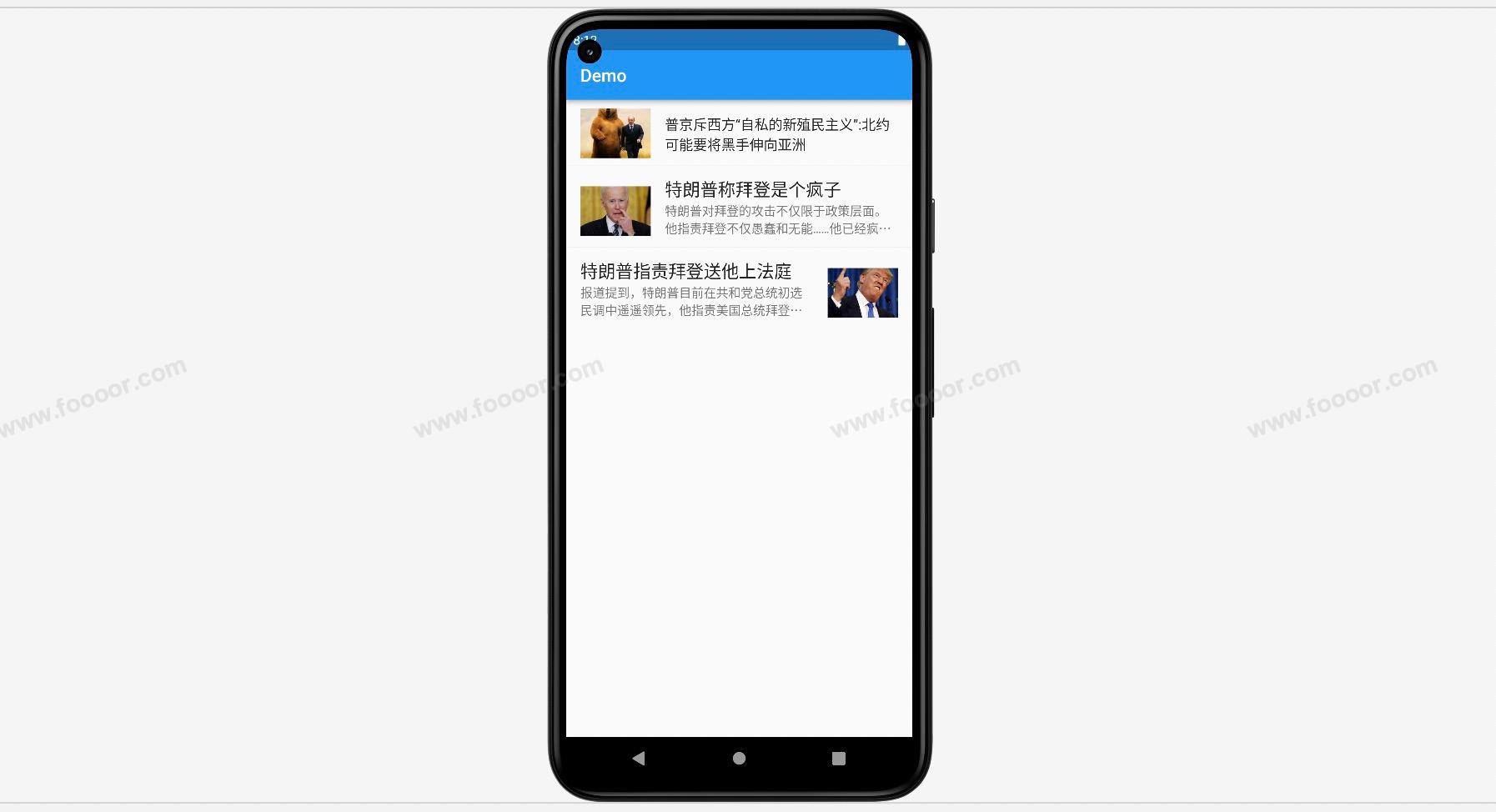
我们只需要修改每个 ListTile 的设置即可。
代码如下:
dart
import 'package:flutter/material.dart';
import './doubi_icon.dart';

void main() => runApp(const MyApp());

/// App根Widget
class MyApp extends StatelessWidget {
  const MyApp({super.key});

  @override
  Widget build(BuildContext context) {
    return const MaterialApp(
      debugShowCheckedModeBanner: false,
      home: DemoPage(),
    );
  }
}

/// 页面
class DemoPage extends StatelessWidget {
  const DemoPage({super.key});

  @override
  Widget build(BuildContext context) {
    return Scaffold(
        appBar: AppBar(
          title: const Text('Demo'),
        ),
        body: ListView(
          padding: const EdgeInsets.fromLTRB(0, 10, 0, 0),      // 列表距离上面过于接近,这里设置一下padding
          children: [
            // --------------------- item ---------------------
            ListTile(
              leading: Image.network(
                  fit: BoxFit.cover,
                  width: 80,
                  "http://doubibiji.com/open-assets/img/pujing.jpg"),
              title: const Text('普京斥西方“自私的新殖民主义”:北约可能要将黑手伸向亚洲'),
            ),
            const Divider(),
            // --------------------- item ---------------------
            ListTile(
              leading: Image.network(
                  fit: BoxFit.cover,
                  width: 80, // leading 默认是占据 ListTile 的高度,所以这里Image的高度调整不了
                  "http://doubibiji.com/open-assets/img/baideng.jpg"),
              title: const Text(
                "特朗普称拜登是个疯子",
                maxLines: 1,
                style: TextStyle(fontSize: 20),
              ),
              subtitle: const Text(
                "特朗普对拜登的攻击不仅限于政策层面。他指责拜登不仅愚蠢和无能……他已经疯了,是个彻头彻尾的疯子",
                overflow: TextOverflow.ellipsis,
                maxLines: 2,
              ),
            ),
            const Divider(),
            // --------------------- item ---------------------
            ListTile(
              trailing: Image.network(              // trailing 也可以设置成图片
                  fit: BoxFit.cover,
                  width: 80,
                  "http://doubibiji.com/open-assets/img/telangpu.jpg"),
              title: const Text(
                "特朗普指责拜登送他上法庭",
                maxLines: 1,
                style: TextStyle(fontSize: 20),
              ),
              subtitle: const Text(
                "报道提到,特朗普目前在共和党总统初选民调中遥遥领先,他指责美国总统拜登下令对他进行调查。 ",
                overflow: TextOverflow.ellipsis,
                maxLines: 2,
              ),
            ),
          ],
        ));
  }
}
ListTile 在构建列表的时候很方便,因为可以设置leading 、title 、trailing 为一个 Container 组件,然后在Container 组件设置想要的样式就更方便了。
但是有一些设置不太好调整,例如调整图标和文字的距离,所以很多情况下,我们需要自己自定义自己的布局,这个后面再讲。
2 动态列表
上面我们构建的列表,列表中的数据都是写死的,但是实际开发中,列表中的数据都是动态的,一般都是请求服务器获取一个数据列表,然后将列表中的数据通过 ListView 展示出来。下面我们来构建一个动态的列表。
先看代码:
dart
import 'package:flutter/material.dart';

void main() => runApp(const MyApp());

/// App根Widget
class MyApp extends StatelessWidget {
  const MyApp({super.key});

  @override
  Widget build(BuildContext context) {
    return const MaterialApp(
      debugShowCheckedModeBanner: false,
      home: DemoPage(),
    );
  }
}

/// 页面
class DemoPage extends StatelessWidget {
  const DemoPage({super.key});

  @override
  Widget build(BuildContext context) {
    return Scaffold(
        appBar: AppBar(
          title: const Text('Container Demo'),
        ),
        //------------------ 构建动态ListView ---------------------
        body: ListView.builder(
            itemCount: 20,                    // itemCount表示itemBuilder将会执行的次数
            itemBuilder: (context, index) {   // itemBuilder函数用于Item
              return ListTile(title: Text("第 $index 个Item"));
            })
    );
  }
}
在上面的代码中,我么使用 ListView.builder 来构建一个 ListView 。其中涉及到两个参数, itemCount 表示 itemBuilder 将被执行的次数, itemBuilder 是一个函数,返回的是一个 Widget ,也就是列表中的 item ,函数接收两个参数,一个是 context 表示上下文对象, index 表示是第几个 item 。所以上面的代码执行后, itemBuilder 将会被执行20次,每次执行将 index 传递给 itemBuilder 。
Flutter 的 ListView.builder 构造函数可以动态地构建列表项,只在需要的时候创建,并且会复用已经创建的列表项,避免不必要的性能开销。
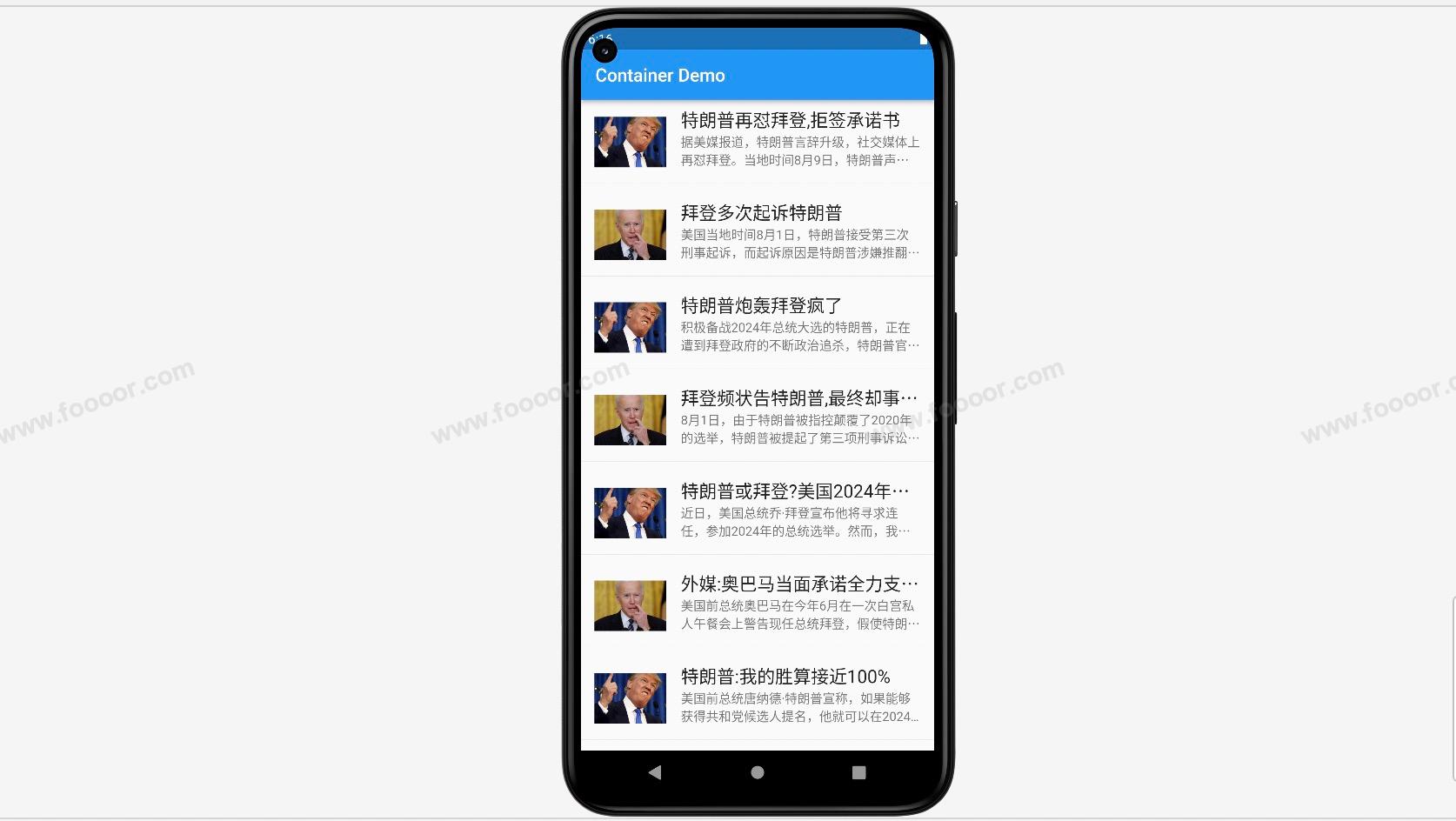
执行效果:

在实际的开发中,都是从服务器获取到一个列表数据,然后将列表数据使用ListView 进行展示。
下面我们将新闻数据放到一个List中,模拟是从服务器获取的。
news_list.dart
dart
List<Map<String, String>> newsList = [
  {
    "cover":"http://doubibiji.com/open-assets/img/telangpu.jpg",
    "title":"特朗普再怼拜登,拒签承诺书",
    "subtitle":"据美媒报道,特朗普言辞升级,社交媒体上再怼拜登。当地时间8月9日,特朗普声明,他本人拒绝签署要求候选人参加首场初选辩论的对共和党忠诚承诺书。",
  },
  {
    "cover":"http://doubibiji.com/open-assets/img/baideng.jpg",
    "title":"拜登多次起诉特朗普",
    "subtitle":"美国当地时间8月1日,特朗普接受第三次刑事起诉,而起诉原因是特朗普涉嫌推翻2020年的大选结果。",
  },
  {
    "cover":"http://doubibiji.com/open-assets/img/telangpu.jpg",
    "title":"特朗普炮轰拜登疯了",
    "subtitle":"积极备战2024年总统大选的特朗普,正在遭到拜登政府的不断政治追杀,特朗普官司缠身已严重影响了2024年总统大选的竞选活动,被彻底激怒的特朗普对拜登发起连续猛烈的炮轰。",
  },
  {
    "cover":"http://doubibiji.com/open-assets/img/baideng.jpg",
    "title":"拜登频状告特朗普,最终却事与愿违",
    "subtitle":"8月1日,由于特朗普被指控颠覆了2020年的选举,特朗普被提起了第三项刑事诉讼。这是一个非常严重的罪名,并且将国会暴乱的责任推到了特朗普身上。",
  },
  {
    "cover":"http://doubibiji.com/open-assets/img/telangpu.jpg",
    "title":"特朗普或拜登?美国2024年总统选举再掀风波",
    "subtitle":"近日,美国总统乔·拜登宣布他将寻求连任,参加2024年的总统选举。然而,我个人更倾向于唐纳德·特朗普再次当选美国总统。",
  },
  {
    "cover":"http://doubibiji.com/open-assets/img/baideng.jpg",
    "title":"外媒:奥巴马当面承诺全力支持拜登连任",
    "subtitle":"美国前总统奥巴马在今年6月在一次白宫私人午餐会上警告现任总统拜登,假使特朗普如愿赢得明年的共和党总统候选人提名,那么他将在2024年的总统选举中成为拜登的巨大挑战。",
  },
  {
    "cover":"http://doubibiji.com/open-assets/img/telangpu.jpg",
    "title":"特朗普:我的胜算接近100%",
    "subtitle":"美国前总统唐纳德·特朗普宣称,如果能够获得共和党候选人提名,他就可以在2024年美国总统选举中击败长期以来的政治对手——现任总统乔·拜登。",
  },
  {
    "cover":"http://doubibiji.com/open-assets/img/baideng.jpg",
    "title":"拜登要把特朗普关进“黑监狱”",
    "subtitle":"动用司法武器清除异己,这在美国历史中并不新鲜,但像如今的特朗普和拜登这样杀红了眼,却并不常见。 ",
  },
  {
    "cover":"http://doubibiji.com/open-assets/img/telangpu.jpg",
    "title":"特朗普入狱,拜登认输,美国或迎来5大劫难!",
    "subtitle":"拜登上台之后,一直吹嘘自己能够将美国带入一个全新的高度,可现下美国不但没有进一步的发展,反而还在拖别国后腿,这五大劫难美国在所难逃。",
  },
  {
    "cover":"http://doubibiji.com/open-assets/img/baideng.jpg",
    "title":"拜登特朗普存在两大共同问题,未来的美国总统,仍可能是位新人",
    "subtitle":"下一任美国总统,究竟会是谁呢?目前,拜登和特朗普这对“老冤家”,已经陷入了缠斗,似乎二人将再次上演“终极对决”。",
  },

];
然后在 main.dart 中引入 news_list.dart ,并在构建 ListView 的时候,使用 newsList 来构建。
dart
import 'package:flutter/material.dart';
import './news_list.dart';

void main() => runApp(const MyApp());

/// App根Widget
class MyApp extends StatelessWidget {
  const MyApp({super.key});

  @override
  Widget build(BuildContext context) {
    return const MaterialApp(
      debugShowCheckedModeBanner: false,
      home: DemoPage(),
    );
  }
}

/// 页面
class DemoPage extends StatelessWidget {
  const DemoPage({super.key});

  @override
  Widget build(BuildContext context) {
    return Scaffold(
        appBar: AppBar(
          title: const Text('Container Demo'),
        ),
        //------------------ 构建动态新闻列表ListView ---------------------
        body: ListView.builder(
            itemCount: newsList.length,                    // itemCount表示itemBuilder将会执行的次数
            itemBuilder: (context, index) {   						 // itemBuilder函数用于Item
              return Column(children: [
                ListTile(
                  contentPadding: const EdgeInsets.fromLTRB(15, 5, 15, 5),
                  leading: Image.network(
                    newsList[index]['cover'] ?? '',
                    fit: BoxFit.cover,
                    width: 80,
                  ),
                  title: Text(
                    newsList[index]['title'] ?? '',
                    overflow: TextOverflow.ellipsis,
                    maxLines: 1,
                    style: const TextStyle(fontSize: 20),
                  ),
                  subtitle: Text(
                    newsList[index]['subtitle'] ?? '',
                    overflow: TextOverflow.ellipsis,
                    maxLines: 2,
                  ),
                ),
                const Divider()
              ],);
            })
    );
  }
}
首先 itemCount 就是 newsList 的长度,这样就会构建这么多个 item , itemBuilder 用来构建 item ,这里因为要用到分隔线,所以使用使用 Column 来布局,在每个 ListTile 下面添加一个分割线。在构建 ListTile 的时候,通过 index 在 newsList中获取新闻的信息。
显示效果:
3 水平列表
有时候我们可能会用到水平滚动的列表,水平滚动的列表的实现和垂直列表是一样的,只需要设置ListView的属性为 scrollDirection: Axis.horizontal 即可。
水平列表和垂直列表的宽度和高度是有区别的。垂直列表中 Item 的宽度是跟随 ListView 的宽度的自适应的,而 ListView 的宽度是靠包裹 ListView 的容器确定的,默认是填充整个页面的,我们在实现 Item 的时候,只能调整 Item 的高度。如果要调整 Item 的宽度,只能通过包裹 ListView 的容器来调整 ListView 的宽度,进而调整 Item 的宽度。
而水平列表的高度是跟随 ListView 的高度自适应的,默认也是填充这个页面的,如果要调整水平列表的高度,只能通过调整 ListView 的高度来实现,而调整 ListView 的高度,只能通过调整包裹 ListView 的容器来实现。可以在 ListView 外面包裹一个 Container 或SizedBox。
举个栗子:
dart
import 'package:flutter/material.dart';
import './news_list.dart';

void main() => runApp(const MyApp());

/// App根Widget
class MyApp extends StatelessWidget {
  const MyApp({super.key});

  @override
  Widget build(BuildContext context) {
    return const MaterialApp(
      debugShowCheckedModeBanner: false,
      home: DemoPage(),
    );
  }
}

/// 页面
class DemoPage extends StatelessWidget {
  const DemoPage({super.key});

  @override
  Widget build(BuildContext context) {
    return Scaffold(
        appBar: AppBar(
          title: const Text('Demo'),
        ),
        //------------------ ListView ---------------------
        body: SizedBox(				// SizedBox限制ListView的高度
          height: 120,
          child: ListView(
            scrollDirection: Axis.horizontal,  // 设置ListView的方向
            children: [
              Container(
                width: 120,										 // 设置item的宽度
                decoration: const BoxDecoration(color: Colors.red),
              ),
              Container(
                width: 120,
                decoration: const BoxDecoration(color: Colors.black),
              ),
              Container(
                width: 120,
                decoration: const BoxDecoration(color: Colors.green),
              ),
              Container(
                width: 120,
                decoration: const BoxDecoration(color: Colors.yellow),
              )
            ],
          ),
        )
    );
  }
}
通过 SizedBox 限制 ListView 的高度,否则高度将充满屏幕。然后通过 scrollDirection 设置 ListView 的方向为水平方向。然后通过 Container 创建了4个 Item。
显示效果:

4.13 网格组件GridView
GridView 是一个用于展示网格布局的组件,它可以在水平和垂直方向上排列子组件,通常用于展示一系列相似的数据项,比如图片、卡片、图标等。GridView 可以根据指定的行数、列数或交叉轴上的子组件的最大宽度来排列子组件。
GridView创建网格列表主要有下面三种方式
通过GridView.count 实现网格布局
通过GridView.extent 实现网格布局
通过GridView.builder实现动态网格布局
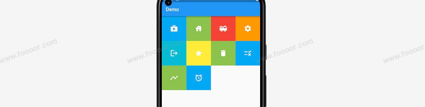
1 GridView.count
使用 GridView.count 创建 GridView,可以通过 crossAxisCount 参数指定每一行元素的个数。
dart
import 'package:flutter/material.dart';

void main() => runApp(const MyApp());

/// App根Widget
class MyApp extends StatelessWidget {
  const MyApp({super.key});

  @override
  Widget build(BuildContext context) {
    return const MaterialApp(
      debugShowCheckedModeBanner: false,
      home: DemoPage(),
    );
  }
}

/// 页面
class DemoPage extends StatelessWidget {
  const DemoPage({super.key});

  @override
  Widget build(BuildContext context) {
    return Scaffold(
        appBar: AppBar(
          title: const Text('Demo'),
        ),
        // ------------------使用GridView.count创建GridView--------------------
        body: GridView.count(
          crossAxisCount: 4,      // 设置每一行元素的个数
          children: const [
            IconButton(icon: Icons.shop, color: Colors.lightBlue),
            IconButton(icon: Icons.house, color: Colors.lightGreen),
            IconButton(icon: Icons.fire_truck, color: Colors.red),
            IconButton(icon: Icons.settings, color: Colors.orange),
            IconButton(icon: Icons.logout, color: Colors.cyan),
            IconButton(icon: Icons.star, color: Colors.yellow),
            IconButton(icon: Icons.delete, color: Colors.lightGreen),
            IconButton(icon: Icons.rule, color: Colors.lightBlue),
            IconButton(icon: Icons.timeline, color: Colors.lightGreen),
            IconButton(icon: Icons.access_alarm, color: Colors.lightBlue),
          ],
        ));
  }
}

// 自定义一个按钮组件
class IconButton extends StatelessWidget {
  final Color color;
  final double size;
  final IconData icon;

  const IconButton(
      {super.key,
      required this.icon,
      this.color = Colors.blue,
      this.size = 32.0});

  @override
  Widget build(BuildContext context) {
    return Container(
      height: 100.0,
      width: 100.0,
      color: color,
      child: Center(child: Icon(icon, size: size, color: Colors.white)),
    );
  }
}
在上面的代码中,通过 GridView.count 创建了 GridView ,并在 GridView 中添加了很多的自定义按钮,并通过 crossAxisCount 设置每一行元素的个数。
元素本身设置的宽高会失效。
显示效果:
2 GridView.extent
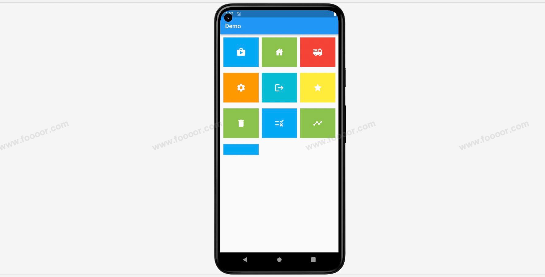
使用 GridView.extent 创建 GridView,是通过 maxCrossAxisExtent 参数来控制每一个元素允许的最大宽度来设置每一行元素的个数的。
举个栗子:
dart
import 'package:flutter/material.dart';

void main() => runApp(const MyApp());

/// App根Widget
class MyApp extends StatelessWidget {
  const MyApp({super.key});

  @override
  Widget build(BuildContext context) {
    return const MaterialApp(
      debugShowCheckedModeBanner: false,
      home: DemoPage(),
    );
  }
}

/// 页面
class DemoPage extends StatelessWidget {
  const DemoPage({super.key});

  @override
  Widget build(BuildContext context) {
    return Scaffold(
        appBar: AppBar(
          title: const Text('Demo'),
        ),
        // ------------------使用GridView.extent创建GridView--------------------
        body: GridView.extent(
          maxCrossAxisExtent: 120,      // 元素最大宽度不会超过120
          children: const [
            IconButton(icon: Icons.shop, color: Colors.lightBlue),
            IconButton(icon: Icons.house, color: Colors.lightGreen),
            IconButton(icon: Icons.fire_truck, color: Colors.red),
            IconButton(icon: Icons.settings, color: Colors.orange),
            IconButton(icon: Icons.logout, color: Colors.cyan),
            IconButton(icon: Icons.star, color: Colors.yellow),
            IconButton(icon: Icons.delete, color: Colors.lightGreen),
            IconButton(icon: Icons.rule, color: Colors.lightBlue),
            IconButton(icon: Icons.timeline, color: Colors.lightGreen),
            IconButton(icon: Icons.access_alarm, color: Colors.lightBlue),
          ],
        ));
  }
}

// 自定义一个按钮组件
class IconButton extends StatelessWidget {
  final Color color;
  final double size;
  final IconData icon;

  const IconButton(
      {super.key,
      required this.icon,
      this.color = Colors.blue,
      this.size = 32.0});

  @override
  Widget build(BuildContext context) {
    return Container(
      height: 100.0,
      width: 100.0,
      color: color,
      child: Center(child: Icon(icon, size: size, color: Colors.white)),
    );
  }
}
使用 GridView.extent 创建,通过 maxCrossAxisExtent 设置每个元素的最大宽度不会超过120,然后在这个约束条件下,尽可能多的在每一行显示子元素。
显示效果和上面的一样:
3 GridView 属性设置
我们可以通过属性设置 GridView 中各个元素的间距,以及宽高的比例。
举个栗子:
dart
import 'package:flutter/material.dart';
void main() => runApp(const MyApp());
/// App根Widget
class MyApp extends StatelessWidget {
const MyApp({super.key});
@override
Widget build(BuildContext context) {
return const MaterialApp(
debugShowCheckedModeBanner: false,
home: DemoPage(),
);
}
}
/// 页面
class DemoPage extends StatelessWidget {
const DemoPage({super.key});
@override
Widget build(BuildContext context) {
return Scaffold(
appBar: AppBar(
title: const Text('Demo'),
),
body: SizedBox(
height: 400, // 用来限制GridView的高度
// -------------------- GridView设置 -------------------
child: GridView.count(
scrollDirection: Axis.vertical, // 设置主轴的方向
padding: const EdgeInsets.all(10), // 设置GridView的内边距
crossAxisCount: 3, // 设置每行显示3个元素
mainAxisSpacing: 20, // 设置主轴的间距,这里是垂直间距
crossAxisSpacing: 10, // 设置交叉轴的间距,这里是水平间距
childAspectRatio: 1.2, // 设置宽高比例,宽度是高度的1.2倍
children: const [
IconButton(icon: Icons.shop, color: Colors.lightBlue),
IconButton(icon: Icons.house, color: Colors.lightGreen),
IconButton(icon: Icons.fire_truck, color: Colors.red),
IconButton(icon: Icons.settings, color: Colors.orange),
IconButton(icon: Icons.logout, color: Colors.cyan),
IconButton(icon: Icons.star, color: Colors.yellow),
IconButton(icon: Icons.delete, color: Colors.lightGreen),
IconButton(icon: Icons.rule, color: Colors.lightBlue),
IconButton(icon: Icons.timeline, color: Colors.lightGreen),
IconButton(icon: Icons.access_alarm, color: Colors.lightBlue),
],
),
));
}
}
// 自定义一个按钮组件
class IconButton extends StatelessWidget {
final Color color;
final double size;
final IconData icon;
const IconButton(
{super.key,
required this.icon,
this.color = Colors.blue,
this.size = 32.0});
@override
Widget build(BuildContext context) {
return Container(
height: 100.0,
width: 100.0,
color: color,
child: Center(child: Icon(icon, size: size, color: Colors.white)),
);
}
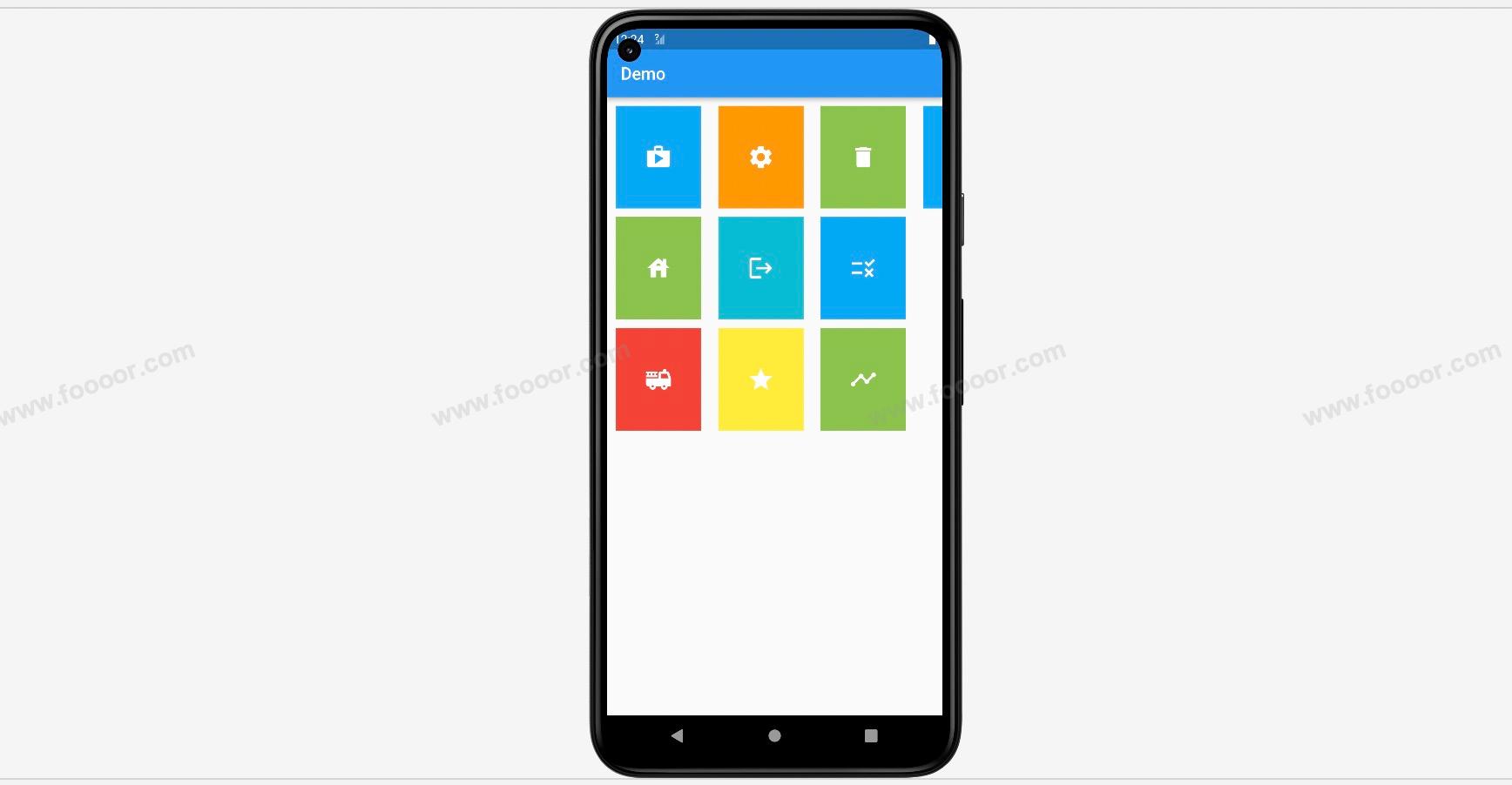
}在上面的代码中,我们通过属性设置了 GridView 中的各个属性,解释一下:
| 属性 | 说明 |
|---|---|
| scrollDirection | 滚动的方向,其实也是主轴的方向 |
| padding | 整个GridView的内边距 |
| mainAxisSpacing | 主轴方向上的间距 |
| crossAxisSpacing | 交叉轴上的间距 |
| childAspectRatio | 宽高的比例 |
| crossAxisCount | 每一行元素的个数。 |
我们通过 scrollDirection 设置了滚动的方向,默认就是 Axis.vertical 的,也就是垂直方向的,所以超出 SizedBox 限制的尺寸部分,是可以进行滚动的。
显示效果:
当我们修改 scrollDirection 的方向为水平方向( Axis.horizontal )呢?
显示效果发生了很大的变化:
可以看到滚动方向 scrollDirection 会影响主轴方向,元素的排列方向变化了,水平和垂直方向的间距也调换了。也影响到了 childAspectRatio ,滚动方向为垂直方向时,childAspectRatio 表示宽和高比例,滚动方向为水平时,childAspectRatio 表示高和宽的比例。
4 GridView.builder
GridView.builder 和 ListView.builder 的用法类似,可以帮助我们使用数据动态的构建 GridView 。
在下面的例子中,我们创建了一个集合,然后在构建 GridView 的时候,根据集合的数据来动态的构建。
代码如下:
dart
import 'package:flutter/material.dart';
void main() => runApp(const MyApp());
/// App根Widget
class MyApp extends StatelessWidget {
const MyApp({super.key});
@override
Widget build(BuildContext context) {
return const MaterialApp(
debugShowCheckedModeBanner: false,
home: DemoPage(),
);
}
}
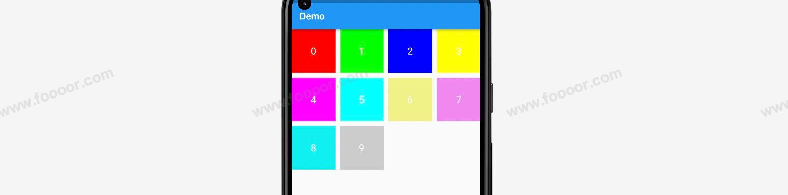
List<Map<String, dynamic>> dataList = [
{"text": "0", "color": 0xffff0000},
{"text": "1", "color": 0xff00ff00},
{"text": "2", "color": 0xff0000ff},
{"text": "3", "color": 0xffffff00},
{"text": "4", "color": 0xffff00ff},
{"text": "5", "color": 0xff00ffff},
{"text": "6", "color": 0xfff0f088},
{"text": "7", "color": 0xfff088f0},
{"text": "8", "color": 0xff00f0f0},
{"text": "9", "color": 0xffcccccc},
];
/// 页面
class DemoPage extends StatelessWidget {
const DemoPage({super.key});
@override
Widget build(BuildContext context) {
return Scaffold(
appBar: AppBar(
title: const Text('Demo'),
),
body: SizedBox(
height: 400,
// -------------------- GridView设置 -------------------
child: GridView.builder(
itemCount: dataList.length,
gridDelegate: const SliverGridDelegateWithFixedCrossAxisCount(
crossAxisCount: 4,
mainAxisSpacing: 10,
crossAxisSpacing: 10,
),
itemBuilder: (context, index) {
return GridItem(
text: "${dataList[index]["text"]}",
color: dataList[index]["color"]);
}),
));
}
}
// 自定义Item组件
class GridItem extends StatelessWidget {
final String text;
final int color;
const GridItem({super.key, required this.text, required this.color});
@override
Widget build(BuildContext context) {
return Container(
color: Color(color),
child: Center(
child: Text(
text,
style: const TextStyle(fontSize: 20, color: Colors.white),
)),
);
}
}在上面的代码中,我们首先创建了自定义的 Item 组件,接收文本和背景颜色,用于 GridView 的构建。
在构建 GridView 的时候,使用 GridView.builder 来构建,itemCount 参数表示 Item 的个数,根据集合的长度来构建。
gridDelegate 用于对 GridView 进行设置,和之前构建 GridVied 的参数类似,但是这里接收的数据类型是 SliverGridDelegateWithFixedCrossAxisCount,针对的是使用 crossAxisCount 参数构建 GridView 的情况,还有一种类型是 SliverGridDelegateWithMaxCrossAxisExtent,针对的是使用 参数来构建 GridView 的情况,可以根据需要选用指定的类型。
itemBuilder 接收的是一个函数,返回的是 GridView 中的每个元素 Item ,函数的有两个参数,和之前构建 ListView 时候的参数是一样的,context 表示上下文对象,index 表示当前的序号,我们可以根据 index 在 dataList 中取数据,来构建和返回每一个 Item。
显示效果:
4.14 层叠组件Stack
在前面学习的布局中,是没办法实现层叠效果的,例如将文字显示在图片上。下面我们来学习层叠组件 Stack。使用层叠结构,可以实现悬浮的组件。
Stack 是一个用于堆叠排列子组件的布局组件,它允许你将多个子组件在相同位置叠加显示,从而实现复杂的布局效果。我们还可以使用 Stack 结合 Align 或者 Stack 结合 Positiond 来实现页面的定位布局。
举个栗子:
dart
import 'package:flutter/material.dart';
void main() => runApp(const MyApp());
/// App根Widget
class MyApp extends StatelessWidget {
const MyApp({super.key});
@override
Widget build(BuildContext context) {
return const MaterialApp(
debugShowCheckedModeBanner: false,
home: DemoPage(),
);
}
}
/// 页面
class DemoPage extends StatelessWidget {
const DemoPage({super.key});
@override
Widget build(BuildContext context) {
return Scaffold(
appBar: AppBar(
title: const Text('Demo'),
),
body: Container(
width: double.infinity,
height: 400,
color: Colors.grey,
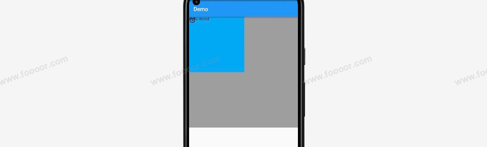
child: Stack(
children: [
Container(width: 200, height: 200, color: Colors.lightBlue),
const Icon(Icons.access_alarm),
const Text("Hello World")
],
),
)
);
}
}我们在 Container 组件中放了一个 Stack 组件,然后在Stack组件中放了三个子组件(Container、Icon、Text),通过效果可以看出三个子组件叠加到一起了。
显示效果:
那么如何设置子组件在父组件中的位置呢?
可以使用 Stack 结合 Positioned 组件来定位,也可以使用 Stack 结合 Align 组件来定位。
1 Stack和Positioned
可以使用Positioned组件将子组件包裹,然后对子组件进行定位。
举个栗子:
dart
import 'package:flutter/material.dart';
void main() => runApp(const MyApp());
/// App根Widget
class MyApp extends StatelessWidget {
const MyApp({super.key});
@override
Widget build(BuildContext context) {
return const MaterialApp(
debugShowCheckedModeBanner: false,
home: DemoPage(),
);
}
}
/// 页面
class DemoPage extends StatelessWidget {
const DemoPage({super.key});
@override
Widget build(BuildContext context) {
return Scaffold(
appBar: AppBar(
title: const Text('Demo'),
),
body: Container(
width: double.infinity,
height: 400,
color: Colors.grey,
// ------------------ Stack -------------------
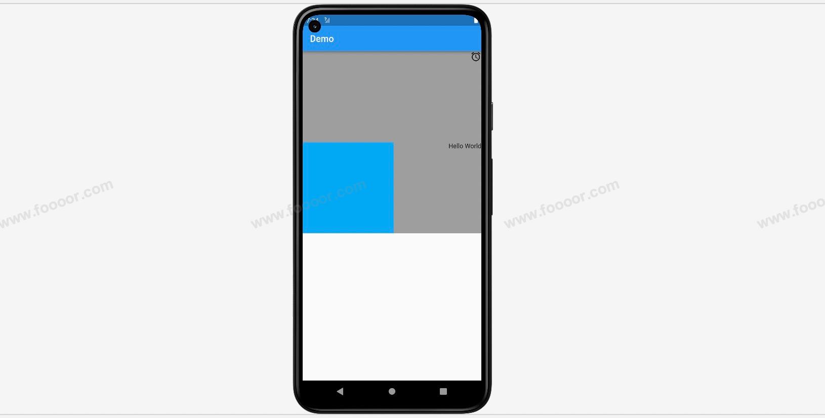
child: Stack(
children: [
Positioned( // 使用Positioned控制位置
left: 0,
bottom: 0,
width: 100,
height: 100,
child: Container(width: 200, height: 200, color: Colors.lightBlue)),
Positioned(
right: 0,
child: Icon(Icons.access_alarm)
),
Positioned(
right: 0,
top: 200,
child: const Text("Hello World")
)
],
),
));
}
}在 Stack 组件中,使用 Positioned 组件将子组件进行包裹,然后通过 Positioned 组件的 top、bottom、left、right 属性,来设置子组件上下左右的距离。
注意:top、bottom、left、right是相对于Stack的外部容器进行定位的,如果Stack没有外部容器,则相对于页面进行定位的。
所以如果 Stack 不是作为根组件,建议使用 Container 或 SizedBox 包裹。
显示效果:
除了可以使用 Positioned 组件控制子组件的位置,还可以使用 width 和 height 属性控制子组件的大小。
举个栗子:
dart
import 'package:flutter/material.dart';
void main() => runApp(const MyApp());
/// App根Widget
class MyApp extends StatelessWidget {
const MyApp({super.key});
@override
Widget build(BuildContext context) {
return const MaterialApp(
debugShowCheckedModeBanner: false,
home: DemoPage(),
);
}
}
/// 页面
class DemoPage extends StatelessWidget {
const DemoPage({super.key});
@override
Widget build(BuildContext context) {
// 获取屏幕尺寸
final size = MediaQuery.of(context).size;
final screenWidth = size.width;
return Scaffold(
appBar: AppBar(
title: const Text('Demo'),
),
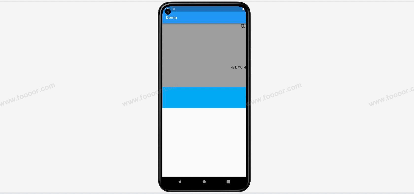
body: Container(
width: double.infinity,
height: 400,
color: Colors.grey,
// ------------------ Stack -------------------
child: Stack(
children: [
Positioned( // 使用Positioned控制位置
left: 0,
bottom: 0,
width: screenWidth, // 设置和屏幕一样宽,这里不能使用double.infinity
height: 100,
child: Container(width: 200, height: 200, color: Colors.lightBlue)),
Positioned(
right: 0,
child: Icon(Icons.access_alarm)
),
Positioned(
right: 0,
top: 200,
child: const Text("Hello World")
)
],
),
));
}
}在上面的代码中,通过 Positioned 组件设置了 Container 组件的宽高,这里设置了宽度和屏幕一样宽,但是需要注意,这里的 width 和 height 必须是必须是固定值,所以不能设置为 double.infifinity ,我们可以使用 MediaQuery.of(context).size 获取屏幕的尺寸,然后进行设置。
上面虽然 Container 自身设置了宽高,但是因为设置了在 Positioned 组件中设置了宽高,所以 Container 自身的设置失效了。
建议通过 Positioned 组件设置子组件的宽度和高度。
显示效果:
2 Stack和Align
在讲解 Stack 和 Align 进行层叠布局之间,先讲解一下 Align 组件。
其实 Center 组件是继承自Align组件的,Container 组件也是可以结合 Align 组件来实现内部组件的定位。
在之前 Container 组件中子组件的定位是使用 alignment 属性来控制的,例如:
dart
Container(
  color: Colors.lightBlue,
  alignment: Alignment.center,
  child: const Text("Hello Doubi"),
)
还可以将子组件使用 Align 组件组件来包裹,然后设置 Align 组件的 alignment 属性来实现定位,例如:
dart
Container(
  color: Colors.lightBlue,
  alignment: Alignment.center,
  child: const Align(
    alignment: Alignment.center,
    child: Text("Hello Doubi"),
  )
)
结果是一样的。
查看 Alignment.center 的值,发现值是 Alignment(0.0, 0.0) ,其实是可以通过设置 alignment 属性来指定子组件在父组件的任何位置的。子组件是以 Container 的中心点作为坐标原点,即 Alignment(0.0, 0.0) ,其余各个点的坐标如下:

可以通过 Alignment(x, y) 来控制子组件的位置,具体的计算公式如下:
dart
(Alignment.x * childWidth/2 + childWidth/2, Alignment.y * childHeight/2 + childHeight/2)举个栗子:
dart
import 'package:flutter/material.dart';
void main() => runApp(const MyApp());
/// App根Widget
class MyApp extends StatelessWidget {
const MyApp({super.key});
@override
Widget build(BuildContext context) {
return const MaterialApp(
debugShowCheckedModeBanner: false,
home: DemoPage(),
);
}
}
/// 页面
class DemoPage extends StatelessWidget {
const DemoPage({super.key});
@override
Widget build(BuildContext context) {
return Scaffold(
appBar: AppBar(
title: const Text('Demo'),
),
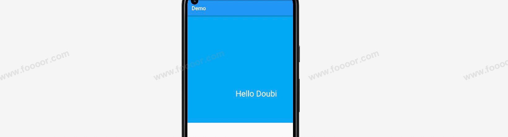
body: Container(
width: double.infinity,
height: 400,
color: Colors.grey,
// ------------------ Container 和 Align 的使用 -------------------
child: Container(
color: Colors.lightBlue,
alignment: Alignment.center,
child: const Align(
alignment: Alignment(0.5, 0.5),
child: Text("Hello Doubi", style: TextStyle(fontSize: 30, color: Colors.white)),
),
),
));
}
}在 Container 组件中使用 Align 可以随意的控制子组件在 Container 中的位置。
显示效果:
下面使用 Stack 结合 Align 来实现层叠布局和定位。
dart
import 'package:flutter/material.dart';

void main() => runApp(const MyApp());

/// App根Widget
class MyApp extends StatelessWidget {
  const MyApp({super.key});

  @override
  Widget build(BuildContext context) {
    return const MaterialApp(
      debugShowCheckedModeBanner: false,
      home: DemoPage(),
    );
  }
}

/// 页面
class DemoPage extends StatelessWidget {
  const DemoPage({super.key});

  @override
  Widget build(BuildContext context) {
    return Scaffold(
      appBar: AppBar(
        title: const Text('Demo'),
      ),
      body: SizedBox(
            width: double.infinity,
            height: 40,

            // -------------------Stack 和 Align--------------------------
            child: Stack(
              children: const [
                Align(
                  alignment: Alignment.centerLeft,
                  child: Text("取消"),
                ),
                Align(
                  alignment: Alignment.centerRight,
                  child: Text("确定"),
                ),
              ],
            ),
          )
    );
  }
}
在上面的代码中,使用 Stack 和 Align 来实现了两个按钮的层叠定位。
显示效果如下:

我还是觉得使用 Stack 和 Positioned 更好控制一些。
4.15 布局组件AspectRatio
如果我们想实现在页面上显示一个容器,宽度是屏幕的宽度,高度是宽度的一半,该如何实现呢。
这个时候可以借助 AspectRatio 组件来实现。
举个栗子:
dart
import 'package:flutter/material.dart';

void main() => runApp(const MyApp());

/// App根Widget
class MyApp extends StatelessWidget {
  const MyApp({super.key});

  @override
  Widget build(BuildContext context) {
    return const MaterialApp(
      debugShowCheckedModeBanner: false,
      home: DemoPage(),
    );
  }
}

/// 页面
class DemoPage extends StatelessWidget {
  const DemoPage({super.key});

  @override
  Widget build(BuildContext context) {
    return Scaffold(
      appBar: AppBar(
        title: const Text('Demo'),
      ),
      body: Column(
        children: [
          // -------------使用AspectRatio,设置宽高比为3------------------
          AspectRatio(
            aspectRatio: 3,
            child: Container(
              color: Colors.lightBlue,
            )),
        ],
      )
    );
  }
}
在上面的代码中,使用 AspectRatio 包裹 Container,设置宽高比为 3:1。
显示效果: