Appearance
CSS3教程 - 6 盒子模型1
在讲盒子模型之前,我们先介绍一下文档流。
6.1 文档流
文档流,英文名称 normal flow,也就是正常的流。
网页是一个有很多层一层一层摞起来的,CSS分别为每一层来设置样式,我们看到的是从最上面俯视看到的效果。而在这些层中,最底下的一层为文档流,文档流是网页的基础。我们所创建的元素,默认都是在文档流中进行排列的。
页面中的元素,主要有两个状态:在文档流中 、 脱离文档流 。
在文档流中的元素有什么特点呢?
1 块元素
- 块元素在页面中独占一行(自上向下垂直排列)
- 默认宽度是父元素的全部(会把父元素撑满)
- 默认高度是被内容(子元素)撑开
2 行内元素
- 行内元素不会独占页面的一行,只占自身的大小
- 行内元素在页面中左向右水平排列(与书写习惯一致)
- 如果一行之中不能容纳下所有的行内元素,则元素会换到第二行继续自左向右排列
- 行内元素的默认宽度和高度都是被内容撑开
举个栗子:
我们定义了很多块元素和行内元素,可以看到它们不同的显示效果。
html
<head>
    <style>
        .box1 {
            width: 100px;
            height: 100px;
            background-color: red;
        }
        .box2 {
            width: 100px;
            height: 100px;
            background-color: blue;
        }
    </style>
</head>

<body>
    <div class="box1"></div>
    <div class="box2"></div>
    <span>诗兴大发,背诗一首</span>
    <span>我有一壶酒,</span>
    <span>足以慰风尘。</span>
    <span>倾尽江海里,</span>
    <span>赠饮天下人。</span>
    <span>网友所作</span>
    <span>好诗!好诗!</span>
</body>
显示效果如下:

可以看到上面,div是块元素,即使将div的宽度设置为很小,第二个div也会单独一行。span为行内元素,会在一行进行排列。
那么元素脱离文档流有什么特点呢,后面会介绍。
6.2 盒子模型
什么是盒子模型
盒子模型(box model),就是CSS将页面中所有的元素都设置为一个长方形的盒子,这样对页面布局的时候,就是将不同的盒子摆放到页面中不同的位置,理解和操作起来就比较简单了。
每一个盒子都由一下几个部分组成:
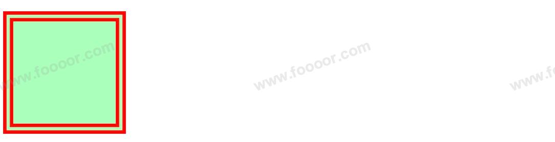
我们将一个盒子放在靠墙的位置来理解
- 内容区(content),相当于箱子里可以放东西的空间;
- 内边距(padding),相当于箱子里的防撞泡沫棉;
- 边框(border):也就是箱子本身;
- 外边距(margin):箱子放在墙边,是箱子和墙或其他箱子的距离
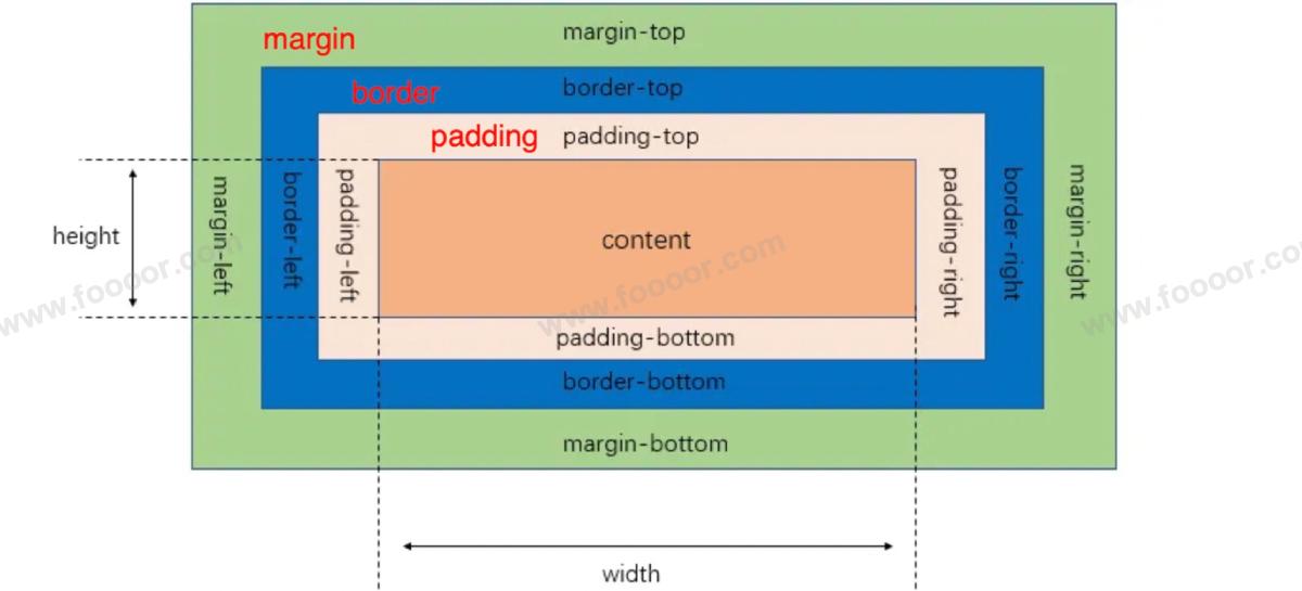
上面的图很重要!
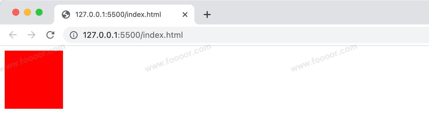
1 内容区
内容区主要用于显示元素的主要内容,内容包括子元素和文本、图片等。
内容区的大小有元素的 width 和 height 属性来设置(不包含padding、border、margin)。
width:设置内容区的宽度height:设置内容区的高度
举个栗子:
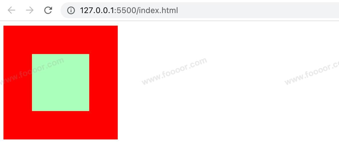
css
.box1 {
    width: 100px;
    height: 100px;
    background-color: red;
}
显示如下:
2 边框
边框属于盒子边缘,边框里边属于盒子内部,出了边框都是盒子的外部。
设置边框至少需要设置三个样式:
border-width :边框的宽度,默认 3px;
border-color :边框的颜色,默认使用 color 的颜色值;
border-style: 边框的样式,没有默认值,必须指定;
举个栗子:
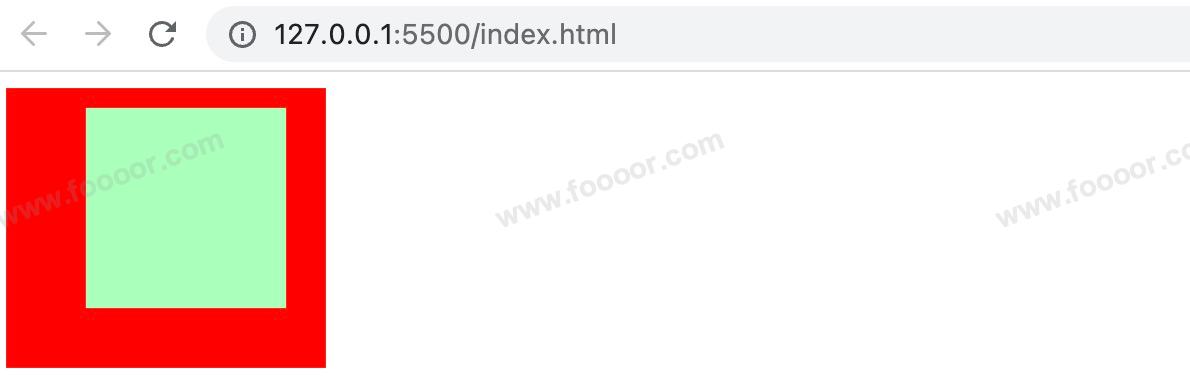
html
<style>
.box1 {
    border-width: 10px;
    border-color: red;
    /* 常用的边框样式
    solid  实线
    dotted 点状虚线
    dashed 虚线
    double 双线
    */
    border-style: solid;

    width: 100px;
    height: 100px;
    background-color: #afb;
}
</style>

<div class="box1"></div>
显示效果如下:

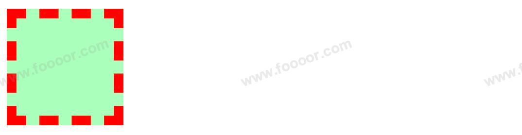
其他边框样式举例:
dotted:
dashed:
double:
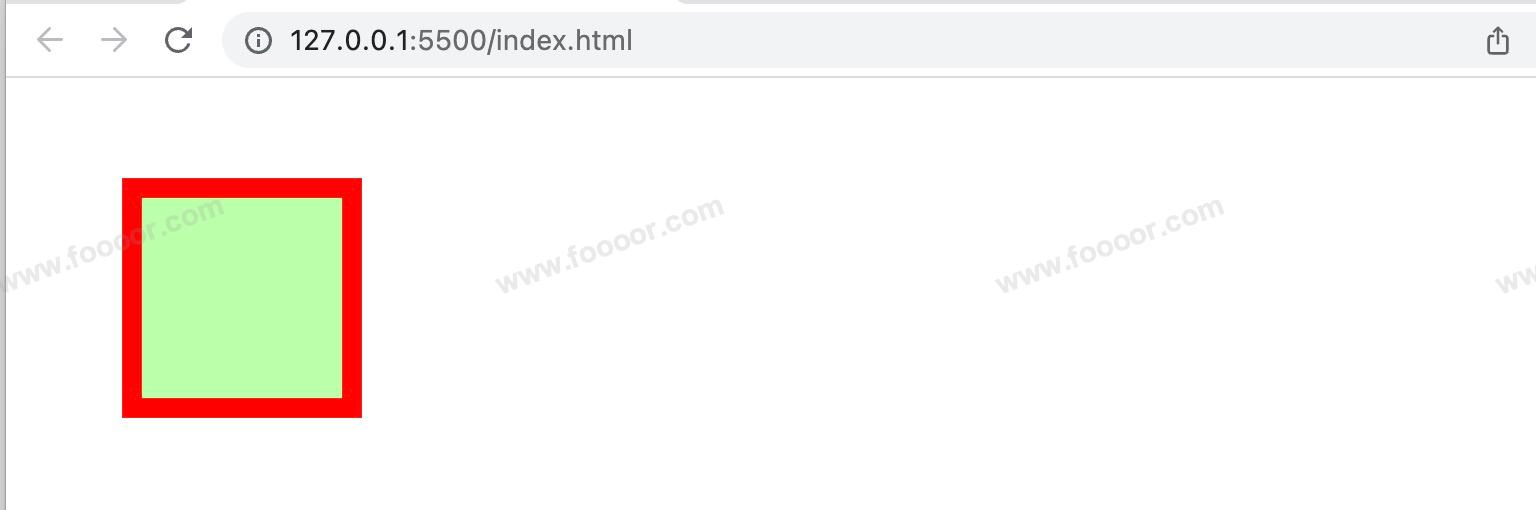
3 边框的大小
非常重要的一点:边框的大小会影响到整个盒子的大小。
例如我们把边框尺寸设置为50px,width设置为100px时,元素的总宽度变成了200px (左50px + 100px + 右50px);
html
<style>
.box1 {
    border-width: 50px;
    border-color: red;
    border-style: solid;

    width: 100px;
    height: 100px;
    background-color: #afb;
}
</style>

<div class="box1"></div>
显示如下:
4 边框的其他设置方式
上面设置边框的时候,是设置的4个方向的边框是统一的样式,还可以对每一个方向的边框设置不同的样式。
我们以 border-width 为例,分别设置四个方向不同的宽度:
css
border-width: 10px 20px 30px 40px;显示的效果如下:
上面是用4个值分别设置了4个方向的宽度,还可以用3个值、2个值来设置
例如:
css
border-width: 10px 20px;
border-width: 10px 20px 30px;
不同个数的值对应的含义如下:
- 一个值:
上下左右 - 四个值:
上 右 下 左, 是顺时针方向 - 两个值:
上下 左右 - 三个值:
上 左右 下
除了上面的写法,还可以针对不同方向的边框,通过对应的属性来设置。
border-width边框的宽度:默认 3pxborder-top-width:上边框的宽度border-right-width:右边框的宽度border-bottom-width:下边框的宽度border-left-width:左边框的宽度
border-color边框的颜色:默认使用 color 的颜色值border-top-color:上边框的颜色border-right-color:右边框的颜色border-bottom-color:下边框的颜色border-left-color:左边框的颜色
border-style边框的样式:没有默认值,必须指定border-top-style:上边框的样式border-right-style:右边框的样式border-bottom-style:下边框的样式border-left-style:左边框的样式
宽度、颜色、样式的简写
border:简写属性,通过该属性可以同时设置边框所有的相关样式,并且没有顺序要求,该方式是最常用的。
css
.box1 {
  border: 10px red solid;
}
还可以通过四个属性单独设置某一个方向的边框样式:
border-top:上边框的宽度、颜色和样式border-right:右边框的宽度、颜色和样式border-bottom:下边框的宽度、颜色和样式border-left:左边框的宽度、颜色和样式
去掉边框样式
如果只要上、左、下三个方向的样式,我们可以这样设置
css
.box1 {
    border-top: 10px red solid;
    border-bottom: 10px red solid;
    border-left: 10px red solid;
}
我们还可以设置4个方向的样式,然后取消某一个方向的样式,如下:
css
.box1 {
    border: 10px red solid;
    border-right: none;
}
通过 none 属性去掉样式。
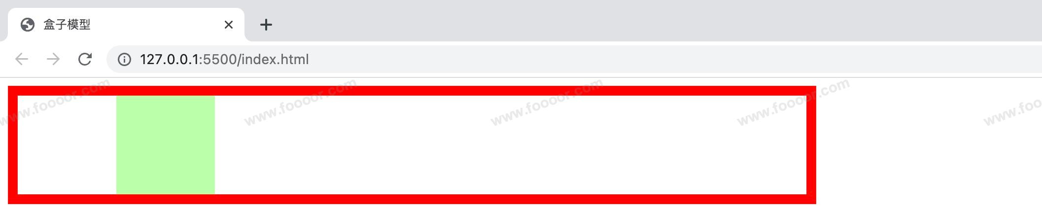
5 内边距
内边距,是内容区和边框之间的空间。
元素一共有4个方向的内边距:
padding-top:上内边距padding-right:右内边距padding-bottom:下内边距padding-left:左内边距
四个属性可以简写为一个 padding 属性,可以同时指定四个方向的内边距,规则和边框中属性值设置一样:
- 四个值:
上 右 下 左, 是顺时针方向 - 三个值:
上 左右 下 - 两个值:
上下 左右 - 一个值:
上下左右
有两点需要特别注意:
- 内边距的设置会影响到盒子的大小;
- 背景颜色会延伸到内边距上。
下面举个栗子:
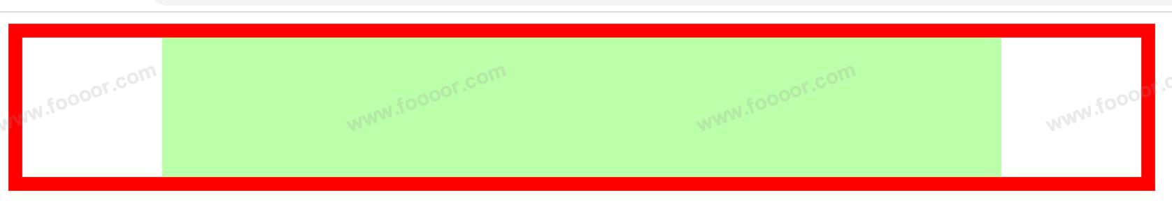
因为背景颜色会延伸到内边距上,所以通过背景颜色无法区分内容区和内边距,所以下面我们在元素内部放了一个子元素,将子元素的宽高撑满父元素的内容区,然后设置了子元素的背景颜色,这样就可以很明显的区分父元素的内容区和内边距。
html
<style>
  .outer {
    width: 200px;
    height: 200px;

    /* 设置边框 */
    border: 10px red solid;

    padding-top: 20px;
    padding-right: 40px;
    padding-bottom: 60px;
    padding-left: 80px;
    /* 可以简写为
    padding: 20px 40px 60px 80px;
    */

    background-color: #65ddff;
  }

  .inner {
    width: 200px;
    height: 200px;
    background-color: greenyellow;
  }
</style>

<div class="outer">
  <div class="inner"></div>
</div>
显示如下:
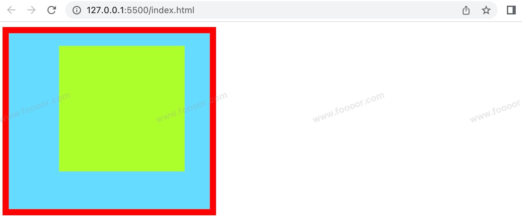
可以看出,outer 设置了一个 padding 属性,其盒子大小被“撑大了”。
盒子可见框的大小,由内容区、内边距和边框共同决定,所以在计算盒子大小时,需要将这三个区域加到一起计算。
6 外边距
外边距,是添加在边框外周围的空间。
注意:外边距不会影响盒子可见框的大小,但是外边距会影响盒子的位置和占用的空间,主要用于布局。
元素一共有四个方向的外边距:
margin-top:上外边距,设置为正值,元素自身向下移动margin-right:右外边距,设置为正值,其右边的元素向右移动,其实这个说法并不准确,对于块元素,设置margin-right不会产生任何效果margin-bottom:下外边距,设置为正值,其下边的元素向下移动,其实这个说法说法并不准确,对于块元素,会有垂直方向上的边距重叠问题(后面会细说)margin-left:左外边距,设置为正值,元素自身向右移动
上面的属性如果设置为负值,则会朝相反的方向移动。
四个属性可以简写为一个 margin 属性,可以同时指定四个方向的外边距,规则和边框中属性值设置一样:
- 四个值:
上 右 下 左, 是顺时针方向 - 三个值:
上 左右 下 - 两个值:
上下 左右 - 一个值:
上下左右
元素在页面中是按照自左向右的顺序排列的,所以默认情况下:
- 如果我们设置的左和上外边距,则会移动元素自身
- 而设置下和右外边距会移动其他元素
举个栗子:
css
.box1 {
    width: 100px;
    height: 100px;
    background-color: #bfa;
    border: 10px red solid;

    margin-top: 50px;
    margin-right: 50px;
    margin-bottom: 50px;
    margin-left: 50px;
}

<body>
		<div class="box1"></div>
</body>
显示如下:
可以看到只有左边距和上边距生效了,因为元素右边和下面没有其他元素,所以没法让右边和下面的元素移动。
当在下面再添加一个div时
css
<style>
    .box1 {
      width: 100px;
      height: 100px;
      background-color: #bfa;
      border: 10px red solid;

      margin-top: 50px;
      margin-right: 50px;
      margin-bottom: 50px;
      margin-left: 50px;
    }
    .box2 {
      width: 100px;
      height: 100px;
      background-color: #bfa;
      border: 10px red solid;
    }
</style>
<body>
    <div class="box1"></div>
  	<div class="box2"></div>
</body>
显示效果如下:
6.3 水平方向布局
元素在其父元素中水平方向的位置由以下几个属性共同决定:
margin-leftborder-leftpadding-leftwidthpadding-rightborder-rightmargin-right
一个元素在其父元素中,水平布局必须要满足以下的等式:
margin-left + border-left + padding-left + width + padding-right + border-right + margin-right = 其父元素的宽度
以上等式必须满足,如果相加结果使等式不成立,则称为:过渡约束
如果出现过渡约束,则等式会自动调整,以确保满足上面公式。
举个栗子:
html
<style>
    .outer {
      width: 800px;
      height: 100px;
      border: 10px red solid;
    }
    .inner {
      width: 100px;
      height: 100px;
      margin-left: 100px;
      background-color: #bfa;
    }
</style>

<div class="outer">
		<div class="inner"></div>
</div>
显示如下:
那么根据上面的公式,inner 的 div 应该是 100 + 0 + 0 + 100 + 0 + 0 + 0 != 800,并不相等,所以浏览器会自动调整,以使等式满足。
浏览器调整有以下几种情况:
如果这七个值中没有
auto的情况,则浏览器会自动调整margin-right值以使等式满足100 + 0 + 0 + 100 + 0 + 0 + 0 = 800==>100 + 0 + 0 + 100 + 0 + 0 + 600 = 800如果这七个值中有
auto的情况,则会自动调整auto值以使等式成立这七个值中有三个值可以设置为
auto:width、margin-left、maring-right如果三个中只有一个值为 auto,则会自动调整
auto的那个值以使等式成立100 + 0 + 0 + auto + 0 + 0 + 100 = 800==>100 + 0 + 0 + 600 + 0 + 0 + 100 = 800auto + 0 + 0 + 100 + 0 + 0 + 100 = 800==>600 + 0 + 0 + 100 + 0 + 0 + 100 = 800100 + 0 + 0 + 100 + 0 + 0 + auto = 800==>100 + 0 + 0 + 100 + 0 + 0 + 600 = 800举个栗子
将宽度设置为auto
css.inner { width: auto; height: 100px; margin-left: 100px; margin-right: 100px; background-color: #bfa; }显示效果:
如果有多个
auto,且宽度为auto,则宽度会调整到最大,其他auto的外边距会自动设置为 0auto + 0 + 0 + auto + 0 + 0 + 100 = 800==>0 + 0 + 0 + 700 + 0 + 0 + 100 = 800100 + 0 + 0 + auto + 0 + 0 + auto = 800==>100 + 0 + 0 + 700 + 0 + 0 + 0 = 800auto + 0 + 0 + auto + 0 + 0 + auto = 800==>0 + 0 + 0 + 800 + 0 + 0 + 0 = 800注意width的值默认就是就是auto,margin的值默认是0,padding的值默认是0。
如果只有两个外边距都为
auto,则auto的外边距会自动均分以使等式成立auto + 0 + 0 + 100 + 0 + 0 + auto = 800==>350 + 0 + 0 + 100 + 0 + 0 + 350 = 800我们经常利用这个特点:同时设置左右外边距为auto,可以让其在父元素中水平居中,注意此时一定要设置width。
举个例子,将宽度固定,
margin-left和margin-right设置为 auto;css.inner { width: 100px; height: 100px; margin-left: auto; margin-right: auto; background-color: #bfa; }显示如下:
如果子元素的宽度大于父元素的宽度,那么
margin-right会被设置为负值,以使等式成立,同时子元素会从父元素中溢出。
6.4 垂直方向布局
在垂直方向的布局相对简单,没有特别的约束,默认情况下父元素的高度被内容撑开。
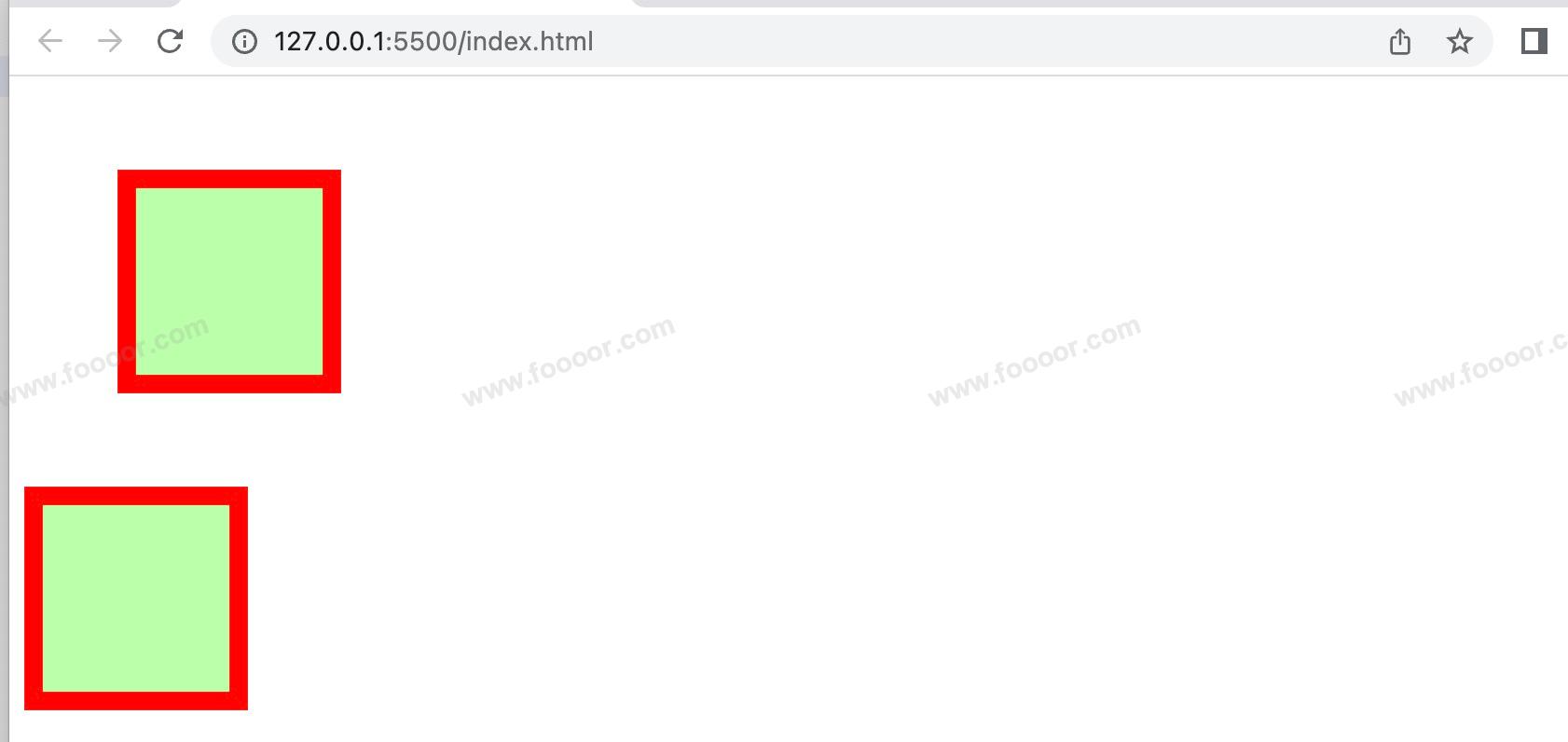
6.4.1 元素溢出
子元素是在父元素的 内容区 中排列的,如果子元素的大小超过了父元素,则子元素会从父元素中溢出。
举个栗子:
下面设置了父元素高度为100px,子元素高度为200px。
css
<style>
    .outer {
      width: 200px;
      height: 100px;
      background-color: #bfa;
    }
    .inner {
      width: 100px;
      height: 200px;
      background-color: red;
    }
</style>

<div class="outer">
		<div class="inner"></div>
</div>
显示效果如下,可以看出子元素从父元素中溢出了:
那么如何处理子元素溢出这个问题呢?
使用 overflow属性来设置父元素如何处理溢出的子元素。
overflow属性可选值如下:
visible:溢出内容会在父元素外部位置显示,默认值,就是上面显示的情况;hidden:溢出内容会被裁剪,不会显示;scroll:生成水平和垂直方向两个滚动条,通过滚动条来查看完整的内容;auto:根据需要生成滚动条;
举个栗子
html
<style>
.box1 {
width: 200px;
height: 200px;
background-color: #bfa;
/* 依次演示下面三个值的效果 */
overflow: hidden;
/* overflow: scroll; */
/* overflow: auto; */
}
</style>
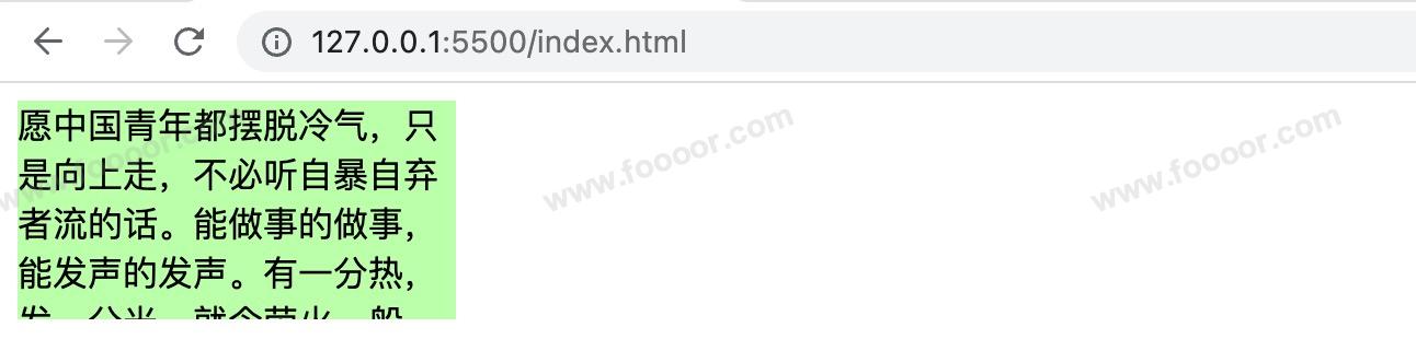
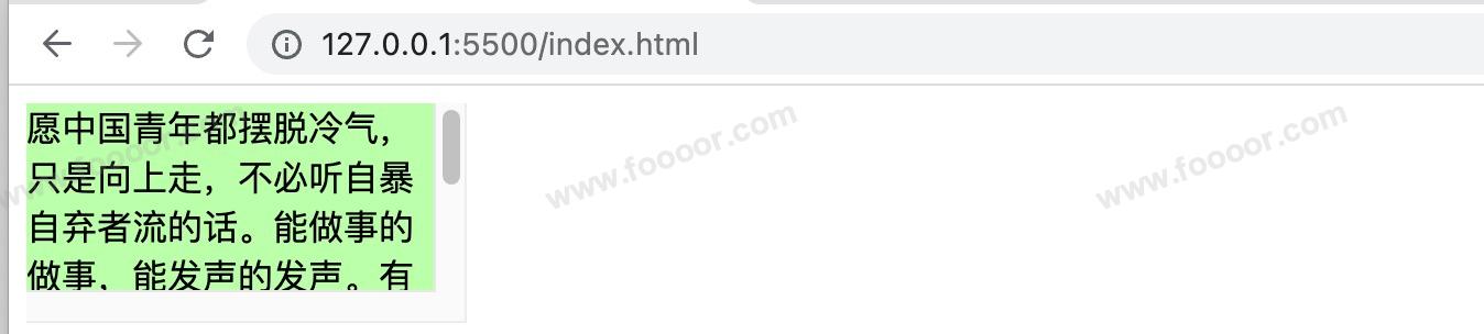
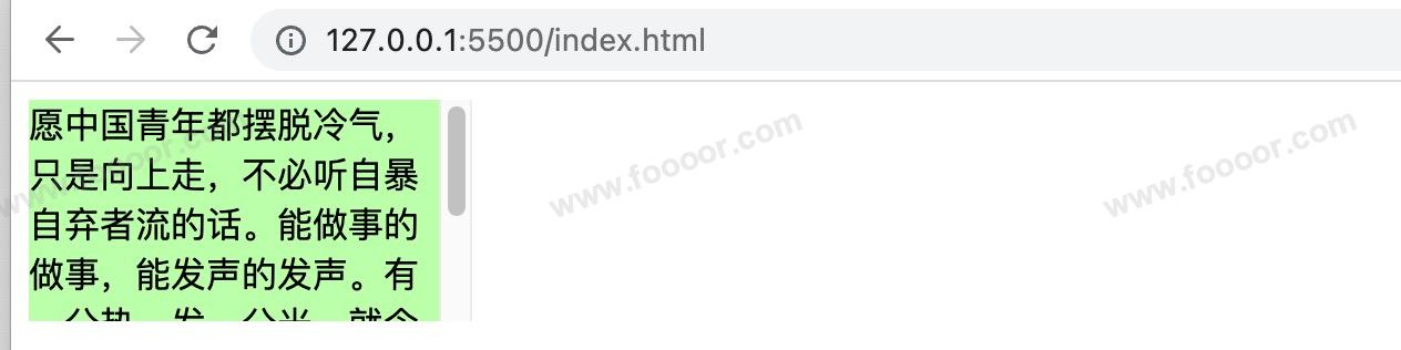
<div class="box1">
愿中国青年都摆脱冷气,只是向上走,不必听自暴自弃者流的话。能做事的做事,能发声的发声。有一分热,发一分光。就令萤火一般,也可以在黑暗里发一点光,不必等候炬火。——鲁迅
</div>hidden 显示效果:
scroll 显示效果:
auto 显示效果:
overflow-x 和 overflow-y
上面 overflow 属性是同时设置水平和垂直方向上的溢出效果,
还可以单独使用 overflow-x 或 overflow-y 属性来单独设置水平或垂直方向上的溢出效果。
6.4.2 边距折叠
1 垂直外边距的折叠
什么是垂直外边距的折叠?
垂直外边距的折叠:相邻的垂直方向外边距会发生重叠现象。
什么意思呢?
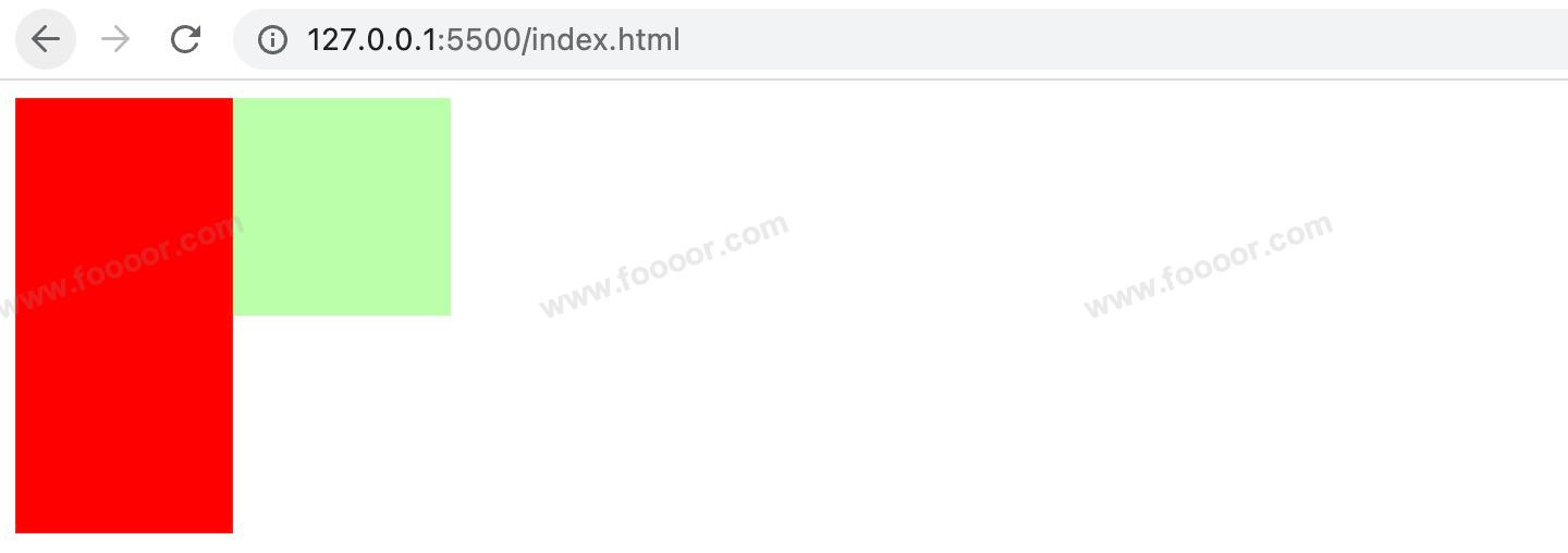
举个栗子:
编写两个div,设置上面的 div 的 margin-bottom 为100px,下面的 div 的 margin-top 为100px,那么两个div的距离应该是200px,但是...
html
<style>
    .box1,
    .box2 {
    		width: 100px;
    		height: 100px;
    }

    .box1 {
        background-color: red;
        /* 设置一个下外边距 */
        margin-bottom: 100px;
    }

    .box2 {
        background-color: blue;
        /* 设置一个上外边距 */
        margin-top: 100px;
    }
</style>

<body>
    <div class="box1"></div>
    <div class="box2"></div>
</body>显示如下,发现两个div的距离却是100px,这个就是垂直外边距的折叠。

2 兄弟元素的边距折叠
兄弟元素间的相邻,垂直外边距会取两者之间的较大值(两者都是正值)。
特殊情况:
- 如果相邻的外边距一正一负,则取两者的和
- 如果相邻的外边距都是负值,则取两者中绝对值较大的
那么这种情况怎么处理呢?
兄弟元素之间的外边距的重叠,对于开发是有利的,所以不需要处理。
3 父子元素的边距折叠
父子元素间相邻(父元素没有边框和内边距,子元素外边距与父元素外边距相邻),子元素会传递给父元素(上外边距)
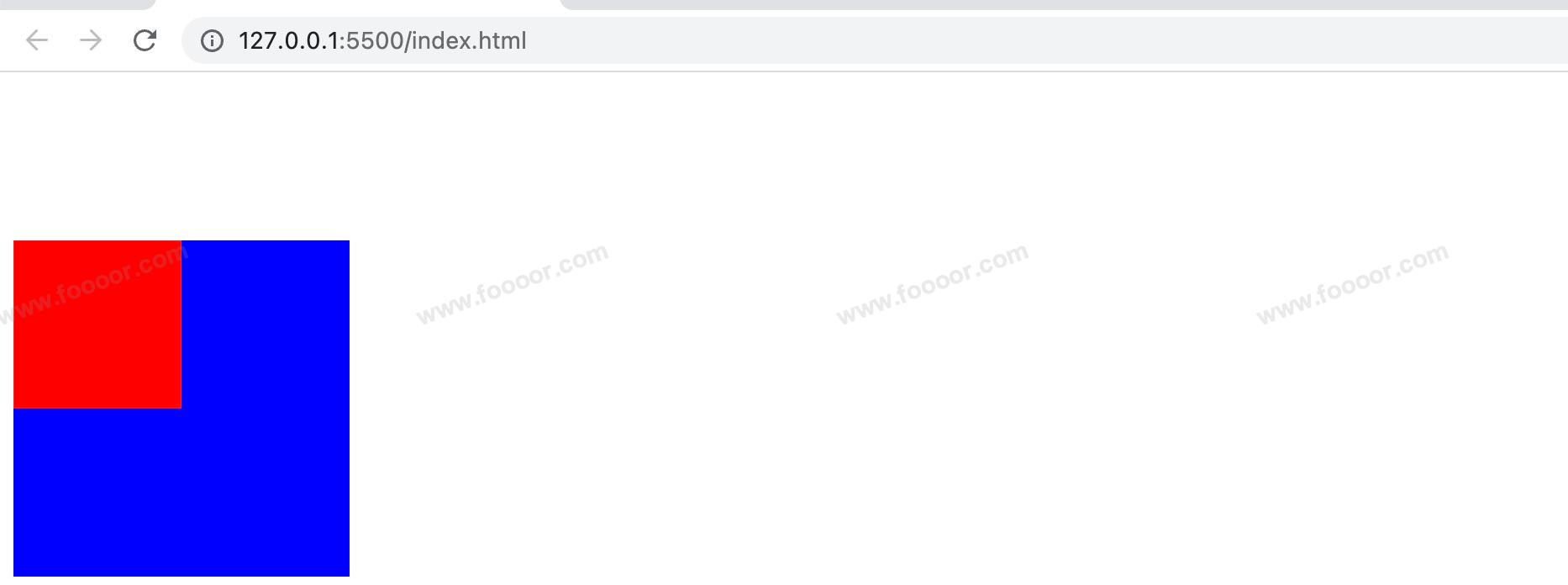
举个栗子,设置父子两个div,设置子 div 的 margin-top 为 100px。
css
<style>
    .box1 {
      width: 200px;
      height: 200px;
      background-color: blue;
    }

    .box2 {
      width: 100px;
      height: 100px;
      background-color: red;
      /* 设置上外边距 */
      margin-top: 100px;
    }
</style>

<div class="box1">
  <div class="box2"></div>
</div>
我们心里想的效果:
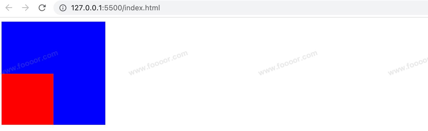
实际显示效果如下,我尼玛,发生了什么?整个父子都往下移动了100px。父子外边距的折叠会影响到页面的布局,必须严肃处理。
如果就要让子元素显示在父元素的左下角,那么要怎么处理呢?
以现在所学的知识,暂时没有完美的方法,后面通过 .clearfix 来解决,具体的思路是在父元素的前面使用伪元素,将父元素和子元素隔开。
如果现在来解决,介绍几种不完美的方案。
方案1
不使用子元素的margin,而是使用父元素的padding。
css
.box3 {
  width: 200px;
  height: 100px;  /*因为设置padding,会导致父元素尺寸变大,所以需要修改父元素的尺寸*/
  background-color: blue;
  padding-top: 100px; /* 不调整子元素的margin,而是转而调整父元素的padding */
}

.box4 {
  width: 100px;
  height: 100px;
  background-color: red;
}
显示效果:
方案2
子元素和父元素直接接触就会出现外边距折叠,我们给父元素添加一个边框就好了。
但是边框会撑大父元素的尺寸,所以同时还需要修改父元素的尺寸。
css
<style>
    .box1 {
      width: 200px;
      height: 199px; /* 边框增加1px,父元素总体高度会增加1,这里减去一个像素,使父元素的总体高度保持在200 */
      background-color: blue;
      border-top: 1px blue solid; /* 设置一个和父元素背景颜色相同的颜色 */
    }

    .box2 {
      width: 100px;
      height: 100px;
      background-color: red;
      /* 设置上外边距 */
      margin-top: 99px; /* 父元素内容区高度为199,margin-top为100,这里需要减小一个像素,否则会从父元素溢出 */
    }
</style>
上面的解决方案都不是完美的方案,后面再通过 .clearfix 来解决(在高度塌陷与BFC章节)。
如果以后出现子元素设置 margin-top 将父元素挤下来的情况,就需要考虑是不是边距折叠的问题。
6.5 行内元素的盒子模型
行内元素盒子模型存在如下特性:
1 不支持设置宽高
行内元素不支持设置宽度和高度。
html
<style>
.s1 {
width: 100px; /* 行内元素设置了宽高,但是不生效 */
height: 100px;
background-color: orange;
}
.box1 {
width: 200px;
height: 200px;
background-color: #bfa;
}
</style>
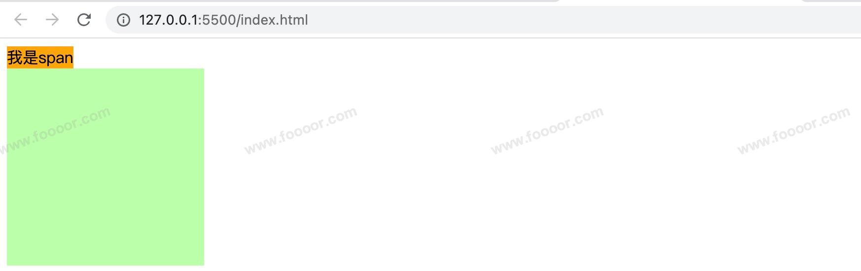
<body>
<span class="s1">我是span</span>
<div class="box1"></div>
</body>显示效果如下,span宽高无效:
2 垂直方向padding不影响页面布局
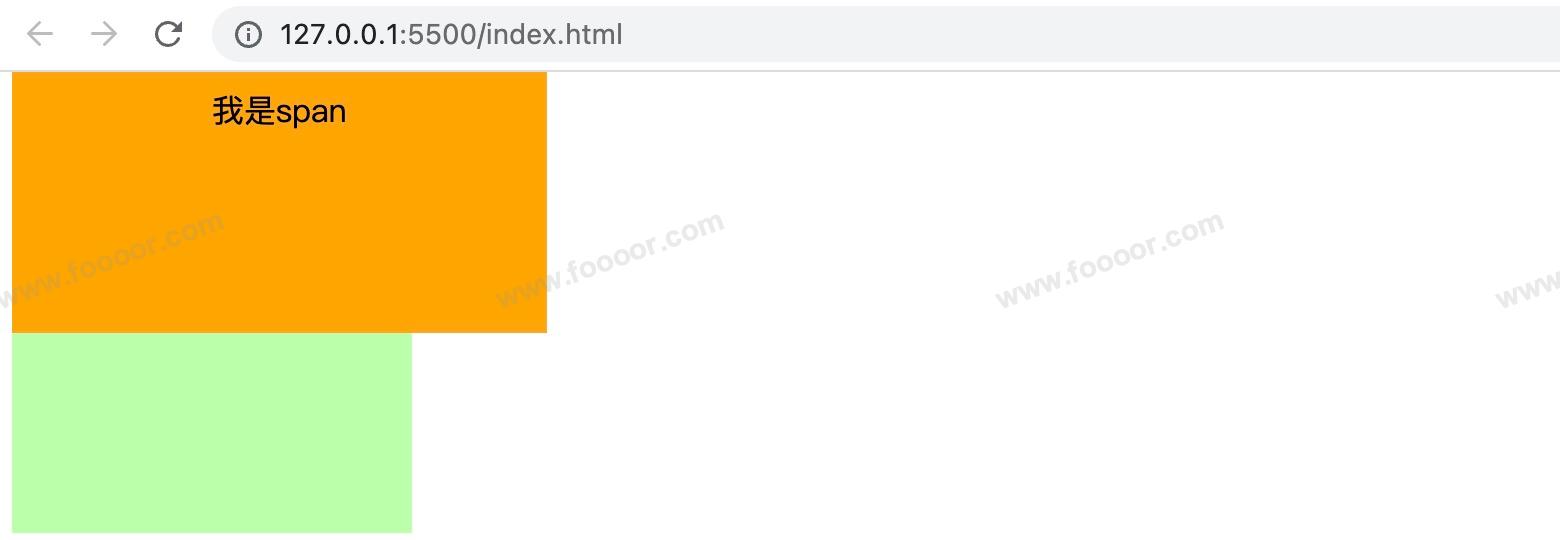
行内元素可以设置padding,但是垂直方向padding不会影响页面的布局
html
<style>
    .s1 {
      /* 下方的div元素并没有因span设置了padding属性,而受到位置上的影响 */
      padding: 100px;
      background-color: orange;
    }

    .box1 {
      width: 200px;
      height: 200px;
      background-color: #bfa;
    }
</style>

<body>
    <span class="s1">我是span</span>
    <div class="box1"></div>
</body>
显示如下,span确实变高了,但是下方的div没动,而是被span挡住了:
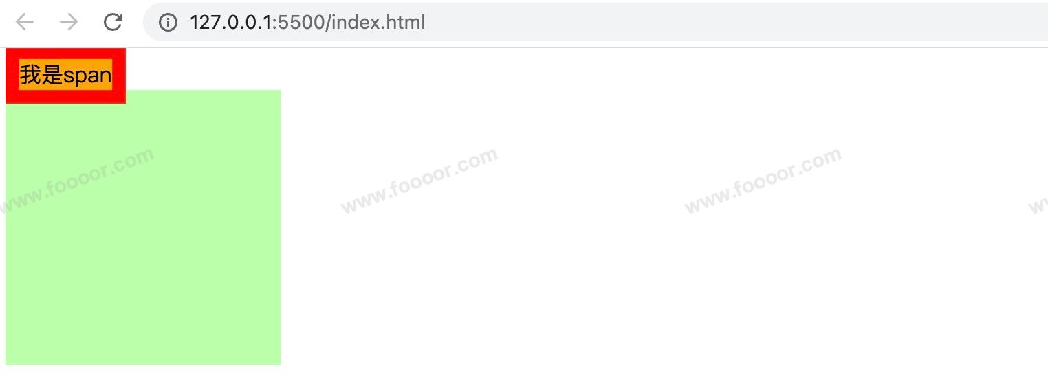
3 垂直方向的border不影响页面布局
行内元素可以设置border,垂直方向的border不会影响页面的布局
html
 <style>
    .s1 {
      border: 10px red solid;
      background-color: orange;
    }

    .box1 {
      width: 200px;
      height: 200px;
      background-color: #bfa;
    }
</style>

<body>
    <span class="s1">我是span</span>
    <div class="box1"></div>
</body>
显示如下:
4 垂直方向的margin不影响页面布局
行内元素可以设置margin,垂直方向的margin不会影响页面的布局
html
<style>
    .s1 {
      margin: 100px;
      background-color: orange;
    }

    .box1 {
      width: 200px;
      height: 200px;
      background-color: #bfa;
    }
</style>

<body>
    <span class="s1">我是span</span>
    <div class="box1"></div>
</body>
显示如下:
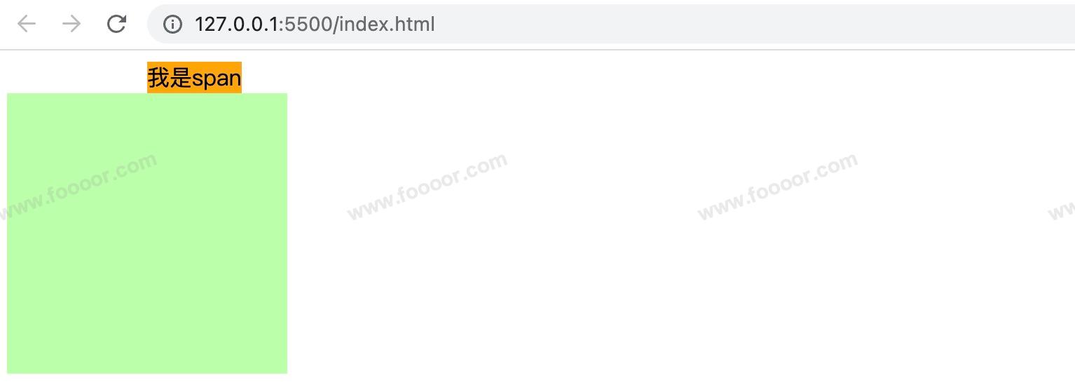
也就是说行内元素垂直方向的 padding,border、margin 都不会影响页面的布局。
如果就是想要行内元素的宽高呢?
可以用 display 修改元素显示的类型。
5 display属性
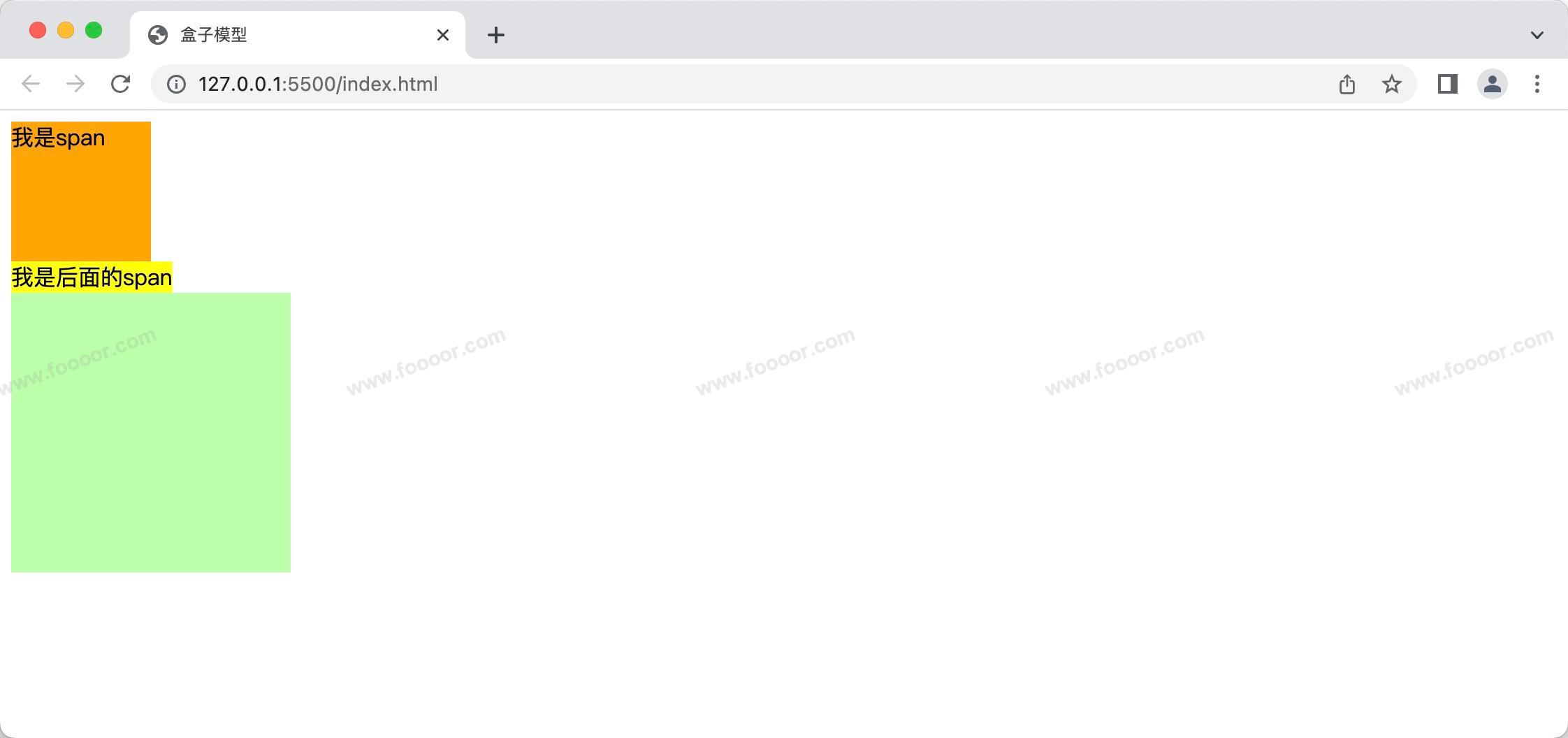
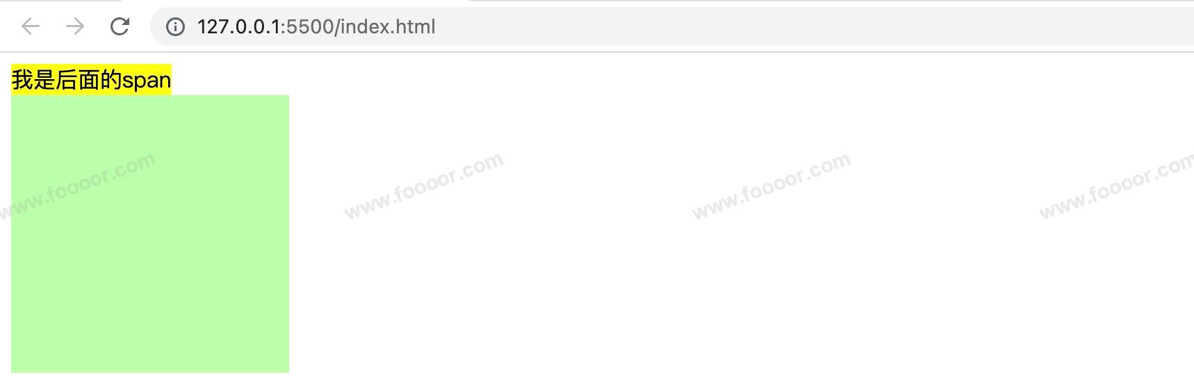
inline:将元素设置为行内元素block:将元素设置为块元素举个栗子,修改span位块元素:
html<style> .s1 { display: block; height: 100px; width: 100px; background-color: orange; } .s2 { background-color: yellow; } .box1 { width: 200px; height: 200px; background-color: #bfa; } </style> <body> <span class="s1">我是span</span> <span>我是后面的span</span> <div class="box1"></div> </body>显示如下,可以看到第一个span元素被设置为块元素后,后面的span元素另起一行:
inline-block将元素设置为行内块元素行内块,既可以设置宽度和高度又不会独占一行css.s1 { /* 将行内元素设置为行内块元素,兼顾行内元素和块元素的特点 */ display: inline-block; height: 100px; width: 100px; background-color: orange; }
但是不太推荐使用
inline-block,因为它有很多缺点,举个栗子:我们写了两个span,并设置为
inline-block样式。html<style> .s1 { display: inline-block; height: 100px; width: 100px; background-color: orange; } </style> <body> <span class="s1">我是span</span> <span class="s1">我是span</span> </body>显示效果如下:
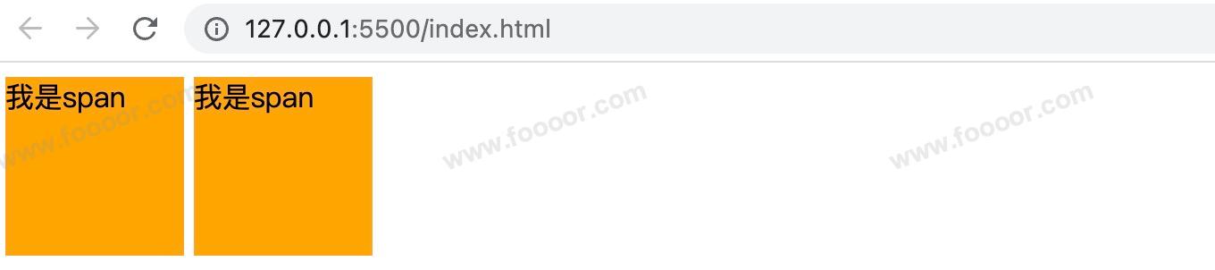
会发现两个span之间莫名其妙多了一个间隙,我们可以理解为两个字之间的间隙,所以如果需要去掉这个间隙,取消两个元素之间的换行和空格即可,下面这样写就没有了:
html<body> <span class="s1">我是span</span><span class="s1">我是span</span> </body>table:将元素设置为一个表格,这里不做介绍了,后面会讲解表格。none:元素不在页面中显示演示一下,设置span的
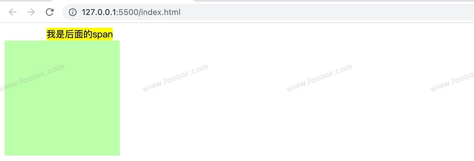
display: none:html<style> .s1 { display: none; background-color: orange; } .s2 { background-color: yellow; } .box1 { width: 200px; height: 200px; background-color: #bfa; } </style> <body> <span class="s1">我是span</span> <span>我是后面的span</span> <div class="box1"></div> </body>显示效果如下,s1不见了,连位置也没了:
如果要想保留位置,只是隐藏元素呢?
需要使用 visibility 属性。
6 visibility属性
visibility 用来设置元素的显示状态,常用的属性如下:
visible:默认值,元素在页面中正常显示hidden:元素在页面中隐藏不显示,但是依然占据页面的位置html<style> .s1 { visibility: hidden; background-color: orange; } .s2 { background-color: yellow; } .box1 { width: 200px; height: 200px; background-color: #bfa; } </style> <body> <span class="s1">我是span</span> <span>我是后面的span</span> <div class="box1"></div> </body>显示效果如下,第一个span虽然不显示,但是仍然占据了位置:
6.6 浏览器的默认样式
通常情况,浏览器都会为元素设置一些默认样式,不同的浏览器给元素的默认样式存在一些差异。
举个栗子:
html
<style>
.box1 {
width: 100px;
height: 100px;
border: 1px solid red;
}
</style>
<body>
<div class="box1"></div>
<p>我是一个段落</p>
<p>我是一个段落</p>
<p>我是一个段落</p>
<ul>
<li>列表项1</li>
<li>列表项2</li>
<li>列表项3</li>
</ul>
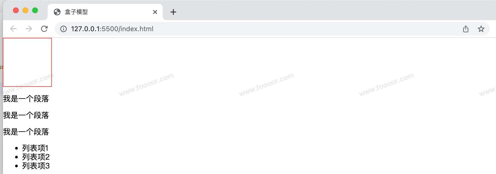
</body>显示效果:
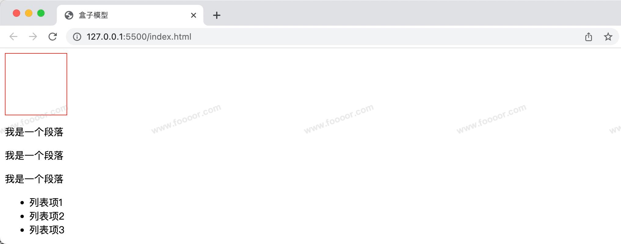
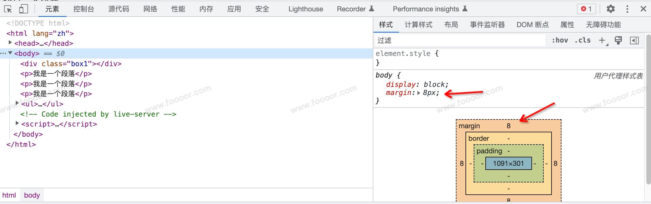
我们会发现 div 根本就没有贴合页面边缘,而且段落之间也有一个间隙,列表显示也很丑。
通过浏览器开发者工具我们会发现 div 没有靠边是因为body有一个margin,其他的元素也会有一些默认样式。
所以一般情况下我们会清除浏览器的默认样式,然后重新设置我们的样式。
那么如何清除所有元素的默认样式呢?
一般情况下,我们通过下面的样式就可以去掉大部分元素的默认样式了:
css
* {
  margin: 0;
  padding: 0;
  /* 去掉li元素前面的黑点 */
  list-style: none;
}
既然我们有这个需求,那么别人也会有这个需求,所以我们不用重复造轮子。
目前有两个方案,reset样式 和 normalize样式。
这两个什么区别呢?
reset样式 :清除所有的默认样式。
normalize样式 :将所有的默认样式进行统一,是在所有的浏览器中显示一致。
1 reset 样式
官方地址:https://meyerweb.com/eric/tools/css/reset/
我们可以在项目中新建一个reset.css,将官网中的样式复制粘贴,然后再我们的页面引入即可。
html
<link rel="stylesheet" href="assets/reset.css" />需要注意,我们在引入的时候,将该样式表放在最前面,以免覆盖了其他的样式表。
使用效果:
会清除掉所有的默认样式。

reset.css 内容如下:
css
/* http://meyerweb.com/eric/tools/css/reset/
   v2.0 | 20110126
   License: none (public domain)
*/

html, body, div, span, applet, object, iframe,
h1, h2, h3, h4, h5, h6, p, blockquote, pre,
a, abbr, acronym, address, big, cite, code,
del, dfn, em, img, ins, kbd, q, s, samp,
small, strike, strong, sub, sup, tt, var,
b, u, i, center,
dl, dt, dd, ol, ul, li,
fieldset, form, label, legend,
table, caption, tbody, tfoot, thead, tr, th, td,
article, aside, canvas, details, embed,
figure, figcaption, footer, header, hgroup,
menu, nav, output, ruby, section, summary,
time, mark, audio, video {
	margin: 0;
	padding: 0;
	border: 0;
	font-size: 100%;
	font: inherit;
	vertical-align: baseline;
}
/* HTML5 display-role reset for older browsers */
article, aside, details, figcaption, figure,
footer, header, hgroup, menu, nav, section {
	display: block;
}
body {
	line-height: 1;
}
ol, ul {
	list-style: none;
}
blockquote, q {
	quotes: none;
}
blockquote:before, blockquote:after,
q:before, q:after {
	content: '';
	content: none;
}
table {
	border-collapse: collapse;
	border-spacing: 0;
}
2 normalize 样式
官方地址:https://necolas.github.io/normalize.css/8.0.1/normalize.css
我们创建一个样式表文件,然后复制拷贝即可:
css
<link rel="stylesheet" href="assets/normalize.css">显示效果:
会将所有的默认样式进行统一,是在所有的浏览器中显示一致。
normalize.css 内容:
css
/*! normalize.css v8.0.1 | MIT License | github.com/necolas/normalize.css */

/* Document
   ========================================================================== */

/**
 * 1. Correct the line height in all browsers.
 * 2. Prevent adjustments of font size after orientation changes in iOS.
 */

html {
  line-height: 1.15; /* 1 */
  -webkit-text-size-adjust: 100%; /* 2 */
}

/* Sections
   ========================================================================== */

/**
 * Remove the margin in all browsers.
 */

body {
  margin: 0;
}

/**
 * Render the `main` element consistently in IE.
 */

main {
  display: block;
}

/**
 * Correct the font size and margin on `h1` elements within `section` and
 * `article` contexts in Chrome, Firefox, and Safari.
 */

h1 {
  font-size: 2em;
  margin: 0.67em 0;
}

/* Grouping content
   ========================================================================== */

/**
 * 1. Add the correct box sizing in Firefox.
 * 2. Show the overflow in Edge and IE.
 */

hr {
  box-sizing: content-box; /* 1 */
  height: 0; /* 1 */
  overflow: visible; /* 2 */
}

/**
 * 1. Correct the inheritance and scaling of font size in all browsers.
 * 2. Correct the odd `em` font sizing in all browsers.
 */

pre {
  font-family: monospace, monospace; /* 1 */
  font-size: 1em; /* 2 */
}

/* Text-level semantics
   ========================================================================== */

/**
 * Remove the gray background on active links in IE 10.
 */

a {
  background-color: transparent;
}

/**
 * 1. Remove the bottom border in Chrome 57-
 * 2. Add the correct text decoration in Chrome, Edge, IE, Opera, and Safari.
 */

abbr[title] {
  border-bottom: none; /* 1 */
  text-decoration: underline; /* 2 */
  text-decoration: underline dotted; /* 2 */
}

/**
 * Add the correct font weight in Chrome, Edge, and Safari.
 */

b,
strong {
  font-weight: bolder;
}

/**
 * 1. Correct the inheritance and scaling of font size in all browsers.
 * 2. Correct the odd `em` font sizing in all browsers.
 */

code,
kbd,
samp {
  font-family: monospace, monospace; /* 1 */
  font-size: 1em; /* 2 */
}

/**
 * Add the correct font size in all browsers.
 */

small {
  font-size: 80%;
}

/**
 * Prevent `sub` and `sup` elements from affecting the line height in
 * all browsers.
 */

sub,
sup {
  font-size: 75%;
  line-height: 0;
  position: relative;
  vertical-align: baseline;
}

sub {
  bottom: -0.25em;
}

sup {
  top: -0.5em;
}

/* Embedded content
   ========================================================================== */

/**
 * Remove the border on images inside links in IE 10.
 */

img {
  border-style: none;
}

/* Forms
   ========================================================================== */

/**
 * 1. Change the font styles in all browsers.
 * 2. Remove the margin in Firefox and Safari.
 */

button,
input,
optgroup,
select,
textarea {
  font-family: inherit; /* 1 */
  font-size: 100%; /* 1 */
  line-height: 1.15; /* 1 */
  margin: 0; /* 2 */
}

/**
 * Show the overflow in IE.
 * 1. Show the overflow in Edge.
 */

button,
input { /* 1 */
  overflow: visible;
}

/**
 * Remove the inheritance of text transform in Edge, Firefox, and IE.
 * 1. Remove the inheritance of text transform in Firefox.
 */

button,
select { /* 1 */
  text-transform: none;
}

/**
 * Correct the inability to style clickable types in iOS and Safari.
 */

button,
[type="button"],
[type="reset"],
[type="submit"] {
  -webkit-appearance: button;
}

/**
 * Remove the inner border and padding in Firefox.
 */

button::-moz-focus-inner,
[type="button"]::-moz-focus-inner,
[type="reset"]::-moz-focus-inner,
[type="submit"]::-moz-focus-inner {
  border-style: none;
  padding: 0;
}

/**
 * Restore the focus styles unset by the previous rule.
 */

button:-moz-focusring,
[type="button"]:-moz-focusring,
[type="reset"]:-moz-focusring,
[type="submit"]:-moz-focusring {
  outline: 1px dotted ButtonText;
}

/**
 * Correct the padding in Firefox.
 */

fieldset {
  padding: 0.35em 0.75em 0.625em;
}

/**
 * 1. Correct the text wrapping in Edge and IE.
 * 2. Correct the color inheritance from `fieldset` elements in IE.
 * 3. Remove the padding so developers are not caught out when they zero out
 *    `fieldset` elements in all browsers.
 */

legend {
  box-sizing: border-box; /* 1 */
  color: inherit; /* 2 */
  display: table; /* 1 */
  max-width: 100%; /* 1 */
  padding: 0; /* 3 */
  white-space: normal; /* 1 */
}

/**
 * Add the correct vertical alignment in Chrome, Firefox, and Opera.
 */

progress {
  vertical-align: baseline;
}

/**
 * Remove the default vertical scrollbar in IE 10+.
 */

textarea {
  overflow: auto;
}

/**
 * 1. Add the correct box sizing in IE 10.
 * 2. Remove the padding in IE 10.
 */

[type="checkbox"],
[type="radio"] {
  box-sizing: border-box; /* 1 */
  padding: 0; /* 2 */
}

/**
 * Correct the cursor style of increment and decrement buttons in Chrome.
 */

[type="number"]::-webkit-inner-spin-button,
[type="number"]::-webkit-outer-spin-button {
  height: auto;
}

/**
 * 1. Correct the odd appearance in Chrome and Safari.
 * 2. Correct the outline style in Safari.
 */

[type="search"] {
  -webkit-appearance: textfield; /* 1 */
  outline-offset: -2px; /* 2 */
}

/**
 * Remove the inner padding in Chrome and Safari on macOS.
 */

[type="search"]::-webkit-search-decoration {
  -webkit-appearance: none;
}

/**
 * 1. Correct the inability to style clickable types in iOS and Safari.
 * 2. Change font properties to `inherit` in Safari.
 */

::-webkit-file-upload-button {
  -webkit-appearance: button; /* 1 */
  font: inherit; /* 2 */
}

/* Interactive
   ========================================================================== */

/*
 * Add the correct display in Edge, IE 10+, and Firefox.
 */

details {
  display: block;
}

/*
 * Add the correct display in all browsers.
 */

summary {
  display: list-item;
}

/* Misc
   ========================================================================== */

/**
 * Add the correct display in IE 10+.
 */

template {
  display: none;
}

/**
 * Add the correct display in IE 10.
 */

[hidden] {
  display: none;
}
根据自己需要进行选择吧,我一般选择第一个 reset.css。