Appearance
CSS3教程 - 13 动画
CSS 中的动画主要包括两种,一种是过渡动画, 例如颜色、大小、透明度的慢慢变化;另一种是帧动画,通过设置多个关键帧,通过在关键帧之间的切换实现动画。
13.1 过渡动画
过渡动画是 状态之间的渐变,当 CSS 属性的值发生变化时,浏览器会在指定的时间内逐步变化,而不是立即跳转到新值。
1 过渡的使用
直接举个栗子:
html
<!DOCTYPE html>
<html>
<head>
<style>
.box1 {
width: 600px;
height: 200px;
background-color: lightgray;
}
.box2 {
width: 100px;
height: 100px;
background-color: skyblue;
}
.box1:hover .box2 {
width: 200px;
height: 200px;
}
</style>
</head>
<body>
<div class="box1">
<div class="box2">foooor.com</div>
</div>
</body>
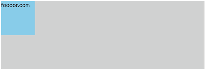
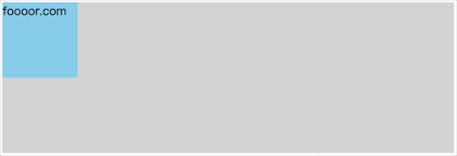
</html>- 上面的代码很简单,就是 box1 中嵌套了 box2,当鼠标悬浮在 box1 上的时候,box2 的尺寸就会变成 200px。
显示如下:
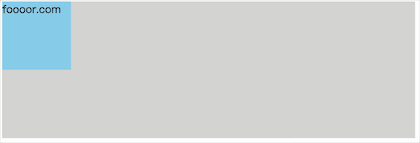
但是鼠标悬浮的时候,box2 的尺寸是瞬间变大的,没有过渡效果,下面就给鼠标悬浮添加过渡效果。
css
.box2 {
  width: 50px;
  height: 50px;
  background-color: skyblue;

  transition-property: width, height;  /* 指定要执行过渡的属性 */
  transition-duration: 1s;  /* 指定过渡效果的持续时间 */
}- 上面给 box2 添加了过渡相关的属性,
transition-property指定要指定过渡的属性,多个属性使用,分隔,如果所有属性都需要过渡,则使用all关键字(transition-property: all;); transition-duration:指定过渡效果的持续时间,单位可以使用秒(s)和毫秒(ms)。
显示如下:
如果多个属性的过渡时间不同,那么可以分别指定过渡时间:
css
transition-property: width, height;  /* 指定要执行过渡的属性 */
transition-duration: 1s, 500ms; /* 指定过渡效果的持续时间 */- 上面为宽度指定过渡时间为
1s,高度的过渡时间为500ms。
CSS 中大部分属性都支持过渡效果,从一个有效数值过渡的另一个有效数值,需要注意,有的值默认是 auto 是不可以的,需要设置为数值才可以。
颜色也是可以过渡,例如将鼠标悬浮后 ,box2 的颜色设置为粉色:
css
.box2 {
  width: 100px;
  height: 100px;
  background-color: skyblue;

  transition-property: all;  /* 指定要执行过渡的属性 */
  transition-duration: 1s;  /* 指定过渡效果的持续时间 */
}

.box1:hover .box2 {
  width: 200px;
  height: 200px;
  background-color: lightpink;
}- 上面设置所有属性都指定多度动画,然后设置鼠标悬浮后,box2 的颜色为粉色。
显示如下:
2 过渡时序函数
过渡时序函数用于定义过渡效果的速度曲线。它决定了属性值在过渡过程中如何随时间变化,从而影响动画的流畅度和视觉效果。
CSS 提供了一些预定义的时序函数,适用于不同的动画效果:
| 时序函数 | 描述 | 运动曲线效果 |
|---|---|---|
linear | 匀速运动(速度恒定) | 🚗——🚗——🚗——🚗 |
ease | 先慢后快再慢(默认值) | 🚗⏳➡️🚀➡️⏳🚗 |
ease-in | 慢慢加速(适合渐入效果) | 🚗⏳➡️🚀 |
ease-out | 快速开始,然后减速(适合渐出效果) | 🚀➡️⏳🚗 |
ease-in-out | 先慢后快再慢(比 ease 更柔和) | 🚗⏳➡️🚀➡️⏳🚗 |
step-start | 直接跳到最终状态 | 🚀(瞬移) |
step-end | 保持初始状态,最后一刻跳转 | 🚗🚗🚗🚗🚀 |
steps(n, jump-type) | 分步跳跃动画 | 🚗→🚗→🚗→🚗 |
cubic-bezier(x1, y1, x2, y2) | 自定义贝塞尔曲线 | 🎨(自由定制) |
下面通过修改 box2 的 margin-left 值,让 box2 进行移动,来看看上面过渡动画的速度曲线的效果,为了可以对比,我这里弄多个元素:
html
<!DOCTYPE html>
<html>
  <head>
    <style>
      .box1 {
        width: 600px;
        background-color: lightgray;
      }

      .box2 {
        width: 50px;
        height: 50px;
        background-color: skyblue;

        transition-property: all;  /* 指定要执行过渡的属性 */
        transition-duration: 2s;  /* 指定过渡效果的持续时间 */
        transition-timing-function: linear;
      }

      .box3 {
        width: 50px;
        height: 50px;
        background-color: greenyellow;

        transition-property: all;  /* 指定要执行过渡的属性 */
        transition-duration: 2s;  /* 指定过渡效果的持续时间 */
        transition-timing-function: ease;
      }

      .box4 {
        width: 50px;
        height: 50px;
        background-color: yellow;

        transition-property: all;  /* 指定要执行过渡的属性 */
        transition-duration: 2s;  /* 指定过渡效果的持续时间 */
        transition-timing-function: ease-in;
      }

      .box5 {
        width: 50px;
        height: 50px;
        background-color: lightsalmon;

        transition-property: all;  /* 指定要执行过渡的属性 */
        transition-duration: 2s;  /* 指定过渡效果的持续时间 */
        transition-timing-function: ease-out;
      }

      .box6 {
        width: 50px;
        height: 50px;
        background-color: burlywood;

        transition-property: all;  /* 指定要执行过渡的属性 */
        transition-duration: 2s;  /* 指定过渡效果的持续时间 */
        transition-timing-function: ease-in-out;
      }

      .box7 {
        width: 50px;
        height: 50px;
        background-color: skyblue;

        transition-property: all;  /* 指定要执行过渡的属性 */
        transition-duration: 2s;  /* 指定过渡效果的持续时间 */
        transition-timing-function: step-start;
      }

      .box8 {
        width: 50px;
        height: 50px;
        background-color: skyblue;

        transition-property: all;  /* 指定要执行过渡的属性 */
        transition-duration: 2s;  /* 指定过渡效果的持续时间 */
        transition-timing-function: step-end;
      }

      .box9 {
        width: 50px;
        height: 50px;
        background-color: skyblue;

        transition-property: all;  /* 指定要执行过渡的属性 */
        transition-duration: 2s;  /* 指定过渡效果的持续时间 */
        transition-timing-function: steps(3, start);
      }

      .box10 {
        width: 50px;
        height: 50px;
        background-color: skyblue;

        transition-property: all;  /* 指定要执行过渡的属性 */
        transition-duration: 2s;  /* 指定过渡效果的持续时间 */
        transition-timing-function: steps(3, end);
      }

      .box1:hover div {
        margin-left: 550px;
      }
    </style>
  </head>

  <body>
    <div class="box1">
      <div class="box2">linear</div>
      <div class="box3">ease</div>
      <div class="box4">ease-in</div>
      <div class="box5">ease-out</div>
      <div class="box6">ease-in-out</div>
      <div class="box7">step-start</div>
      <div class="box8">step-end</div>
      <div class="box9">steps start</div>
      <div class="box10">steps end</div>
    </div>
  </body>
</html>- 上面添加了多个子元素,并添加了不同的速度曲线效果。
运行如下:
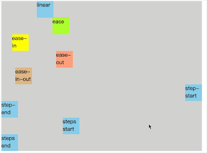
- 不用多说,就是不同的速度效果。
step-start表示在过渡时间开始的时候就瞬移了,step-end表示在过渡时间结束的时候才瞬移。steps可以指定动画分几步过渡,上面指定了分三步,则三步完成过渡;分成多个步后,每一步平分总时间,第二个参数表示的是在每一步时间开始的时候,还是每一步时间结束的时候进行过渡,第二个参数可以省略,默认为end。
3 贝塞尔曲线
其实上面的 linear、ease、ease-in、ease-out、ease-in-out 速度曲线都是通过贝塞尔曲线实现的,所以如果这些效果满足不了你,你可以通过 cubic-bezier() 来指定速度曲线。
值不知道怎么填,可以看一下下面的网站:https://cubic-bezier.com
打开网站,可以通过拖动曲线图上的红色和蓝色的点来调整曲线,最终会生成曲线的值:
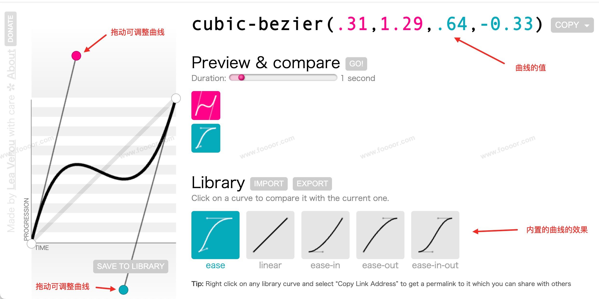
然后将曲线的值放到代码中就可以了:
html
<!DOCTYPE html>
<html>
  <head>
    <style>
      .box1 {
        width: 600px;
        height: 200px;
        background-color: lightgray;
      }

      .box2 {
        width: 100px;
        height: 100px;
        background-color: skyblue;

        transition-property: all;  /* 指定要执行过渡的属性 */
        transition-duration: 2s;  /* 指定过渡效果的持续时间 */
        transition-timing-function: cubic-bezier(.31,1.29,.64,-0.33); /* 指定贝塞尔曲线 */
      }

      .box1:hover div {
        margin-left: 500px;
      }
    </style>
  </head>

  <body>
    <div class="box1">
      <div class="box2">foooor.com</div>
    </div>
  </body>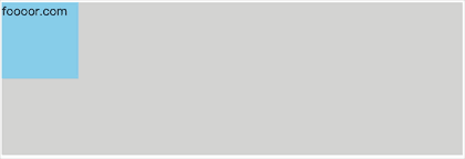
</html>- 上面的曲线是先加速,然后又后退的,所以运行显示如下:
4 动画延迟
动画延迟就是等待指定的时间后,动画才开始,使用 transition-delay 属性指定。
举个栗子:
下面添加了两个子元素 box2 和 box3 ,box3 指定了动画的延迟,做一下对比。
html
<!DOCTYPE html>
<html>
  <head>
    <style>
      .box1 {
        width: 600px;
        height: 200px;
        background-color: lightgray;
      }

      .box2 {
        width: 80px;
        height: 80px;
        background-color: skyblue;

        transition-property: all;
        transition-duration: 2s;
      }

      .box3 {
        width: 80px;
        height: 80px;
        background-color: skyblue;

        transition-property: all;
        transition-duration: 2s;
        transition-delay: 1s;   /* 指定动画延迟 */
      }

      .box1:hover div {
        margin-left: 520px;
      }
    </style>
  </head>

  <body>
    <div class="box1">
      <div class="box2"></div>
      <div class="box3"></div>
    </div>
  </body>
</html>- box3 通过
transition-delay: 1s;指定了动画延迟1s执行。
显示如下:

5 过渡动画复合属性
上面使用的属性,可以通过 transition 复合属性直接指定。
语法:
css
transition: 属性 持续时间 速度曲线 延迟时间;举个栗子,下面的写法都可以:
css
transition: width 2s;  /* 2s表示过渡时间 */
transition: 2s width;  /* 2s表示过渡时间 */
transition: width 2s ease 1s;  /* 前面2s表示过渡时间,后面1s表示延迟时间 */
transition: 2s width ease 1s; /* 前面2s表示过渡时间,后面1s表示延迟时间 */- 属性值没有严格的顺序要求,只是过渡时间在前,延迟时间在后即可。
13.2 关键帧动画
关键帧动画和过渡动画类似,都是可以实现一些动态的效果,不同的是过渡动画需要在某个属性发生变化时才会触发,而关键帧动画可以自动触发动态效果。
1 帧动画的使用
使用关键帧动画,首先要定义关键帧。
举个栗子:
html
<!DOCTYPE html>
<html>
  <head>
    <style>
      .box1 {
        width: 600px;
        height: 200px;
        background-color: lightgray;
      }

      /* 1. 定义帧动画 */
      @keyframes my-animation {
        /* from表示动画开始的位置,也可以使用0% */
        from {
          margin-left: 0px;
        }

        /* from表示动画结束的位置,也可是使用 100%{} */
        to {
          margin-left: 520px;
        }
      }

      .box2 {
        width: 80px;
        height: 80px;
        background-color: orange;

        animation-name: my-animation;  /* 2. 使用上面定义的帧动画 */
        animation-duration: 1500ms;  /* 动画持续时间 */
      }
    </style>
  </head>

  <body>
    <div class="box1">
      <div class="box2"></div>
    </div>
  </body>
</html>- 首先使用
@keyframes定义帧动画,后面的名称是自定义的,使用该动画的时候需要用到;from表示动画开始,to表示动画结束;也可以使用百分比%来定义,更灵活,因为中间可以定义其他的百分比。 - 然后针对
box2使用动画,通过animation-name指定定义的动画,animation-duration指定动画的持续时间。
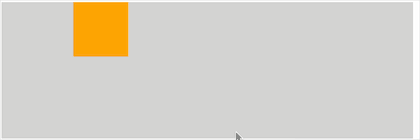
运行如下:

和过渡动画一样,也可以为帧动画指定延迟时间和速度曲线:
css
animation-delay: 1s;  /* 动画延迟执行时间 */
animation-timing-function: ease-in-out;  /* 动画速度曲线 */
和帧动画是一样的,过!
2 动画执行次数
上面的帧动画默认只会执行一次,可以通过 animation-iteration-count 属性指定执行的次数:
css
animation-iteration-count: 3;  /* 指定执行三次 */
animation-iteration-count: infinite;  /* 无限执行 */
3 动画的运行方向
当上面设置动画运行多次的时候,每一次执行默认都是从 from 运行到 to 。通过 animation-direction 指定动画运行的方向。
可选值有:
normal:从from向to运行,每次都是这样,默认值;reverse:反着运动,从to向from运行,每次都是这样;alternate:从from向to运行,然后来回执行;alternate-reverse:从to向from运行,然后来回执行;
举个栗子:
css
animation-direction: alternate; /* 设置执行方向 */显示如下:
4 动画执行状态
使用 animation-play-state 可以设置动画的执行状态,也就是动画运行和暂停。
可选值有:
running:动画执行,默认值;paused:动画暂停;
举个栗子:
当鼠标移入 box2 时,让动画暂停:
html
<!DOCTYPE html>
<html>
  <head>
    <style>
      .box1 {
        width: 600px;
        height: 200px;
        background-color: lightgray;
      }

      /* 1. 定义帧动画 */
      @keyframes my-animation {
        /* from表示动画开始的位置,也可以使用0% */
        from {
          margin-left: 0px;
        }

        /* from表示动画结束的位置,也可是使用 100%{} */
        to {
          margin-left: 520px;
        }
      }

      .box2 {
        width: 80px;
        height: 80px;
        background-color: orange;

        animation-name: my-animation;
        animation-duration: 1500ms;
        animation-delay: 1s;
        animation-timing-function: ease-in-out;
        animation-iteration-count: infinite;
        animation-direction: alternate;  /* 设置执行方向 */
      }

      .box2:hover {
        animation-play-state: paused;
      }
    </style>
  </head>

  <body>
    <div class="box1">
      <div class="box2"></div>
    </div>
  </body>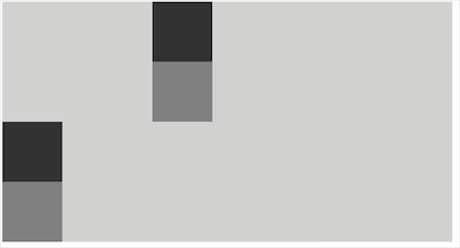
</html>- 上面设置了
.box2:hover,当鼠标移入 box2 时,动画暂停;
显示如下:
5 动画填充模式
什么是动画的填充模式?
动画的填充模式表示动画在执行 之前 和 之后 如何应用样式,默认当动画执行完成后,元素是回到原来的位置的。
通过 animation-fill-mode 可以设置动画的填充模式:
none:动画执行完毕,元素回到原来位置,默认值;forwards:动画执行完毕,元素会停止在动画结束的位置;backwards:动画在等待执行的时候,元素就会处于开始位置;both:结合了forwards和backwards;
举个栗子,我给四个元素设置了不同的填充模式:
html
<!DOCTYPE html>
<html>
  <head>
    <style>
      .box1 {
        width: 600px;
        background-color: lightgray;
      }

      /* 1. 定义帧动画 */
      @keyframes my-animation {
        /* from表示动画开始的位置,也可以使用0% */
        from {
          margin-left: 0px;
        }

        /* from表示动画结束的位置,也可是使用 100%{} */
        to {
          margin-left: 520px;
        }
      }

      .box2 {
        width: 80px;
        height: 80px;
        background-color: #333333;
        margin-left: 200px;

        animation-name: my-animation;
        animation-duration: 1500ms;
        animation-delay: 2s;
        animation-fill-mode: none;
      }

      .box3 {
        width: 80px;
        height: 80px;
        background-color: grey;
        margin-left: 200px;

        animation-name: my-animation;
        animation-duration: 1500ms;
        animation-delay: 2s;
        animation-fill-mode: forwards;
      }

      .box4 {
        width: 80px;
        height: 80px;
        background-color: #333333;
        margin-left: 200px;

        animation-name: my-animation;
        animation-duration: 1500ms;
        animation-delay: 2s;
        animation-fill-mode: backwards;
      }

      .box5 {
        width: 80px;
        height: 80px;
        background-color: grey;
        margin-left: 200px;

        animation-name: my-animation;
        animation-duration: 1500ms;
        animation-delay: 2s;
        animation-fill-mode: both;
      }
    </style>
  </head>

  <body>
    <div class="box1">
      <div class="box2"></div>
      <div class="box3"></div>
      <div class="box4"></div>
      <div class="box5"></div>
    </div>
  </body>
</html>
显示如下:
可以看到 forwards 和 both 在动画结束的时候,停在 to 的位置;backwards 和 both 在动画开始的时候,就出于 from 的位置。
6 帧动画复合属性
帧动画可以通过 animation 复合属性直接指定。
语法:
css
animation: 动画名称 持续时间 动画速度曲线 延迟时间 重复次数 动画方向 填充模式 是否暂停;举个栗子:
css
animation: my-animation 2s ease 1s;- 属性值没有严格的顺序要求,只是过渡时间在前,延迟时间在后即可。
13.3 动画练习
13.3.1 奔跑的少年
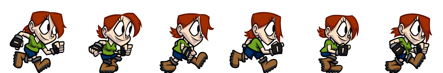
在谷歌、bing、百度搜索图片 sprite animation 可以搜索到一些动画的雪碧图,例如:
上面是一帧一帧的,如果连续播放,就会是一个跑起来的骚年了。
实现思路,将图片作为元素的背景图片,然后调整背景图片的 background-position 属性,让背景图片左移,来显示雪碧图的不同区域。并通过 steps() 来指定动画的时序函数。
如下:
html
<!DOCTYPE html>
<html>
  <head>
    <style>
      /* 1. 定义帧动画 */
      @keyframes run-animation {
        /* from表示动画开始的位置,也可以使用0% */
        0% {
          background-position: 0px 0px;
        }

        /* from表示动画结束的位置,也可是使用 100%{} */
        100% {
          background-position: -1536px 0px;  /* 图片左移 */
        }
      }

      .box1 {
        width: 256px;
        height: 256px;
        background-image: url('./image/run-sprite.png');
        animation: run-animation 1s steps(6) infinite;
      }
    </style>
  </head>

  <body>
    <div class="box1">
    </div>
  </body>
</html>- 这里有一个问题需要注意一下,帧动画在使用
steps(n, end)的时候会导致最后一帧无法显示,使用steps(n, start)会导致第一帧无法显示。 - 所以这里使用
-1536px 0px,因为背景图片默认是平铺的,所以这里显示的是第一帧了,相当于多添加了一帧,这样能完整显示。
显示如下:
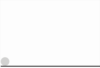
13.3.2 弹力球
创建一个小球,让小球下落,落下后再弹起来,然后再落下,最终落地。
实现如下:
css
<!DOCTYPE html>
<html>
  <head>
    <style>
      .outer {
        width: 100%;
        height: 400px;
        border-bottom: 5px solid #000;   /* 设置下边距 */
        overflow: hidden;  /* 开启BFC,避免父元素和子元素外边距重叠 */
      }

      .ball {
        width: 50px;
        height: 50px;
        border-radius: 50%;
        background-color: lightgray;
        animation: fall-animation 10s ease-in;
        animation-fill-mode: forwards;
      }

      /* 定义动画 */
      @keyframes fall-animation {
        from {
          margin-top: 0;
          animation-timing-function: ease-out;
        }

        20%,
        40%,
        60%,
        80%,
        to {
          margin-top: 350px;
          animation-timing-function: ease-out;
        }

        30% {
          margin-top: 100px;
          animation-timing-function: ease-in;
        }
        50% {
          margin-top: 200px;
          animation-timing-function: ease-in;
        }
        70% {
          margin-top: 250px;
          animation-timing-function: ease-in;
        }
        90% {
          margin-top: 300px;
          animation-timing-function: ease-in;
        }
      }
    </style>
  </head>

  <body>
    <div class="outer">
      <div class="ball"></div>
    </div>
  </body>
</html>- 在 20%、40%、60%、80%、100%的时候在地上;
- 在 30%、50%、70%、90% 的时候弹起来,所以
margin-top慢慢变大。
运行如下:
内容未完......